20 Beautiful Bathroom Color Schemes That Instantly Make Your Space Look More Stylish
Picking the perfect bathroom color sounds simple until you are suddenly comparing 47 shades of white and wondering how you got here.
You want it clean, fresh, and stylish. But bathrooms are small spaces where every surface is visible at once, so a wall color that clashes with your tile or towels that fight with your vanity will always show.
Here is the good news. The right Bathroom Color Schemes can make a basic space feel calm, bold, cozy, or beautifully pulled together without a full remodel. Color is the shortcut to making your bathroom feel more intentional.
Why Bathroom Color Schemes Matter
Color sets the whole mood before anything else does.
Soft neutrals make a small bathroom feel airy. Deep shades make it feel dramatic and designer. Warm earthy tones make it feel cozy instead of cold.
And a good color scheme connects everything together, your tile, vanity, towels, lighting, and decor, so the room feels styled rather than just decorated.
Think of it like the friend who gets everyone standing in the right spot for the group photo. Suddenly the whole thing just works.
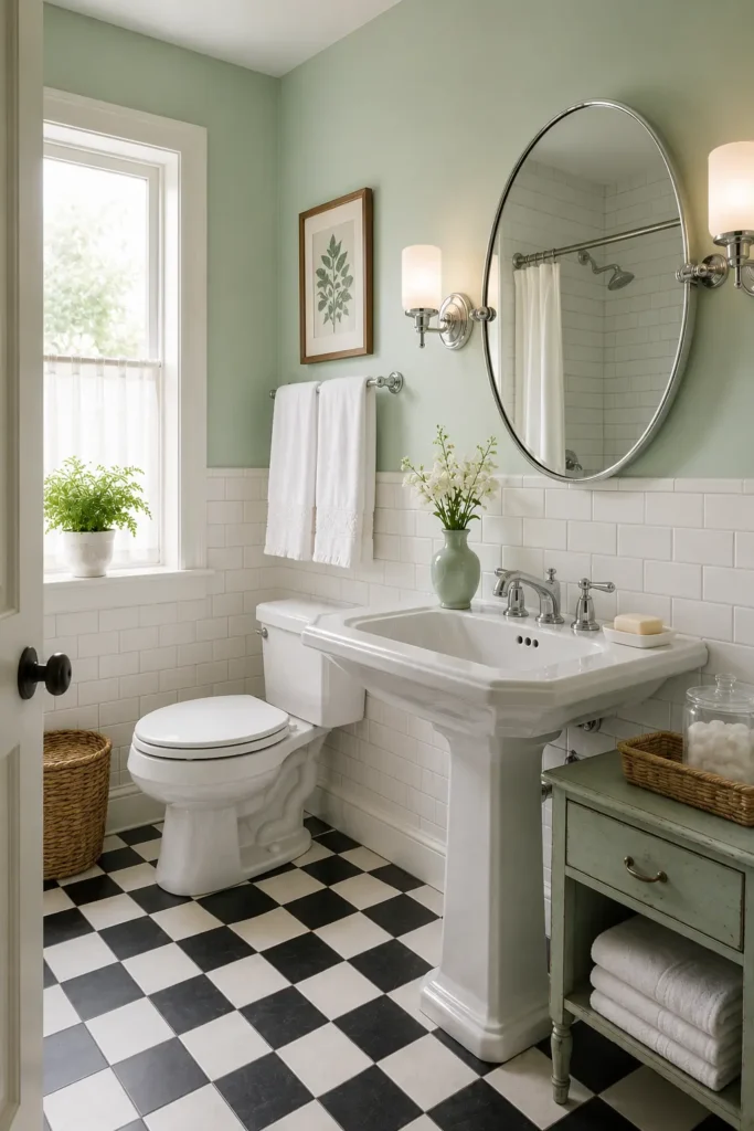
1. Soft Sage Green and Warm White for a Calm Spa Look
My bathroom used to feel like a sterile office waiting room. Cold, flat, and slightly depressing. Then I painted the vanity sage green and everything changed.
Sage green feels fresh without shouting. Natural without being crunchy. Pair it with warm white walls, cream towels, and a little wood and it becomes genuinely relaxing.
This combo is especially great for small bathrooms because it adds personality without making the room feel smaller.
What does the heavy lifting here:
- Soft and grounding: Sage has enough green to feel alive but muted enough to stay calm.
- Pairs with everything: Brass, chrome, nickel all look great against sage.
- Adds life without clutter: It does the visual work so your decor does not have to.
Try the sage on the vanity only first. If you love it, take it to lower wall paneling or a tile accent. Cream waffle towels and a round brass mirror are all you need to finish it off.
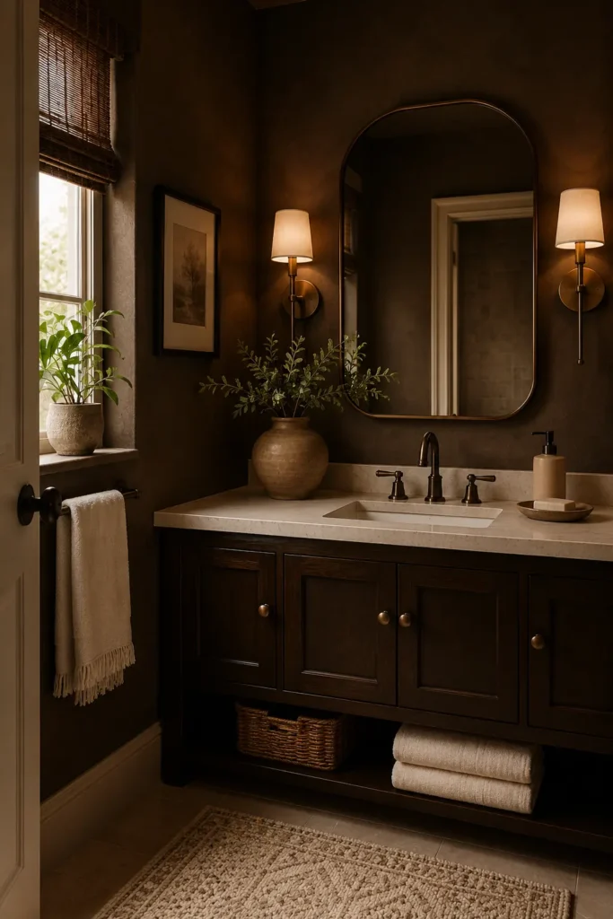
2. Charcoal Black and Cream for Moody Hotel Drama
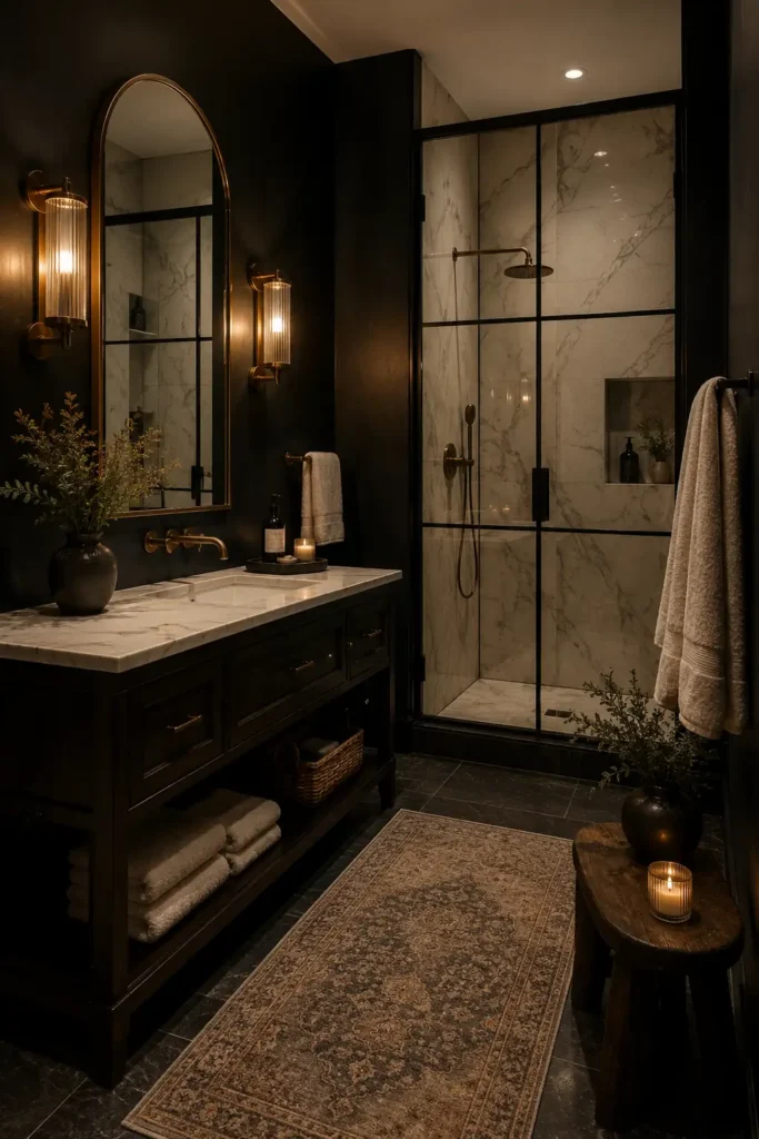
I stayed in a boutique hotel once where the bathroom had charcoal walls and brass sconces. I spent way too long in there. Not for practical reasons. Just because the vibe was immaculate.
Charcoal adds immediate drama. Cream stops it from becoming a cave. Together they feel like something out of a design magazine.
The lighting matters a lot here. Warm bulbs are essential. Cool white light with charcoal walls is a villain origin story.
The breakdown:
- Instant statement: One charcoal wall changes the whole room’s energy.
- Cream does the heavy lifting: It reflects light and prevents the darkness from swallowing the space.
- Brass makes it warm: Gold hardware in a dark room feels intentional and expensive.
Use warm cream instead of bright white. Bright white makes charcoal look harsh. Warm cream makes it look luxurious.
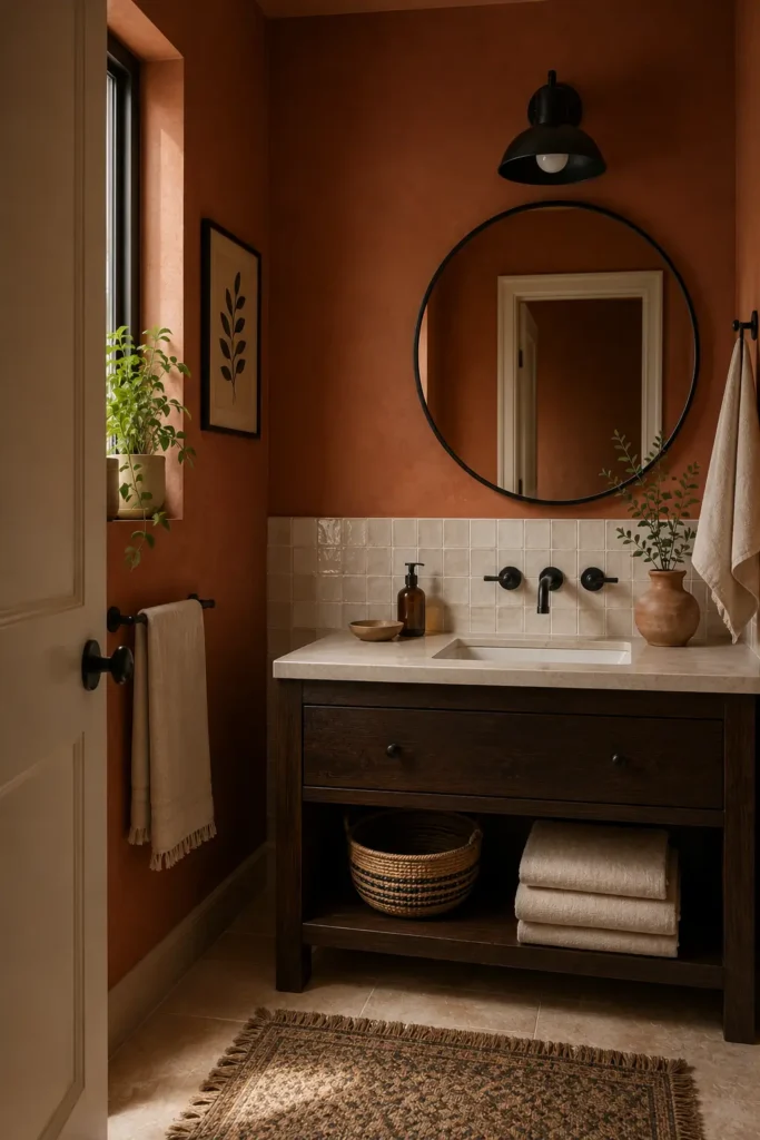
3. Terracotta and Ivory for Warm Mediterranean Charm
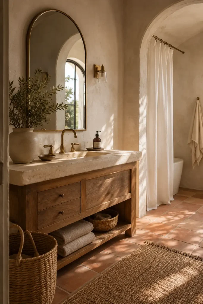
Terracotta is the most underrated bathroom color on the planet and I will die on that hill.
It brings warmth, character, and that inexplicable “I just got back from somewhere beautiful” feeling. Pair it with ivory plaster walls, a natural wood vanity, and woven basket storage.
This works brilliantly in bathrooms that get natural light. If yours is darker, use terracotta in small doses through floor tile, a painted accent wall, or your towels.
What makes it click:
- Instant warmth: Terracotta fixes cold bathrooms faster than any rug or lamp.
- Ivory keeps it breathable: Without a light counterpart, earthy tones can feel heavy.
- Texture is your friend: Zellige tile, woven baskets, and linen towels all look incredible in this palette.
Do not skip the matte black or brass hardware. Chrome feels slightly off against terracotta. Too cold.
4. Navy Blue and Bright White for a Crisp Classic Bathroom
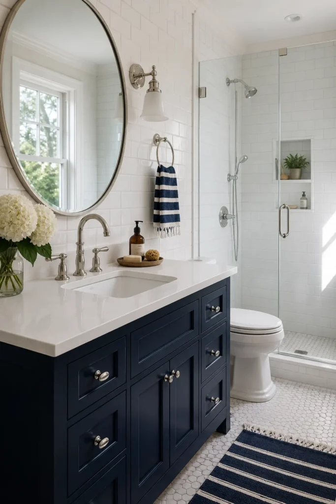
Navy and white never goes out of style. That is not an opinion. It is a fact backed by decades of beautiful bathrooms.
My friend painted his guest vanity navy on a Saturday afternoon. By Sunday morning, three people had asked what contractor he hired.
It was just paint.
The key is using white subway tile or a bright white wall to balance the weight of the navy. Without that contrast, navy reads flat and heavy.
Here is what you are really working with:
- Timeless and clean: This combo has worked for 100 years and will work for 100 more.
- Navy feels bold without being risky: It is a color with a proven track record.
- White creates the contrast: That is the reason the navy looks so deliberate.
Avoid scattering little navy accents everywhere. One strong navy feature is far more powerful than a dozen small dark accessories competing for attention.
5. Dusty Rose and Warm Beige for Soft Vintage Beauty
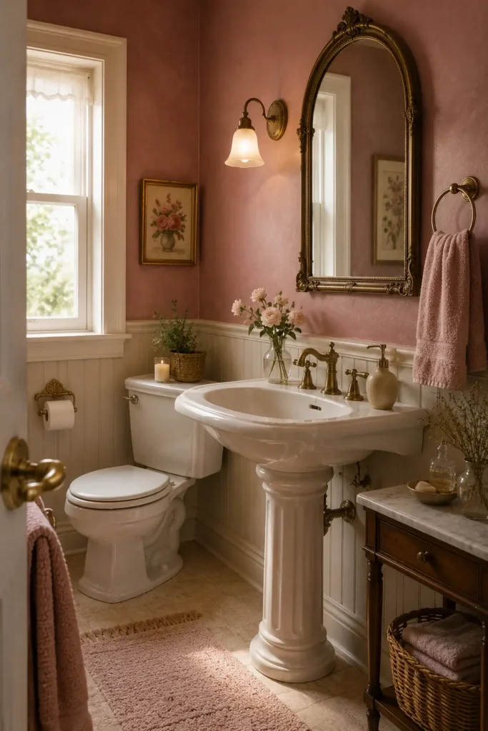
Dusty rose has a reputation problem. People hear “pink bathroom” and immediately picture 1987. But dusty rose paired with warm beige is a completely different situation.
This is soft, sophisticated, and genuinely beautiful. Especially in a powder room where you can lean into the romance of it. Think muted rose walls, antique brass fixtures, a pedestal sink, and a little vintage art print. Guests will comment every time.
The key players:
- Dusty, not candy: The muted quality is everything. Bright pink is not the assignment here.
- Beige over white: Stark white makes dusty rose look cheap. Warm beige makes it look editorial.
- Brass finishes the story: Antique brass hardware completes the vintage mood without looking costume-y.
Start with dusty rose towels and a beige bath mat before committing to paint. Low-stakes way to see if the palette suits your space.
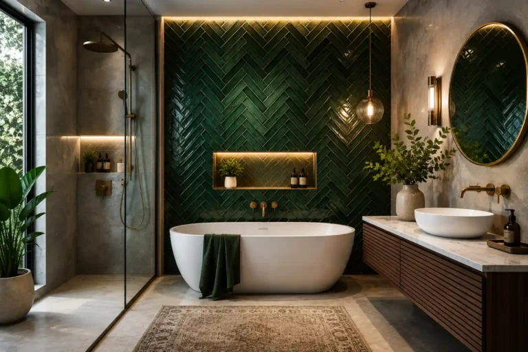
6. Forest Green and Brass for a Rich Designer Look
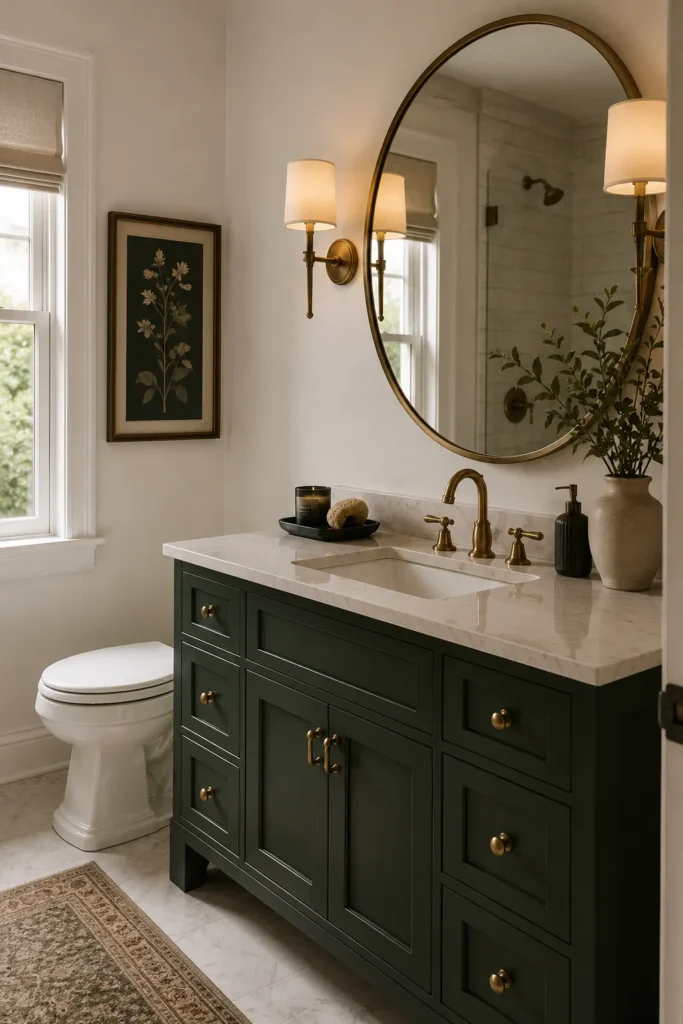
Forest green bathrooms look wildly expensive. They also require almost no budget to pull off if you are clever about it.
Paint is doing most of the work here. A deep forest green vanity with brass hardware and a cream marble counter looks like you hired an interior designer. You didn’t. You bought a quart of paint and some new drawer pulls.
Add a large mirror to prevent the space from feeling heavy. Warm lighting is not optional.
Why designers keep coming back to this one:
- Green and brass are made for each other: Design history has already approved this pairing.
- Cream and marble soften the depth: Without a light counterpart, forest green can feel overwhelming.
- One piece carries the whole room: Just the vanity in forest green is enough. No need to go wall to wall.
Forest green especially loves marble, walnut wood, and unlacquered brass. Hit two of those three and you are in excellent shape.
7. Sky Blue and Sandy Beige for an Airy Coastal Feel
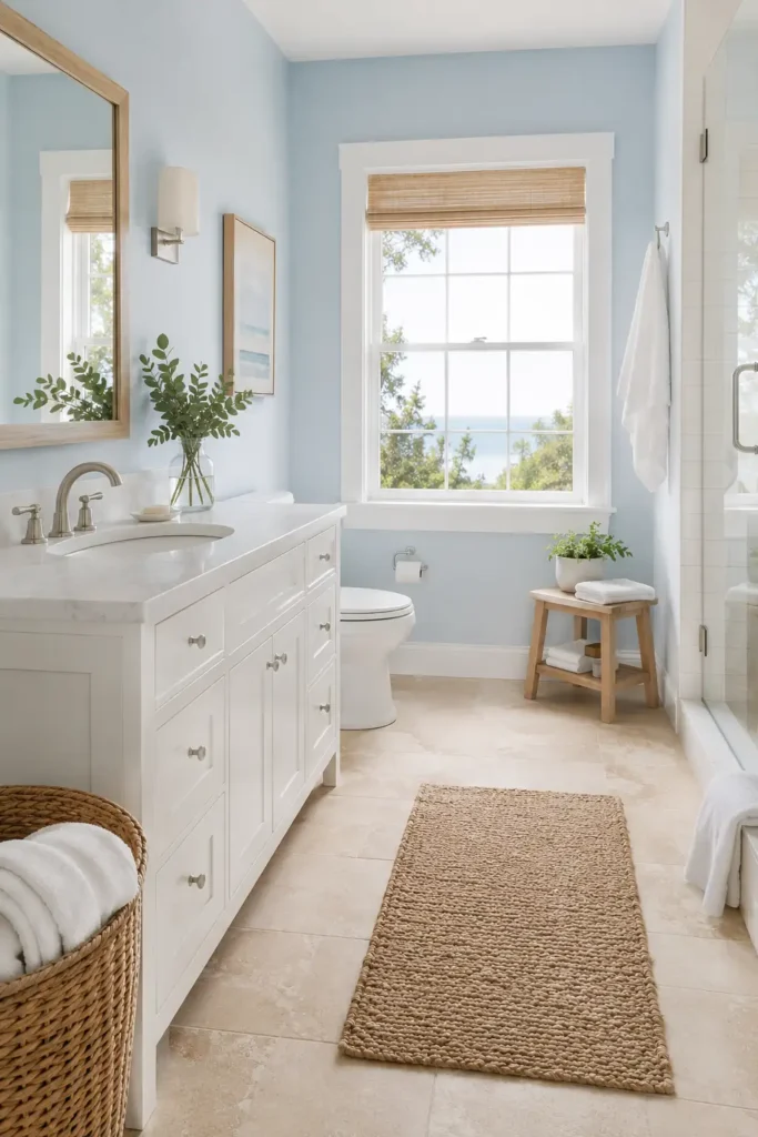
I am going to stop you right there. This is not the seashell bathroom.
No lighthouse prints. No “Life is Better at the Beach” signs. None of that. Sky blue and sandy beige done well is clean, effortless, and looks like a boutique hotel near the water.
Soft blue walls, beige stone floor tile, white towels, a rattan basket, and brushed nickel fixtures. That is all. The restraint is the point.
What pulls it together:
- Sky blue feels open: It borrows from the actual sky, which is the world’s most effective mood lifter.
- Sandy beige anchors it: Without a grounding neutral, blue can feel cold and clinical.
- White accessories complete it: They act as the sea foam without any kitsch.
This color scheme is one of the easiest to live with long-term. It does not demand attention. It just always looks nice.
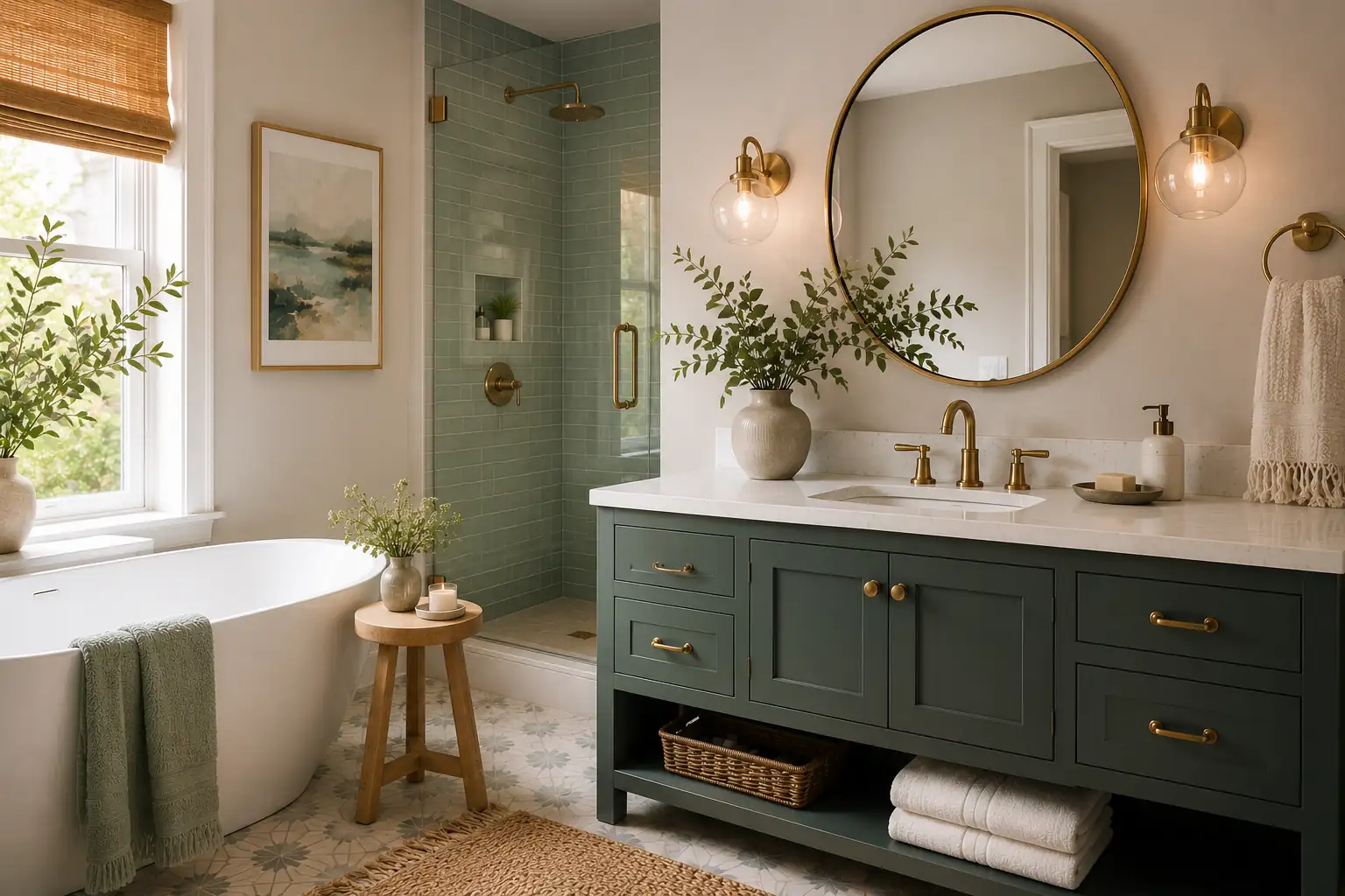
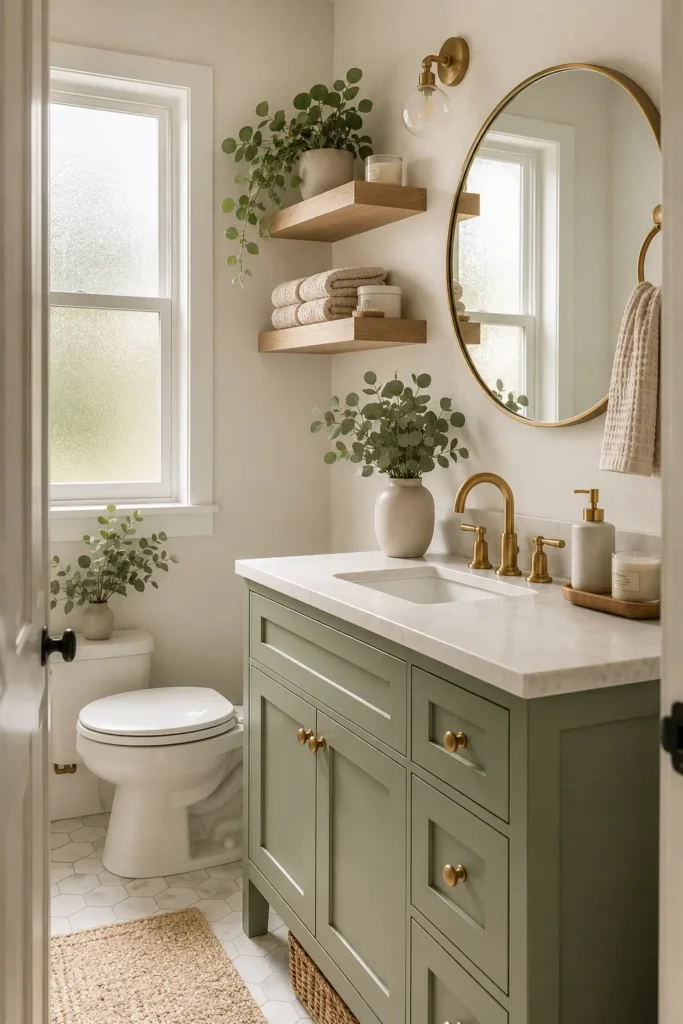
8. Olive Green and Cream for Earthy Modern Style
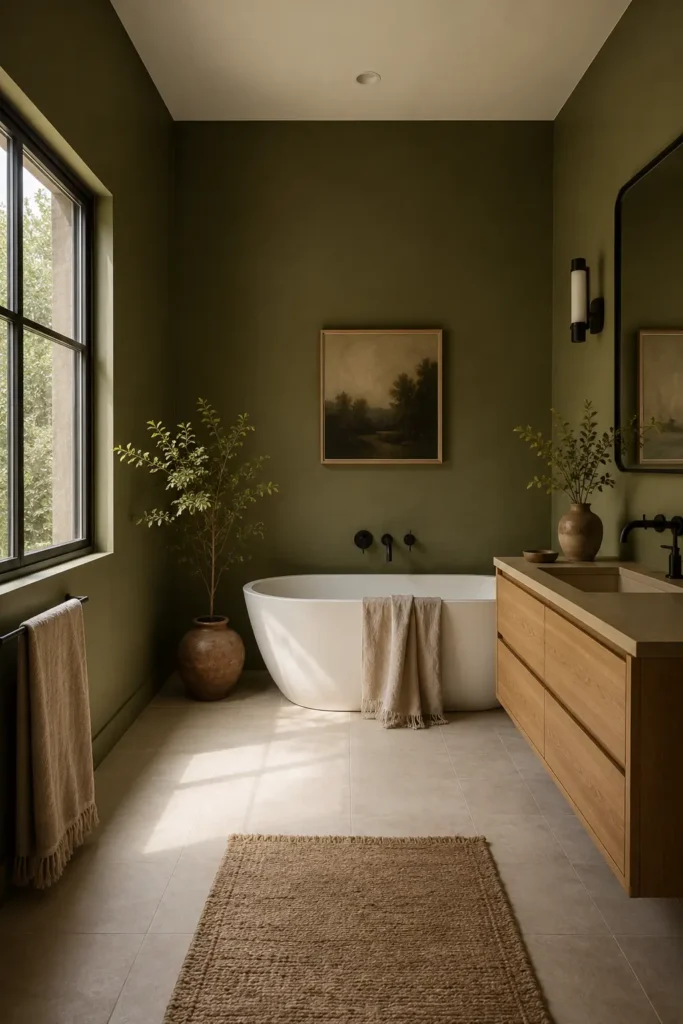
Olive green is sage’s more serious older sibling. Where sage feels soft and airy, olive feels grounded and deliberate.
This is great for anyone who wants an earthy palette but also wants it to look unmistakably modern. Pair it with cream tile, matte black fixtures, a floating oak vanity, and linen towels.
It will photograph beautifully and it is even better in person.
The secret ingredient:
- Olive adds depth: It has more visual weight than sage, which reads as richer and more sophisticated.
- Cream keeps it soft: Without cream, olive can tip into murky territory.
- Natural materials are essential: Wood, linen, clay all belong in this palette.
This scheme genuinely thrives in bathrooms with natural light. The warmer the light source, the more alive the olive looks.
9. Black, White, and Walnut for Modern Contrast
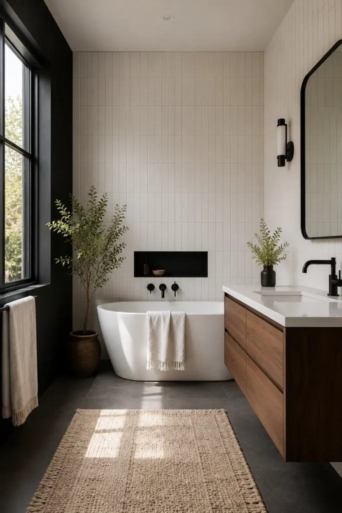
Black and white bathrooms have one weakness. They can feel cold. Almost clinical. Like a photo lab.
Adding walnut wood fixes that instantly. A walnut floating vanity between black fixtures and white tile takes the room from sharp and hard to warm and livable.
Keep the styling simple. The materials are the point here.
What holds it together:
- Walnut is the temperature control: It warms what would otherwise be an ice bath of a bathroom.
- The contrast stays sharp: Black and white still do their dramatic thing. Walnut just makes it friendlier.
- Minimalism is built in: This palette only works when it is not overcrowded.
Add one soft element like a textured bath mat or waffle towel so the room does not feel like a showroom floor.
10. Lavender Gray and White for a Soft Relaxing Bathroom
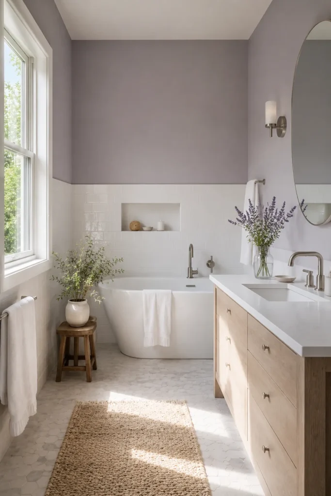
Lavender gray is one of those colors almost nobody chooses, which is exactly why it looks so interesting when you do.
It sits between blue and purple without committing to either. It is calming in a way that plain gray just is not, because there is a warmth hiding in there.
Pair it with white tile, silver fixtures, and pale wood accents and the bathroom feels like a place you actually want to spend time.
Here is the honest truth about this palette:
- Unexpected without being bold: It reads as different but not risky.
- Silver fixtures suit it better than brass: The cool undertones in lavender gray prefer cool metals.
- Works in small spaces: It adds color without adding visual weight.
Choose a soft lavender gray, not a bright lilac. The further you stay from purple, the more timeless it looks.
11. Emerald Green and White Marble for Bold Luxury
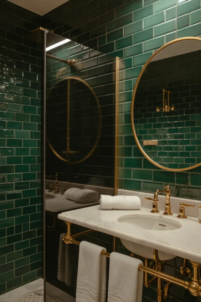
I have seen a lot of bathroom color combinations. Emerald with white marble is still one of the most striking things you can do with a small space.
This is not a subtle color scheme. It is a full commitment. Emerald green tile with white marble and brass fixtures looks genuinely luxurious. The kind of thing you see in a five-star hotel and immediately photograph.
The trick is keeping everything else simple so the emerald can do what it does best.
What to know before you commit:
- Emerald is a power color: It reads as expensive without trying to convince you.
- Marble gives it a classic anchor: Without the marble, emerald can feel trendy. With it, timeless.
- Brass is non-negotiable: Chrome next to emerald feels cold. Brass feels intentional.
Keep your towels white and your accessories minimal. One bold material is a statement. Three bold materials is a situation.
12. Taupe and Soft White for Quiet Luxury
Taupe is the color of a person who has figured it out. I say that with full admiration.
It is not exciting on its own, but in a bathroom it is deeply satisfying. Paired with soft white walls, a stone counter, natural wood accents, and brushed nickel hardware, it looks like a luxury hotel bathroom that someone actually lives in and loves.
The other great thing about taupe? It works beautifully in rented apartments. Bring it in through towels, a bath rug, and a linen shower curtain without touching the paint.
The real reason this palette keeps winning:
- Taupe has warmth that gray does not: It never feels cold or sterile.
- It ages beautifully: Taupe is not a trend. It has been right for decades.
- Stone and wood complete it: Natural materials belong in a taupe bathroom the way salt belongs in good pasta.
Go for brushed nickel or unlacquered brass here. Matte black can work but it is a harder contrast against taupe’s natural softness.
13. Mustard Yellow and White for a Cheerful Retro Pop
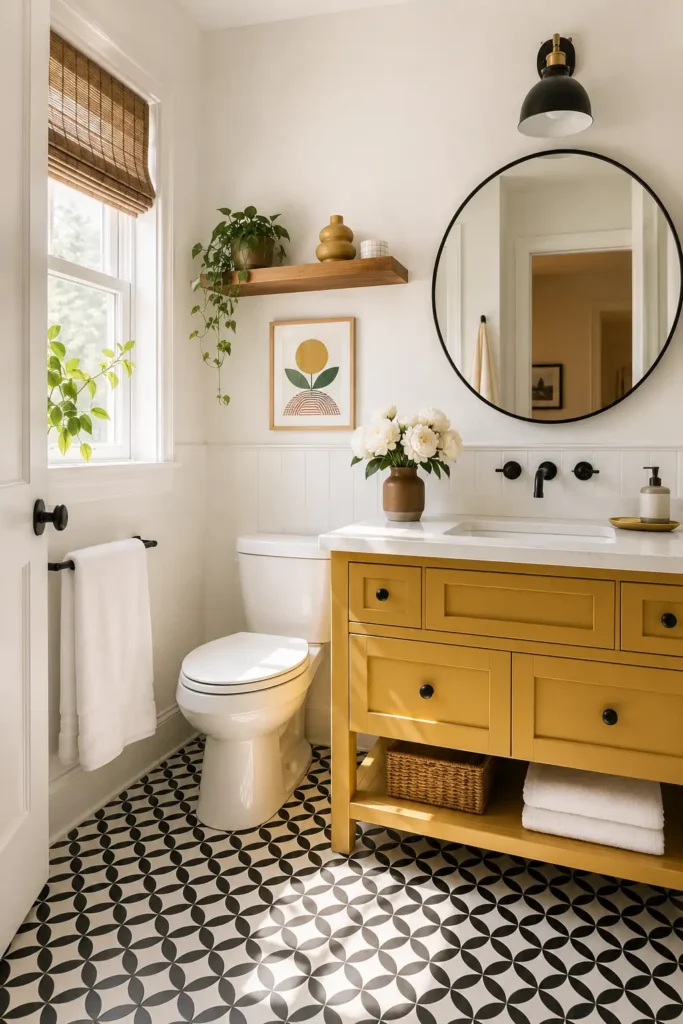
Mustard yellow in a bathroom sounds like a terrible idea. Until it is not.
Used the right way, it is cheerful, bold, and full of personality. The key phrase is “the right way,” which means as an accent, not everywhere. A mustard vanity. A patterned floor tile. A fun shower curtain. Not all three at once.
I did a mustard yellow vanity in a powder room once and it became the most photographed room in the house. Nobody could believe it worked. It absolutely worked.
Here is what makes it land:
- It energizes small spaces: Mustard brings brightness without the clinical edge of straight yellow.
- White contains it: Without a clean white base, mustard gets overwhelming fast.
- Black accents sharpen it: A black framed mirror against mustard and white looks incredibly modern.
Use warm whites, not cool whites. Cool whites make mustard look sickly. Warm whites make it look like a design choice.
14. Warm Terracotta and Matte Black for a Bold Earthy Statement
Most people play it safe with earthy tones. Terracotta with matte black is for the ones who want earthy but with an edge.
The combination feels grounded and modern at the same time. Terracotta brings the warmth and character. Matte black brings the sharpness. Together they create a bathroom that feels intentional and genuinely different from anything your guests have seen before.
This works especially well in powder rooms and smaller bathrooms where you want maximum impact with minimum square footage.
What gives this combo its personality:
- Terracotta is the warmth: It stops the matte black from making the room feel cold or industrial.
- Matte black is the structure: It gives the earthy palette a modern edge it would not have on its own.
- Texture makes it richer: Zellige tile, a linen hand towel, or a woven basket take this palette from good to really good.
Keep the accessories simple and the surfaces interesting. Let the materials do most of the talking here.
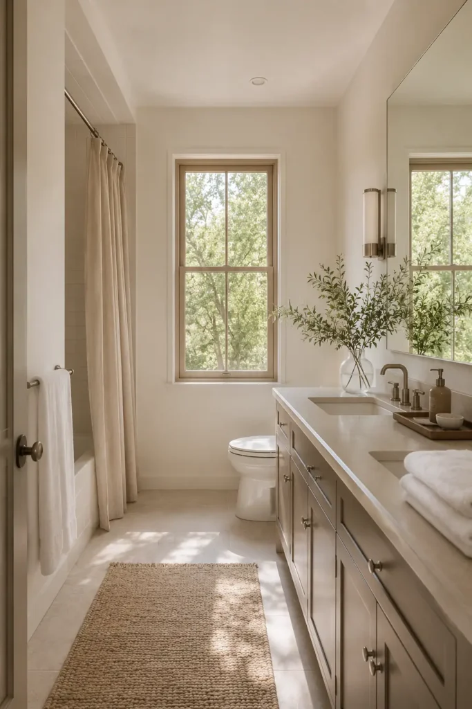
15. Soft Gray, White, and Pale Oak for a Clean Scandinavian Look
Plain gray is a snooze. Soft gray with pale oak is something else entirely.
The wood is what saves this palette. Without it, gray and white is basically a hospital hallway. With it, the whole room softens into something calm, clean, and genuinely peaceful.
A matte black mirror and a simple plant are all the accessories you need. Do not overthink it.
What ties it all together:
- Pale oak adds soul: Wood humanizes what would otherwise feel like a tile showroom.
- Soft gray gives depth without weight: It is more interesting than white but still lets the wood shine.
- Matte black accents keep it from going too soft: They are the structure holding the whole composition together.
This palette is forgiving. It works in small and large bathrooms, with most existing tile colors, and in both high and low light conditions.
16. Coral and Aqua for a Fun Vacation-Inspired Bathroom
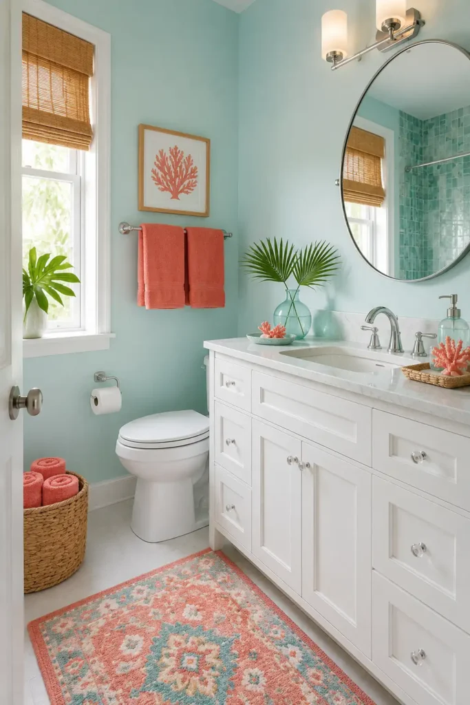
Some bathrooms are not trying to be a spa. Some bathrooms just want to have a good time. This is the palette for those bathrooms.
Coral and aqua together feel like a beach vacation in color form. Energetic, cheerful, and impossible to be in a bad mood around. It is excellent for kids’ bathrooms, guest bathrooms, or anyone who is tired of neutrals.
The trick is choosing slightly muted, slightly dusty versions. Avoid neon. Neon is a different trip entirely.
The safe way to pull this off:
- Aqua on the walls, coral in the accents: This lets the aqua breathe and gives coral a supporting role.
- White is the referee: It keeps the two colors from fighting each other.
- Muted tones over bright: Dusty coral and vintage aqua look intentional. Candy-bright versions look accidental.
Do not make every single item coral or aqua. Leave room for the colors to breathe and they will carry the whole room.
17. Chocolate Brown and Cream for a Cozy High-End Bathroom
Brown is back. Not the brown of 2003, not that muddy mauve beige that haunted suburban homes for a decade. Real, rich, deep chocolate brown.
Paired with cream, stone, and warm lighting, brown feels like a private library in bathroom form. Cozy, personal, and deeply satisfying.
Add bronze or brass fixtures and the whole thing tips into genuinely luxurious territory.
What does the most work in this palette:
- Chocolate brown creates depth: It does in bathrooms what navy does in living rooms, adding weight and intention.
- Cream stops it from going too heavy: The balance between these two is everything.
- Bronze and brass are the perfect accent: They warm the brown and give the cream something to reflect.
Avoid cool or gray-toned accessories in this palette. Warm whites, warm metals, and warm wood only.
18. Mint Green and White for a Fresh Vintage Feel
Mint green is having a quiet moment and it deserves far more attention than it is getting.
It is cheerful without being overwhelming. Vintage without being costume-y. It has a clean, fresh quality that works beautifully in bathrooms, especially small ones where you want personality without a full commitment.
Pair it with white subway tile, chrome fixtures, and a black and white checkerboard floor and you have something really special.
Here is what makes this palette different:
- Mint is lighter than sage: It reflects more light, which makes small bathrooms feel larger.
- Chrome suits it better than brass: The cool, crisp tones in mint prefer cool metals.
- The vintage floor seals the deal: Checkerboard floors are having a major moment and mint is the perfect partner.
Keep the mint soft, not neon. The softer the mint, the fresher and more timeless it reads.
19. Greige and Matte Black for a Modern Neutral Bathroom
Greige is the answer to “I want neutral but I do not want boring.”
It is the perfect blend of gray and beige. Cool enough to feel modern, warm enough to feel livable. Paired with matte black fixtures, it has a sharp, polished quality that reads as distinctly current.
Add warm wood shelving and a white vanity top and the room feels balanced rather than stark.
The reason this combo works :
- Greige sits in everyone’s comfort zone: It is approachable and easy to style around.
- Matte black gives it an edge: Without contrast, greige can fall flat. Matte black is the wake-up call.
- Wood shelving adds warmth: It prevents the matte black from making the room feel too industrial.
This is a great palette for people who want a designer-looking bathroom without going anywhere near a dramatic color. The contrast does the work for you.
20. Blush, Charcoal, and Brass for a Chic Boutique Look
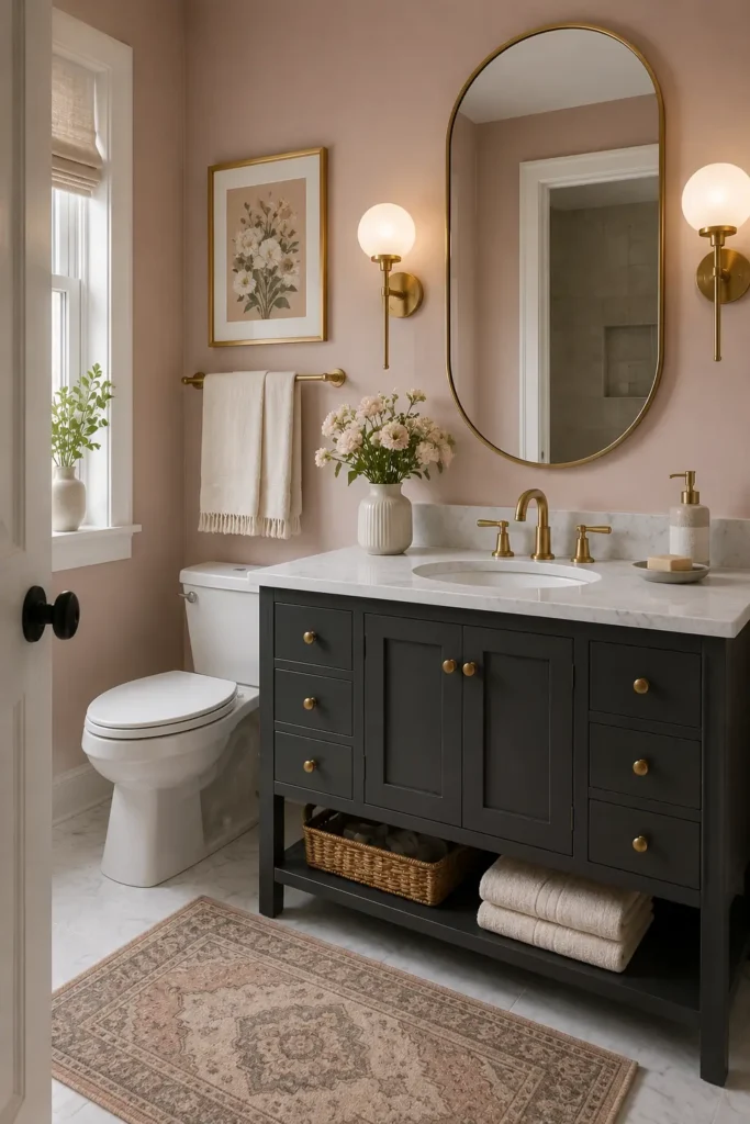
This is the combination I recommend to anyone who tells me their bathroom has no personality.
Blush and charcoal sound like they should not go together. Then you see them with brass hardware and you understand everything. Blush softens, charcoal grounds, brass warms. The three of them together feel like a boutique hotel bathroom in Paris.
Use blush on the walls, charcoal on the vanity, and let the brass hardware do the talking.
Why this trio works so well:
- Blush prevents charcoal from going too dark: It keeps the room romantic rather than just moody.
- Charcoal gives blush authority: On its own, blush can feel insubstantial. Charcoal fixes that.
- Brass is the connective tissue: It pulls the warm and cool tones into one cohesive palette.
Keep the blush muted and dusty. The moment it tips toward candy pink, the sophistication evaporates. Dusty blush is the only way to go.
Final Thoughts
You do not need a renovation to have a bathroom you love.
The right Bathroom Color Schemes can do more work than any new fixture or expensive tile. Color sets the tone, pulls everything together, and makes even the smallest bathroom feel like a deliberate, designed space.
Start with one change. A painted vanity. New towels. A shower curtain that actually matches the mood you want to create. Small updates compound.
Pick the palette that makes you stop scrolling and think “that feels like me.” Then build from there, one pretty little detail at a time.
Would you like help figuring out the right color scheme based on your specific tile and lighting situation? Drop your details in the comments.