Make Your Small Bathroom Feel Bigger Using These 21 Ideas
The first small bathroom I decorated had a door that nearly bumped the sink and one shelf packed with every bottle I owned. I kept adding cute pieces, then wondered why the room felt even tighter. Lesson learned.
A small bathroom does not need to be empty or plain to feel more open. The right mirror, lighter sightlines, vertical storage, clear glass, and a few careful color choices can change how your eye reads the room.
These small bathroom ideas include bright, quiet spaces as well as bold rooms filled with wallpaper, tile, and color. The goal is not to hide the size. It is to use every wall, corner, and bit of daylight wisely while still creating a bathroom that feels like you.
1. Lift Storage Off the Floor
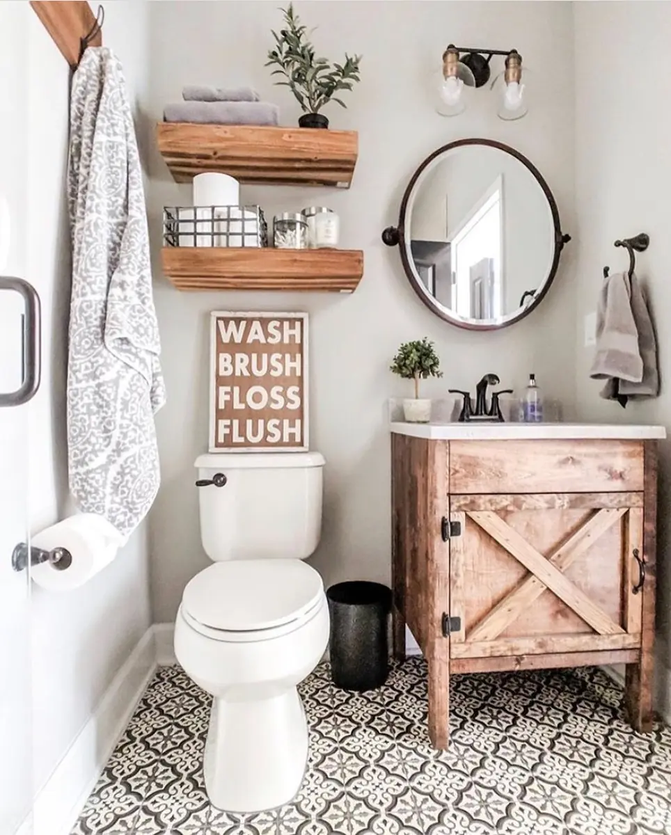
Floor space is precious here, so the walls do the heavy lifting. Two chunky wooden shelves turn the area above the toilet into useful storage, leaving the room below easier to move through.
Keeping towels on top and everyday supplies underneath gives everything a clear order. I like how the open shelves feel lighter than another cabinet, while the round mirror softens the boxy vanity and reflects more light. The patterned floor brings character without crowding the narrow walls.
2. Balance Pattern With Paneling
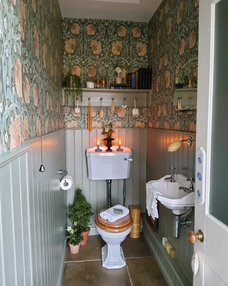
Bold wallpaper in a tiny room? I am for it, but the break matters. Here, the floral print stays above the chair rail while soft gray-green paneling covers the lower walls. That clear split stops the pattern from swallowing the room.
The tall repeat pulls your gaze upward, and the pale ceiling gives the eye a quiet place to rest. White fixtures create another light break. Keep the same lower-wall color around the room so the narrow layout reads as one steady, connected space.
3. Double Daylight With a Mirror
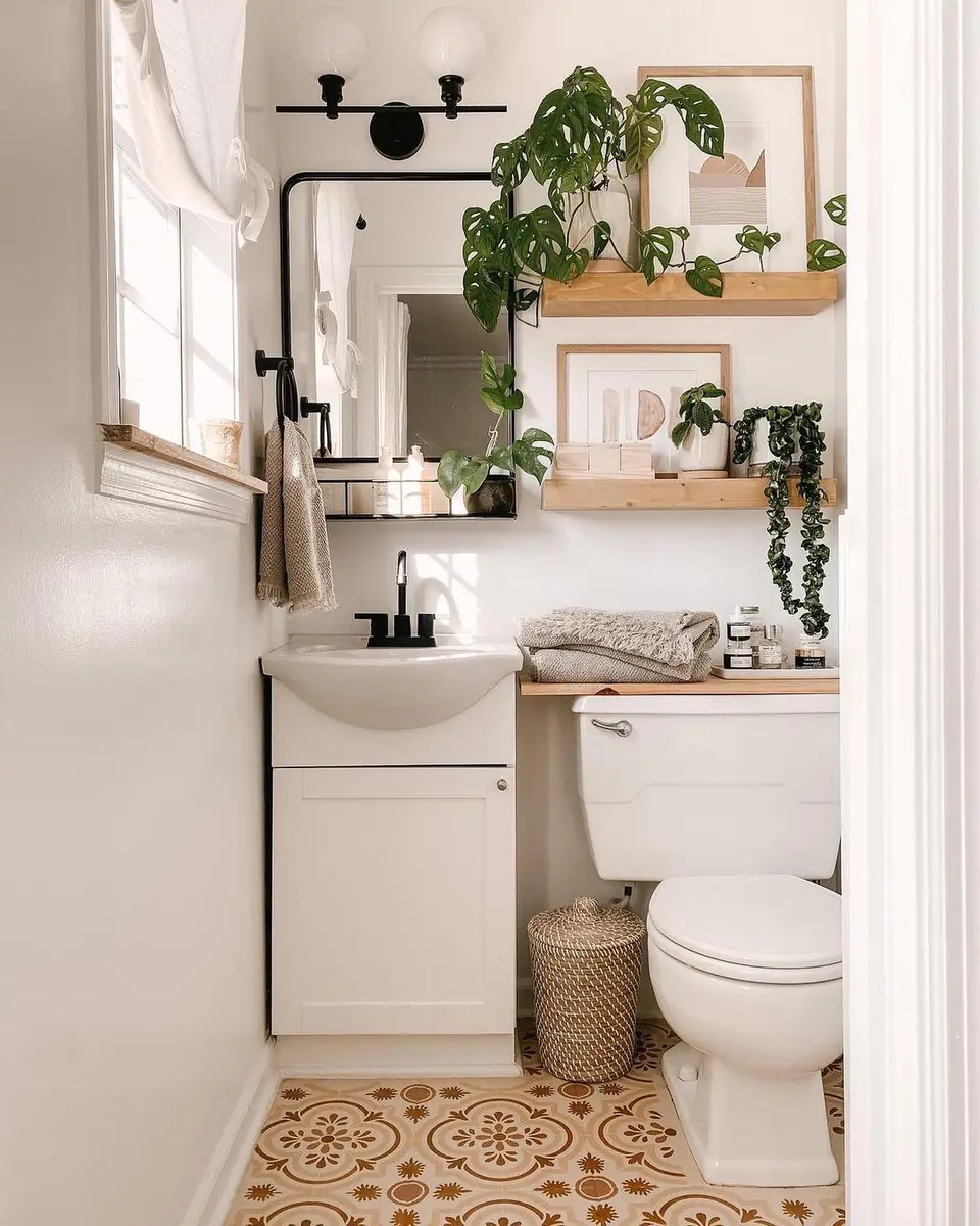
The window is doing most of the work here, but the large black-framed mirror helps that daylight travel farther. Its tall shape reflects more of the room than a small decorative mirror would.
The best detail is restraint. White walls, a white vanity, and pale wood shelves keep the background quiet, so the greenery and patterned floor can stand out without closing in the space. Keep taller plants near the top and the sink area mostly clear. Your eye will move up instead of stopping at counter level.
4. Skip the Heavy Shower Frame
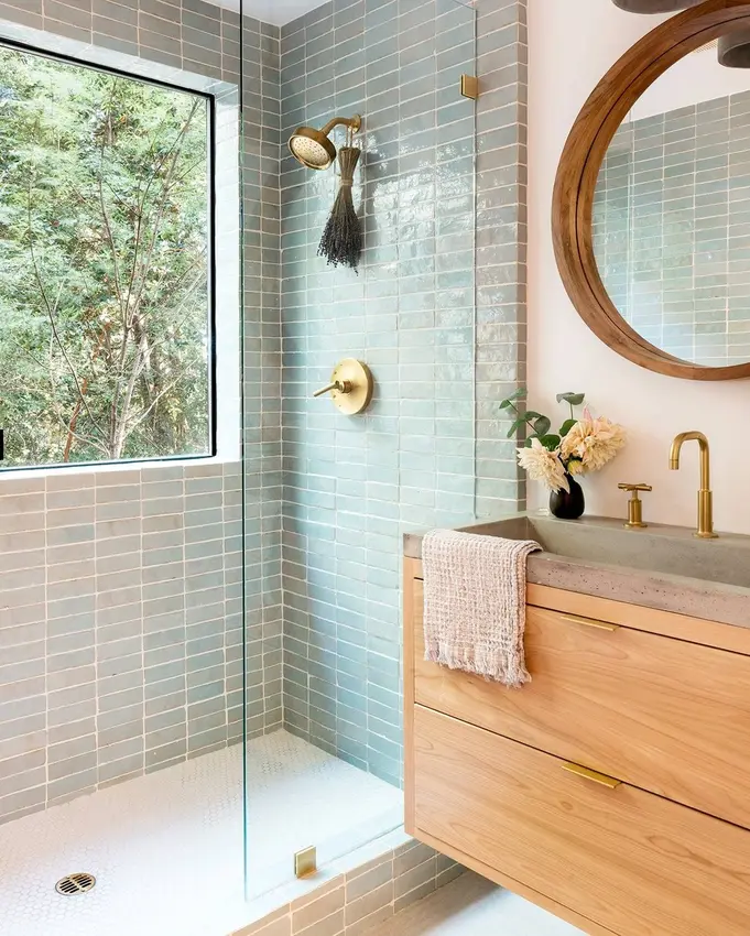
A framed shower enclosure would chop this bathroom into smaller sections. The nearly invisible glass panel does the opposite, letting the blue tile, window, and shower floor remain part of one open view.
There is another smart move underneath the sink. Because the wood vanity floats above the floor, your eye can follow the flooring farther into the room. I would keep the glass as clear as possible and limit products inside the shower. Clear sightlines only work when the view beyond them stays calm.
5. Hang the Curtain Higher
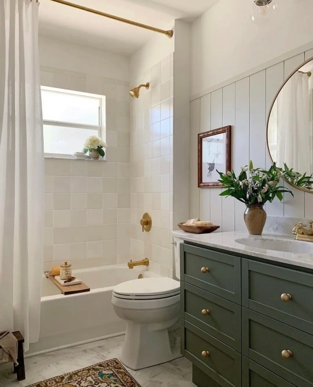
Notice where the shower curtain begins: almost at the ceiling, not just above the tub. That extra height makes the wall look taller and gives the whole room a longer vertical line.
Choose a simple white curtain like this one and let it blend with the tub surround. Heavy prints would cut across the pale backdrop. When the shower is not in use, pull the fabric fully to one side so the window and tiled wall stay visible. It is a tiny habit with a surprisingly roomy payoff.
6. Carry One Finish Through
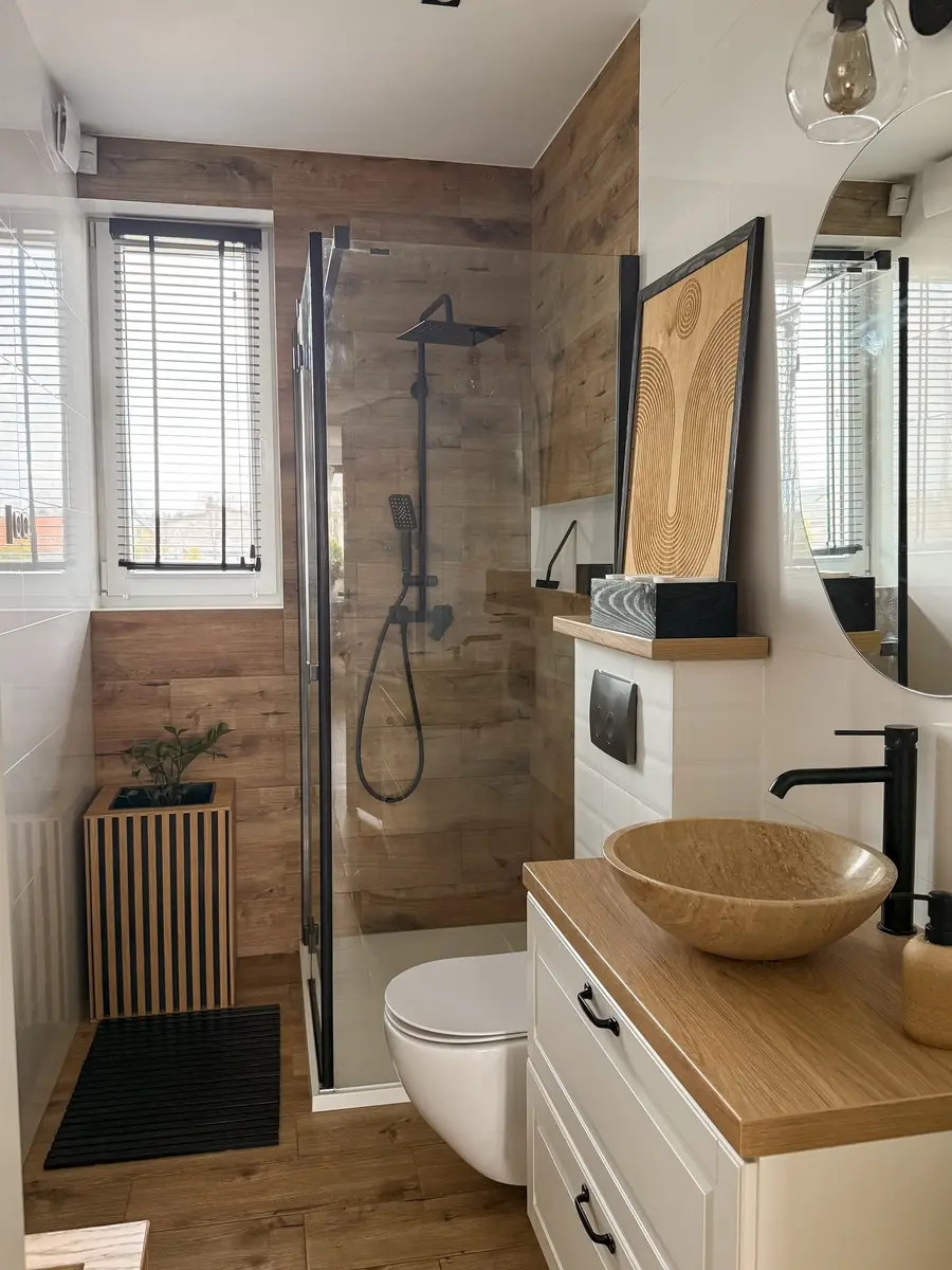
Too many finishes can make a narrow bathroom feel patched together. Here, the warm wood-look surface runs along the floor and climbs the shower walls, so the eye follows one steady path from the doorway to the far window.
Black fixtures give that warmth a clean outline, while white walls and cabinetry stop the wood tone from feeling heavy. Copy the idea with one repeated finish, not five matching accessories. I would use it on two or three connected surfaces, then give the rest of the room some breathing space.
7. Choose a Slim Pedestal Sink
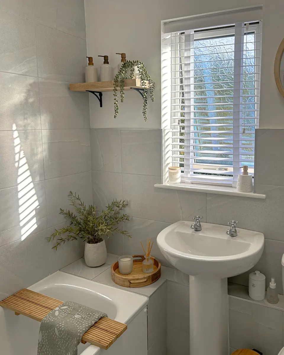
The sink does not try to be storage. Its narrow pedestal leaves more of the wall and floor visible, which helps this tight corner feel less blocked. That matters when the tub begins only a step away.
Of course, giving up a vanity means finding another home for daily supplies. The slim wall shelf and built-in ledges handle that job without adding a bulky cabinet. Keep only a few bottles near the basin, and group bath items on one tray. Small surfaces look larger when their edges stay visible.
8. Turn Floor Tiles Diagonally
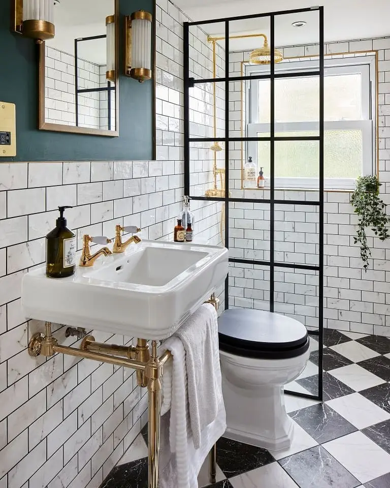
The floor refuses to sit quietly, and that is exactly why it works. Setting the black-and-white squares on a diagonal sends your eye toward the corners rather than straight to the narrow walls. The room gains movement instead of feeling boxed in.
Because the floor is bold, the rest stays disciplined: white wall tile, a slim console sink, and one deep teal section above. I would repeat black only in a few sharp lines, as shown in the shower screen and toilet seat. Too many extra patterns would spoil the trick.
9. Use Vertical Tiles to Stretch Walls
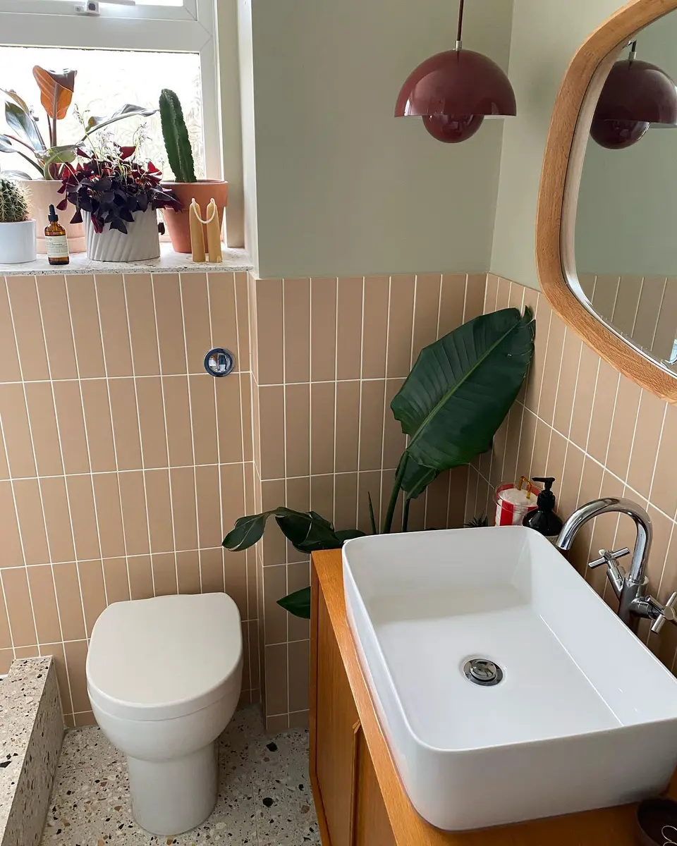
Vertical tile is doing more than adding color here.
Why it works:
- Upright grout lines make the walls look taller.
- Repeating the tile creates one steady visual band.
- Soft peach and sage keep the contrast gentle.
The large basin already carries plenty of visual weight, so I would leave the counter almost bare. One soap bottle is enough. The plants work best near the bright window, where they read as one green group instead of scattered clutter.
10. Keep the Far Window Clear
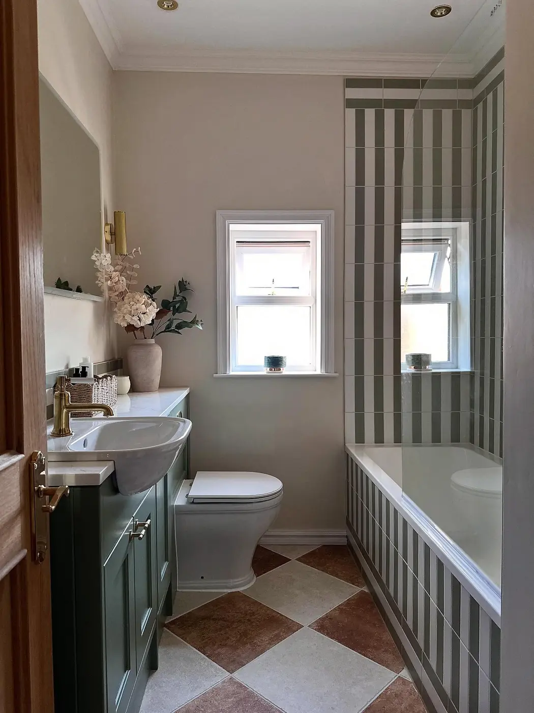
Start with the view from the doorway.
- Leave the window free from a heavy curtain.
- Keep tall decor away from its center.
- Let the pale wall become a bright frame.
That small window acts as the endpoint of the room, pulling your gaze past the sink and toilet instead of toward the narrow side walls. The striped shower and deep green vanity add interest along the route without blocking it. In a long bathroom, a clear destination can create a stronger sense of depth.
11. Build Storage Into the Walls
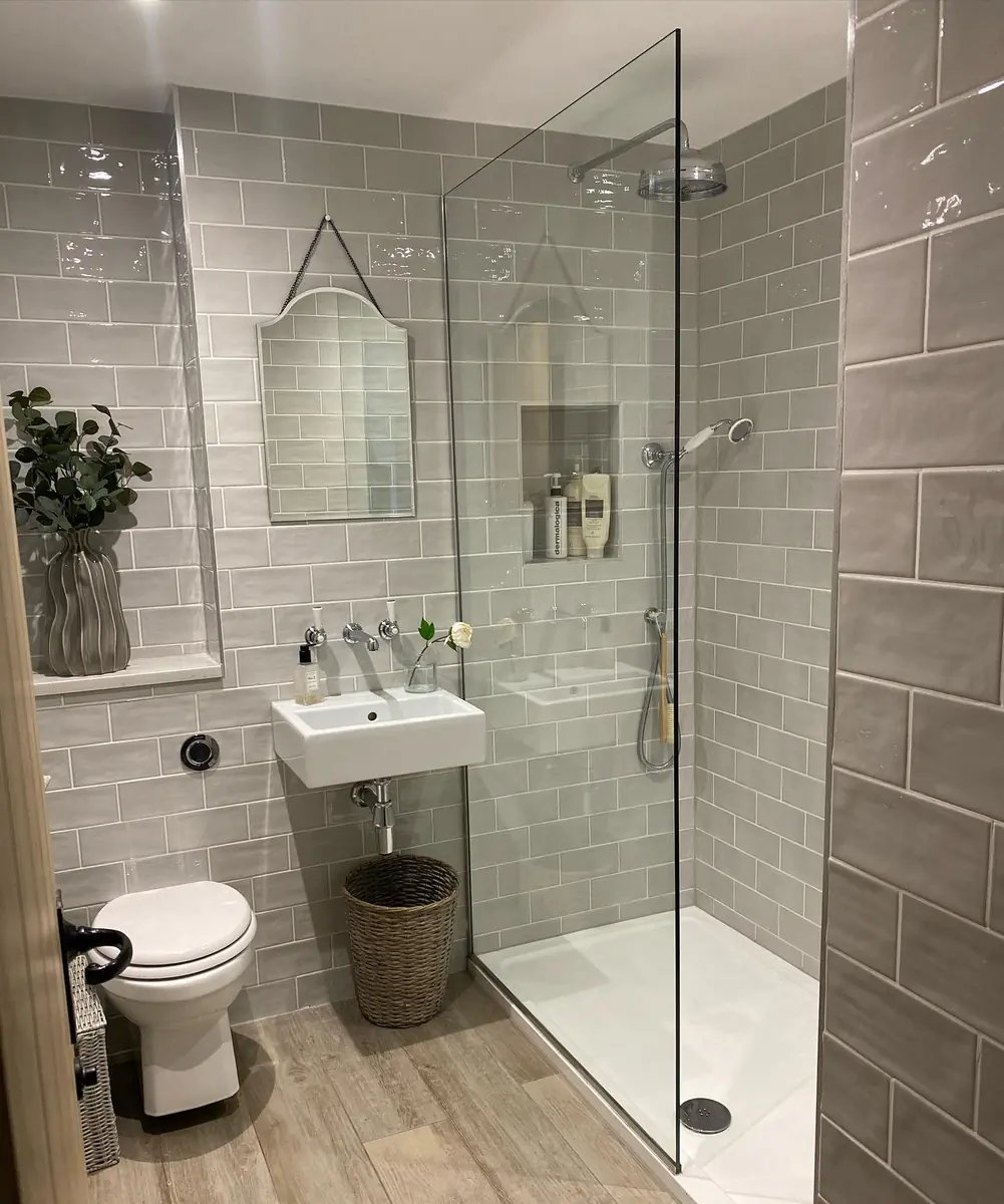
The problem: Cabinets and shower caddies would crowd this narrow layout.
The fix: Recessed niches hold products and decor inside the wall line. One sits beside the basin, while another keeps shower bottles away from the floor.
The payoff: Nothing projects into the walking path, and the tiled walls remain easy for the eye to follow. I would keep each niche lightly filled. Built-in storage loses its roomy advantage the minute it starts looking like an overstocked shop shelf.
12. Make One Artwork the Anchor
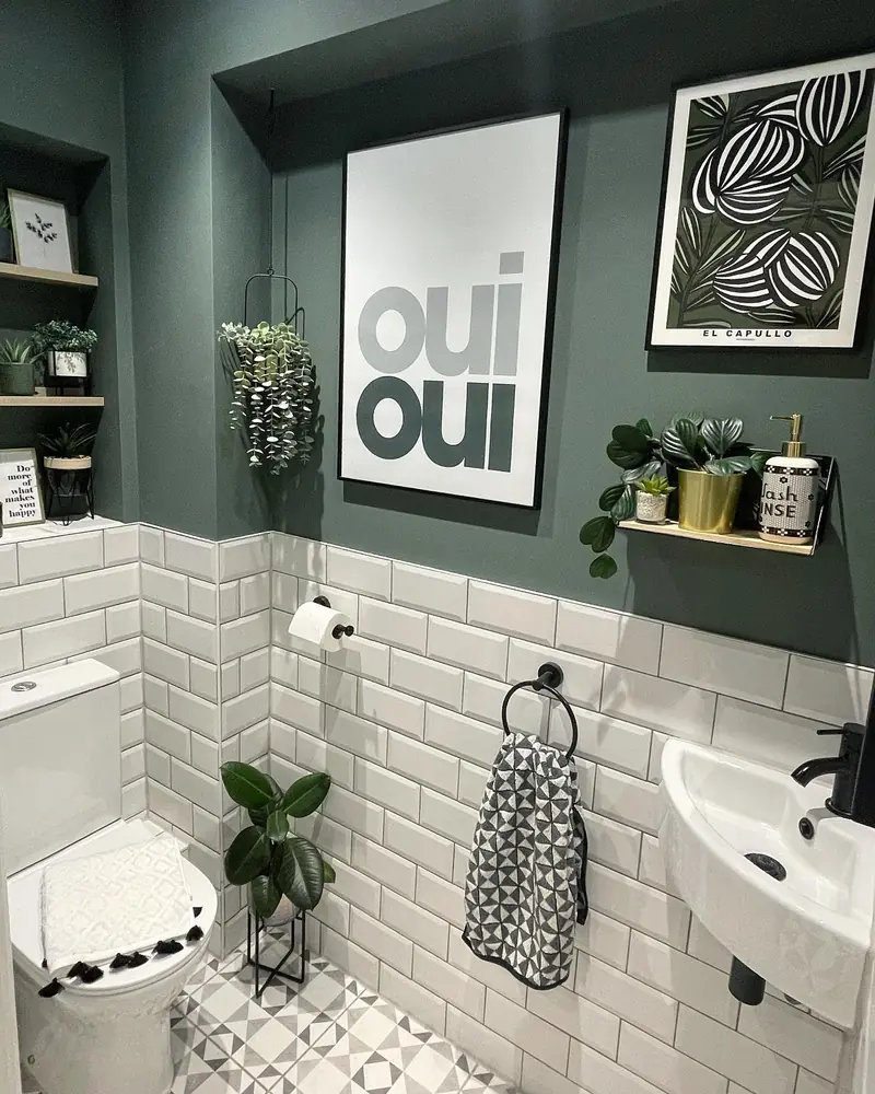
Small room, big artwork. Good call.
The oversized print gives the eye one clear landing spot, so the wall feels planned rather than filled with random little pieces. Its white background also echoes the subway tile below, keeping the dark green paint from closing in.
I would copy the scale, not every accessory. Choose one large frame, add one smaller companion, and leave some wall visible around both. The plants already bring plenty of detail. More tiny signs and shelves could tip this from lively to cramped.
13. Swap Bulky Storage for a Ledge
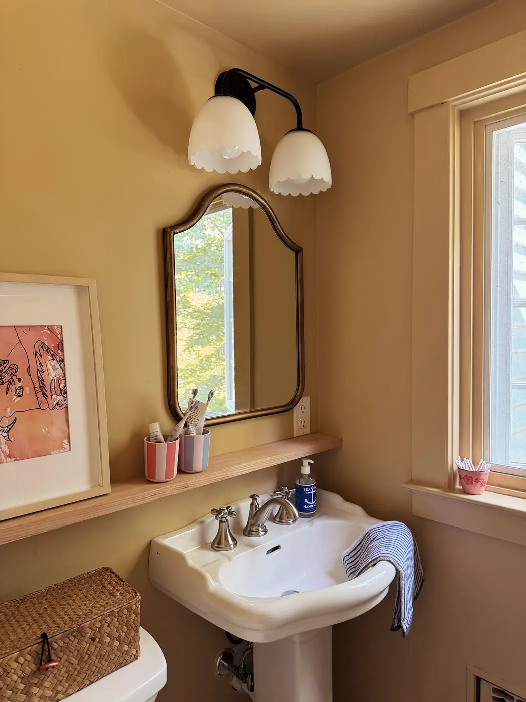
A small-space confession: I once squeezed a deep cabinet into a tiny bathroom. It held plenty, but I spent months bumping into it.
Why this is better: The narrow wooden ledge carries toothbrush cups and framed art without crowding the sink. Running it beneath the mirror also gives the wall one long horizontal line, making it appear wider.
My limit: Keep only shallow, lightweight pieces here. Spare bottles belong in the woven basket, not lined up like a tiny shop shelf.
14. Keep the Ceiling Bright and Bare
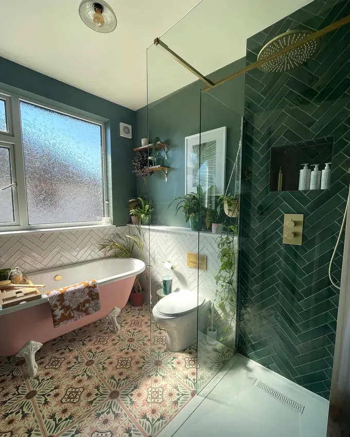
Can dark walls still feel open? Yes. The bright white ceiling creates a clear lift above the deep green walls, while the tall frosted window spreads daylight across the room.
What keeps it balanced? White tile wraps the lower walls, and the clear shower screen avoids adding another solid barrier. The pink tub and patterned floor already bring plenty of personality, so I would leave the ceiling free from extra color or busy trim. One calm surface gives everything else space to breathe.
15. Let Horizontal Tile Widen Walls
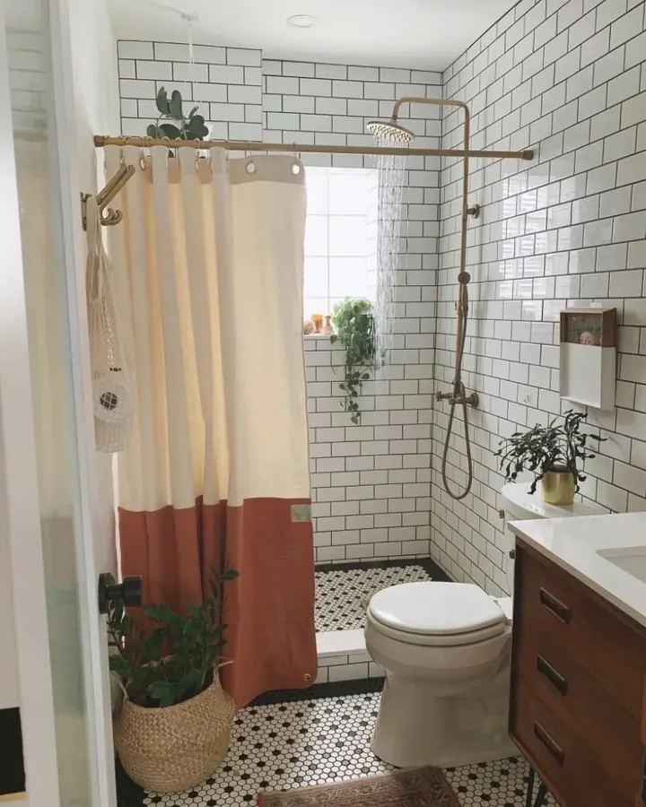
Direction matters more than tile size here.
- The long edges run from side to side.
- Dark grout makes every horizontal line easy to see.
- The layout continues behind the toilet and into the shower.
Together, those lines guide your eye across the narrow bathroom, making the walls appear broader. White tile keeps the repeated pattern from feeling heavy, while the warm vanity and rust-colored curtain prevent the room from looking cold. I would keep wall decor sparse so the widening lines remain easy to follow.
16. Hide the Toilet Tank Away
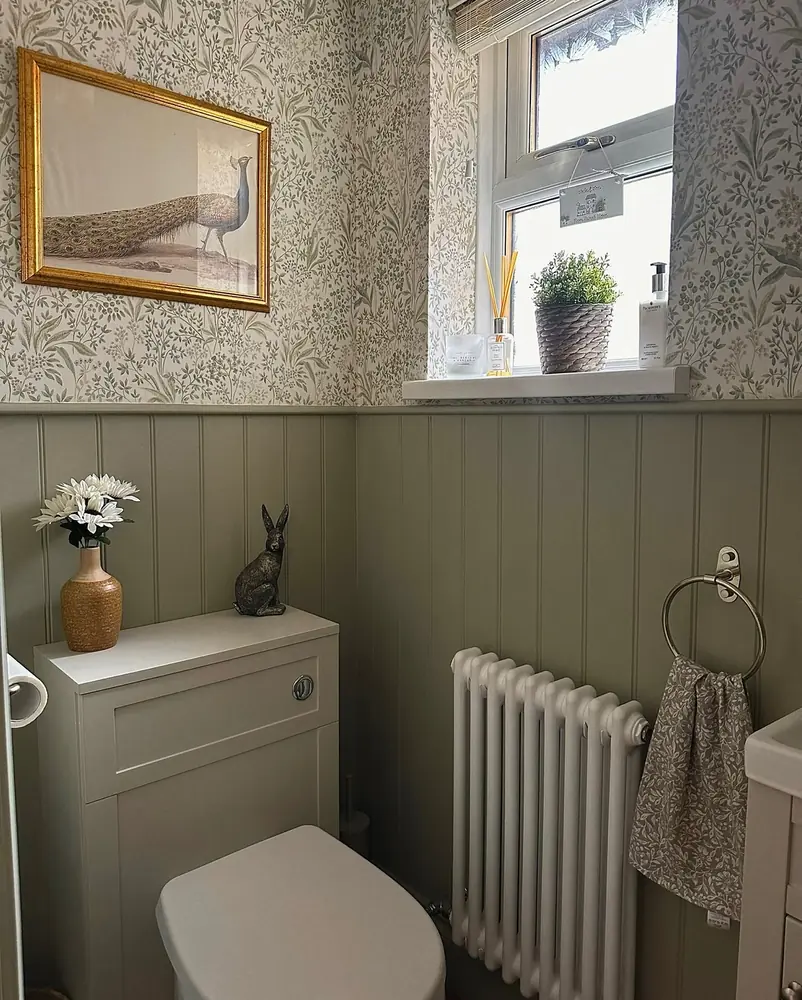
Look again: the toilet tank is missing from view.
What you gain: A slim paneled box hides the plumbing, smooths the sightline, and creates a flat top for a vase. Because its color matches the lower walls, it reads as part of the room instead of another bulky fixture.
One caution: Keep the flush parts easy to reach. Pretty paneling becomes much less charming when a small repair means pulling everything apart. Include a removable front or access panel from the start.
17. Stick to Two Main Colors
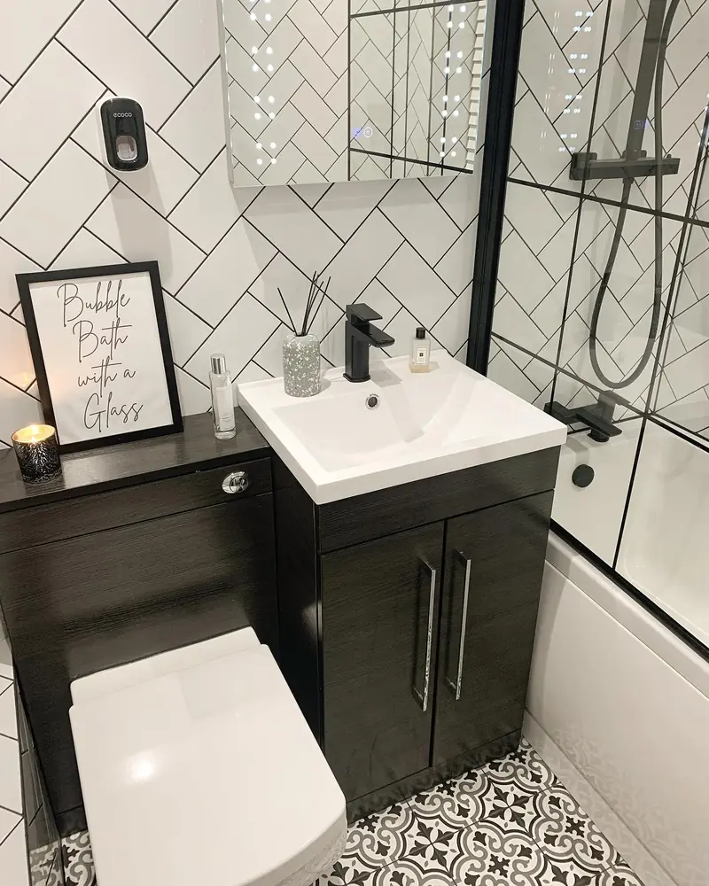
This room should feel busy. It does not. The reason is a strict black-and-white palette that ties together the herringbone walls, patterned floor, dark vanity, and grid shower screen. Even the grout repeats the black lines instead of adding another tone. I would keep towels, bottles, and artwork in that same family, then allow one soft gray accent for relief. Fewer colors give the eye less sorting to do, helping a tight layout feel calmer, sharper, and more connected.
18. Paint the Trim to Match
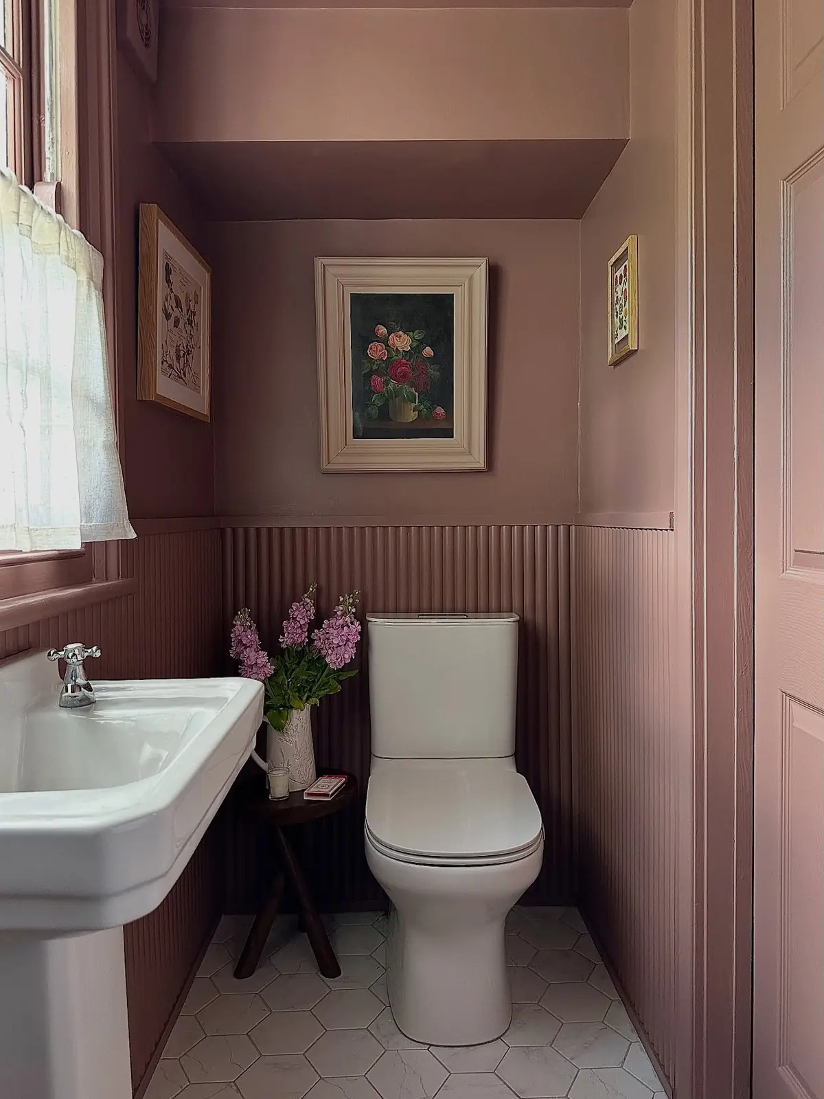
The usual move: White trim around every door, window, and wall edge.
The smarter move here: Paint those lines in the same dusty pink as the walls. With fewer sharp borders, the eye reads the room as one continuous shell instead of several narrow panels.
The vertical ribbed detail still adds depth, but it does not break the color flow. I would keep the toilet, sink, and floor pale, just as shown. Those light fixtures give the rich pink scheme contrast without outlining every corner.
19. Choose a Vanity With Open Legs
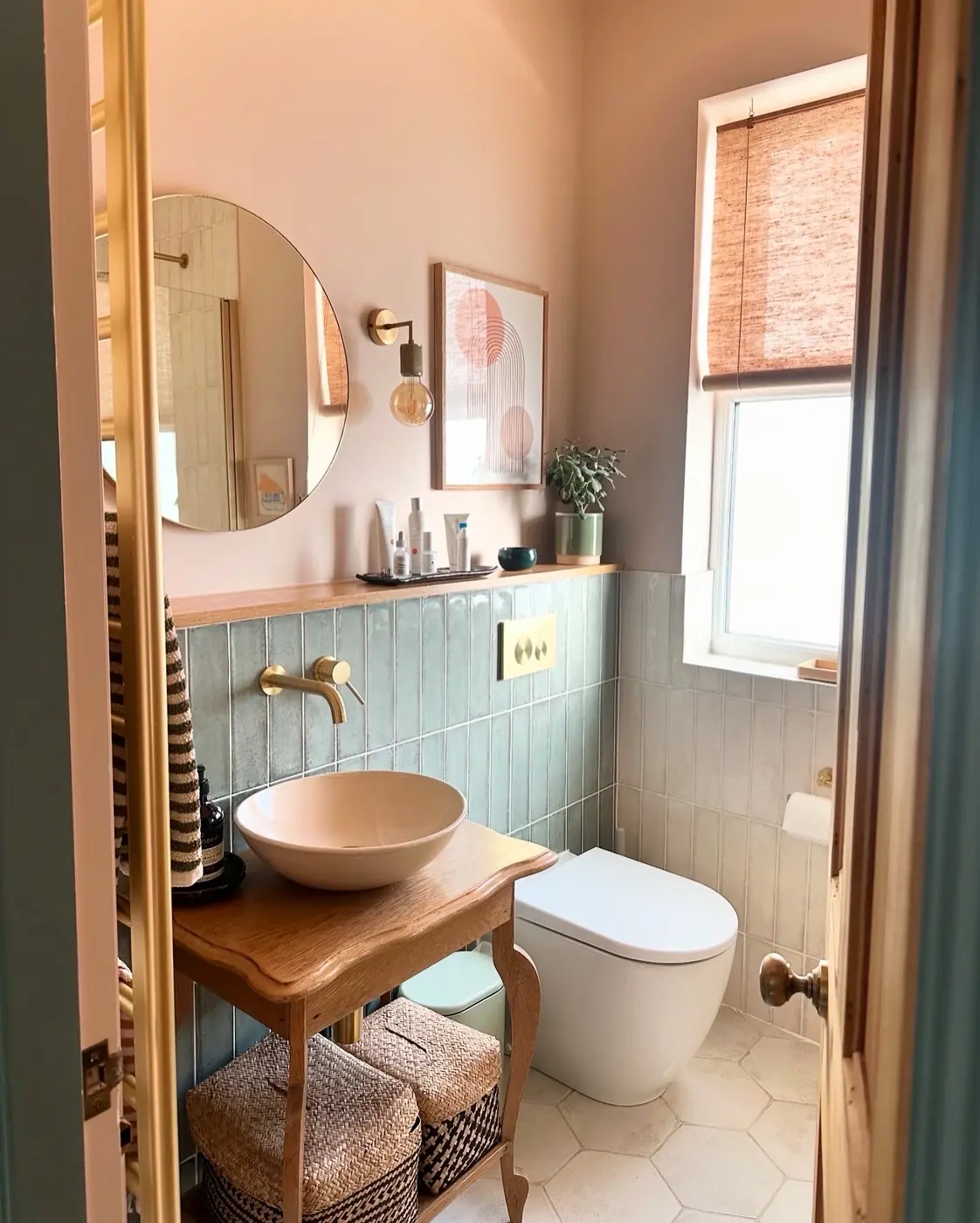
No solid cabinet. No heavy block beside the doorway. Instead, this table-style vanity lets the pale floor remain visible right up to the wall.
That open view matters in a bathroom this narrow, yet storage has not been ignored. Two woven baskets slide onto the lower shelf and keep loose items out of sight. I would match the baskets and avoid stacking supplies above them. The curved wooden legs already bring enough detail, while the simple vessel sink keeps the top from becoming fussy.
20. Let Pattern Blur the Corners
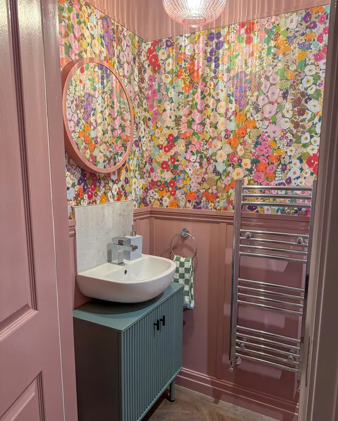
Bold floral wallpaper in a tiny room sounds risky. Here, wrapping it around every upper wall makes the corners harder to notice.
The trick is repetition, not restraint:
- Run the print continuously around the room.
- Keep the lower paneling one solid color.
- Pull a quieter wallpaper shade into the vanity.
The room stays lively, but its boundaries feel less abrupt. I would skip extra wall art because the flowers already do that job. Even my most enthusiastic decorating phase had to learn when to stop.
21. Add a Skylight Above Eye Level
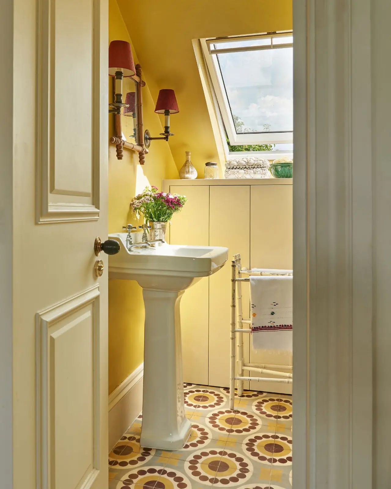
The sloped ceiling could have made this bathroom feel boxed in. The skylight turns it into the best feature.
Daylight enters from above, brightens the far wall, and pulls your gaze toward the sky instead of the close side walls. Placing the fitted cabinet beneath it also uses the lower area without blocking that light. I would keep the window ledge lightly styled and choose a blind made for skylights if privacy or glare becomes an issue. A clear upper view is the whole point.
Small Bathroom, Bigger Feel
Six simple design moves can help a tight bathroom feel brighter, calmer, and easier to use.
Final Thoughts
I still love a decorated bathroom, but I no longer try to fit every good idea into one room. Start with the change that solves your biggest problem, whether that is better storage, more light, or a clearer walking path. Then step back before adding anything else. If storage is the main issue, these over-the-toilet storage ideas make use of a wall that is often left empty.
A narrow ledge, taller curtain, or well-placed mirror may do more than a full makeover. Most of all, leave a little empty space. My old bottle-packed shelf taught me that breathing room is part of the design too. Save these ideas for the next time your small bathroom needs a fresh start.