Painted Flower Pot Ideas That Make Plain Pots Pretty
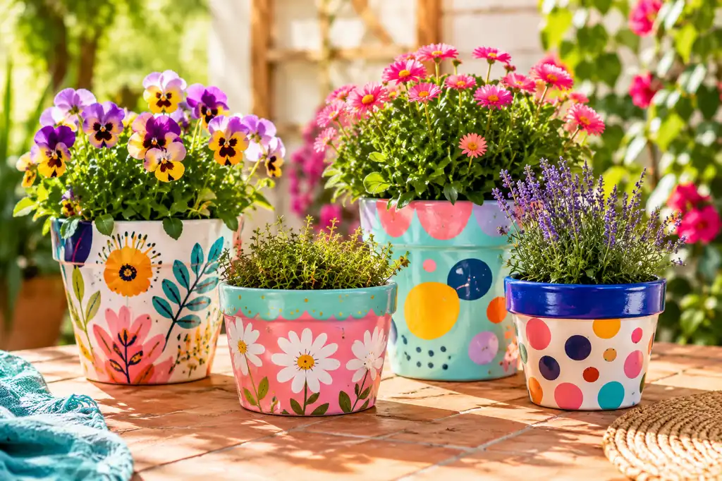
A plain flower pot can disappear into the background, but a little paint changes that fast. I like that you do not need perfect brush skills either. A few loose flowers, simple dots, or one bold color can already make a pot feel more personal.
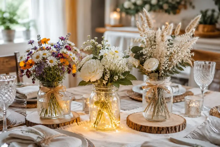
These Painted Flower Pot Ideas include soft florals, playful faces, mandalas, abstract patterns, tiny landscapes, and more. Some are quick and simple, while others are the kind of project I’d happily spend a slow afternoon on. If you like easy handmade decor too, these DIY mason jar centerpieces are another simple project to try.
The best part is that none of them need to be copied exactly. Pick the colors or details you like most, then make the idea your own.
1. Aqua Blooms Go Big
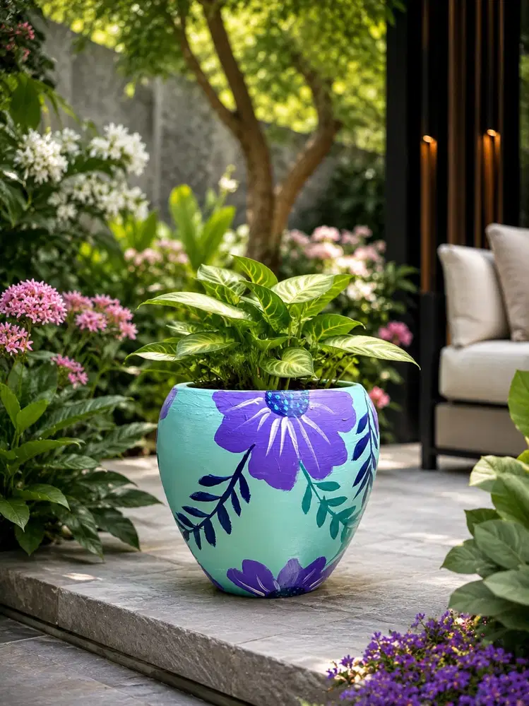
What grabs me first is the scale of those purple flowers. Against the soft aqua base, they feel bold without swallowing the whole pot. I’d keep the petals loose and slightly uneven because that hand-painted finish is part of the charm.
The dark blue and teal leaves help frame the larger blooms, while plenty of aqua still shows between them. That breathing room matters. Without it, a colorful floral pattern like this can quickly start feeling crowded.
2. Simple Pink Tulips
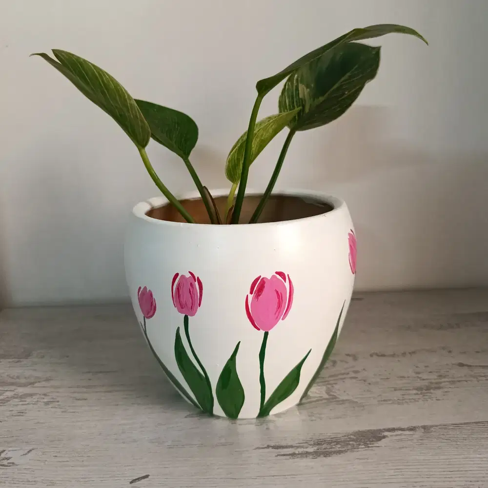
Sometimes a pot needs less, not more. The white background gives these pink tulips plenty of room, and the thin green stems make the flowers feel light rather than chunky.
I’ve learned that simple motifs like this are much easier to get right when you are new to painting pots. A few loose tulips, slightly different heights, and a handful of leaves are enough. I wouldn’t worry about making every petal match. The imperfect brushwork actually makes the flowers sweeter.
3. A Soft Daisy Meadow
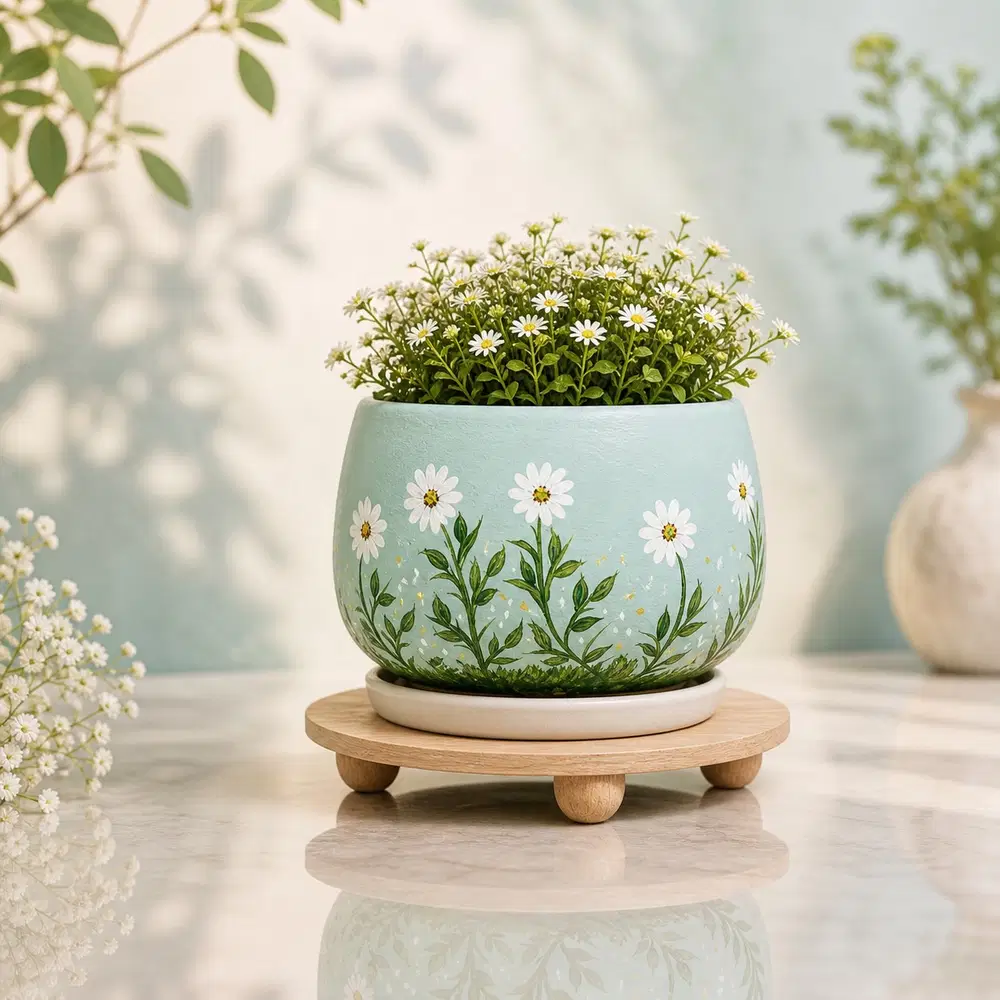
This pale blue-green pot feels calm before you even notice all the tiny details. White daisies rise from delicate leafy stems, with little painted marks near the bottom giving the design a meadow-like finish.
What I especially like is how the painted flowers echo the real blooms planted above. That connection makes the whole pot feel considered without looking fussy. Keep the flowers small, vary their heights, and let plenty of the pastel background remain visible between the stems.
4. Inked Florals on Teal
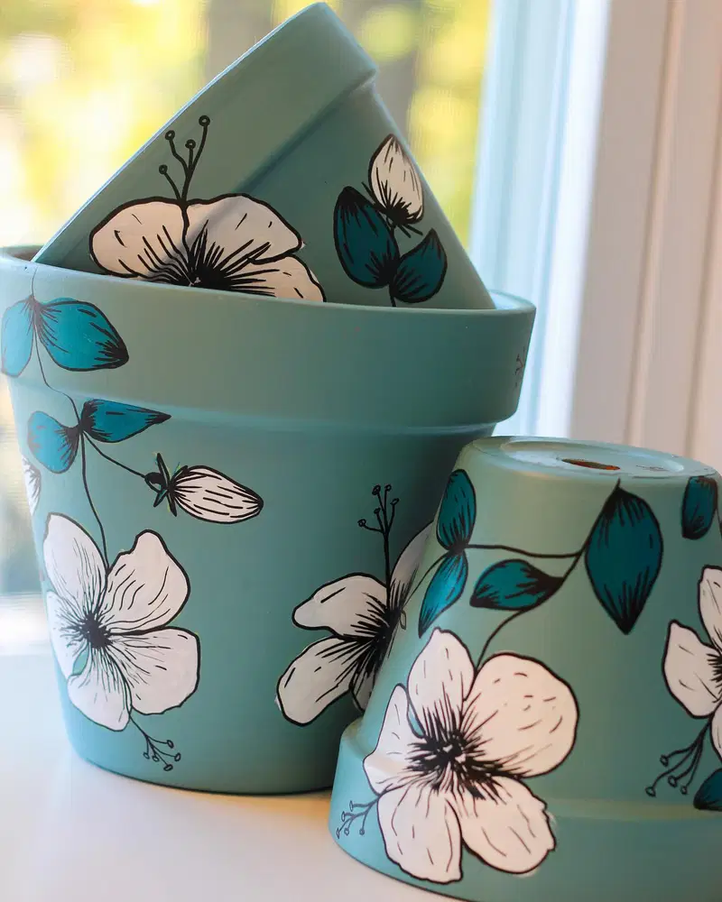
The dark outlines completely change the personality of these teal pots. White flowers and blue-green leaves look almost sketched onto the surface, with fine black strokes adding definition inside the petals.
For me, this is a good option when soft florals start feeling a little too sweet. The limited palette keeps several pot shapes looking like one collection, while the linework supplies the drama. Paint the colored shapes first, then come back with the darker details once everything is dry.
5. Pink With Graphic Vines
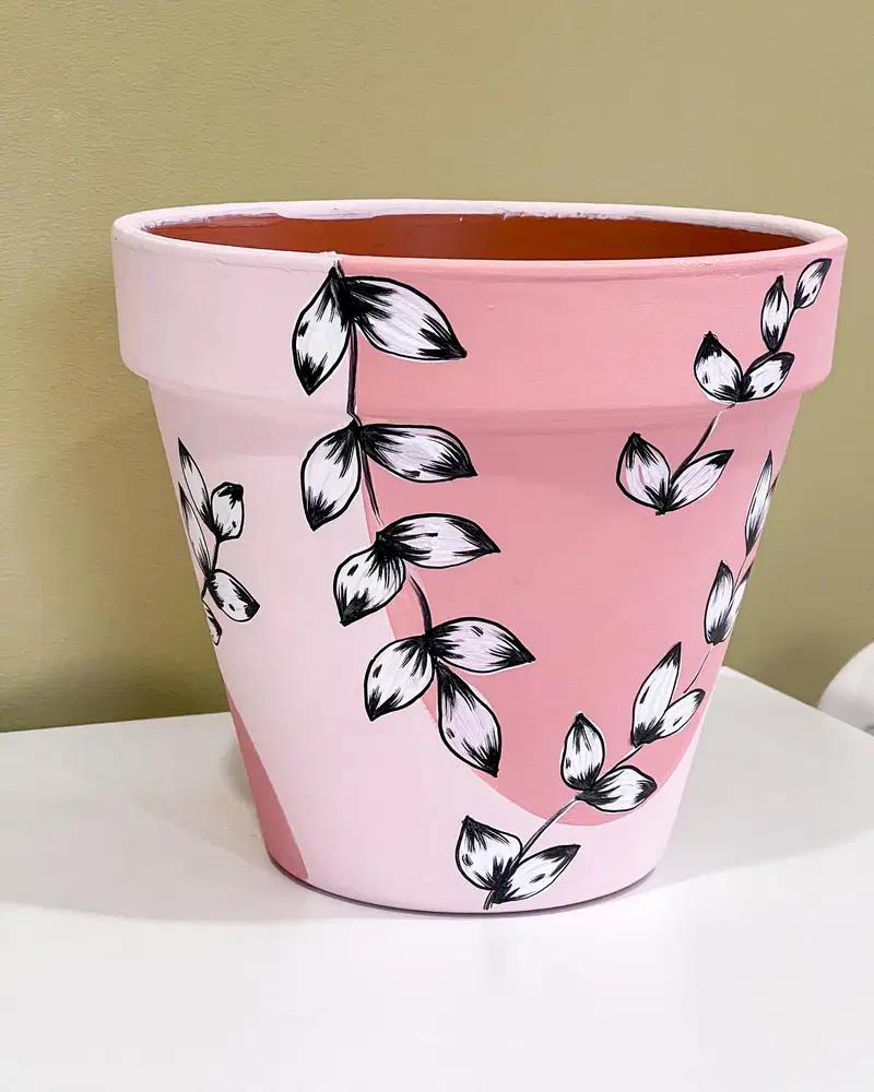
My rule with a soft pink base is to give it something with a little bite. Here, the black-and-white leafy vines do exactly that. Their curved stems move around the pot instead of sitting in stiff rows, and the darker details keep the pink from feeling overly sugary.
The open areas are just as important as the painted ones. I’d leave generous patches of pink between the branches rather than filling every gap. That restraint makes each vine easier to notice.
6. Bees, Blooms, and Honeycomb
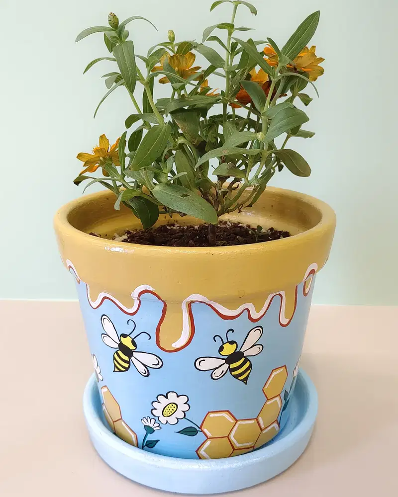
There is a whole little garden story happening here. Buzzing bees float across the pale blue body, honeycomb shapes sit near the base, and the golden rim appears to drip downward like honey.
I’m especially fond of the way the tiny daisies soften the cartoon-style bees. Without them, the theme could feel a bit too literal. Keep the bees as the main characters, then use flowers and honeycomb as supporting details. It is playful, cheerful, and completely different from a traditional floral pot.
7. A Garden Packed With Daisies
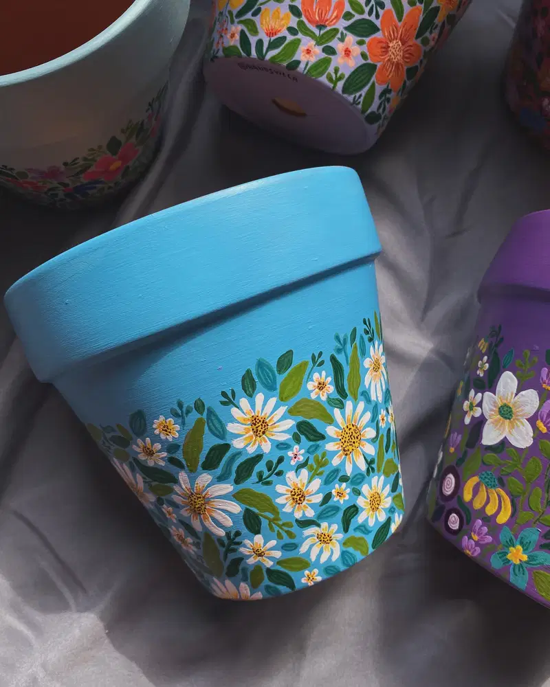
More really does work here. White daisies, tiny blossoms, and several shades of green cover the lower half of a bright turquoise pot, yet the design still feels balanced.
The trick is scale. Large daisies give your eye somewhere to land, while tiny flowers take care of the awkward spaces between them. I’d also keep the wide rim plain, just like this one. That undecorated strip gives such a busy garden pattern a much-needed place to breathe.
8. Bold Blue Daisy Pot
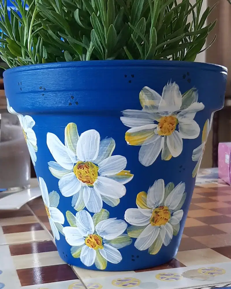
Deep blue makes even simple white daisies look dramatic. The petals here are loose, layered, and visibly brushed rather than carefully perfected, which is exactly why the pot feels so cheerful.
I wouldn’t smooth those strokes out. A little unevenness works beautifully with the textured yellow centers and makes this idea forgiving for anyone who is not confident with a paintbrush. Add a few tiny dark marks between the flowers and you get extra detail without having to paint another complicated motif.
9. Tiny Blooms on Forest Green
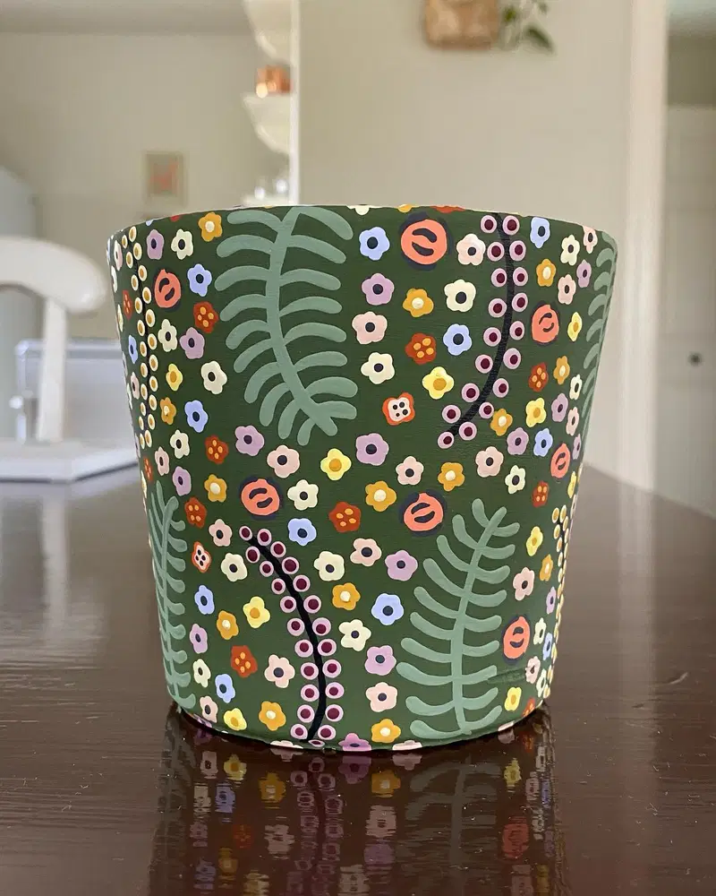
What catches my eye is the contrast between the dark green background and all those tiny pastel flowers. Cream, lavender, yellow, coral, and blue blooms scatter across the surface almost like confetti.
The larger pale green fronds are doing important work too. They break up the tiny details and keep the pattern from turning into visual noise. I’d paint those big leafy shapes first, then tuck smaller flowers and dotted stems into the leftover spaces rather than trying to plan every inch in advance.
10. White Folk Art Details
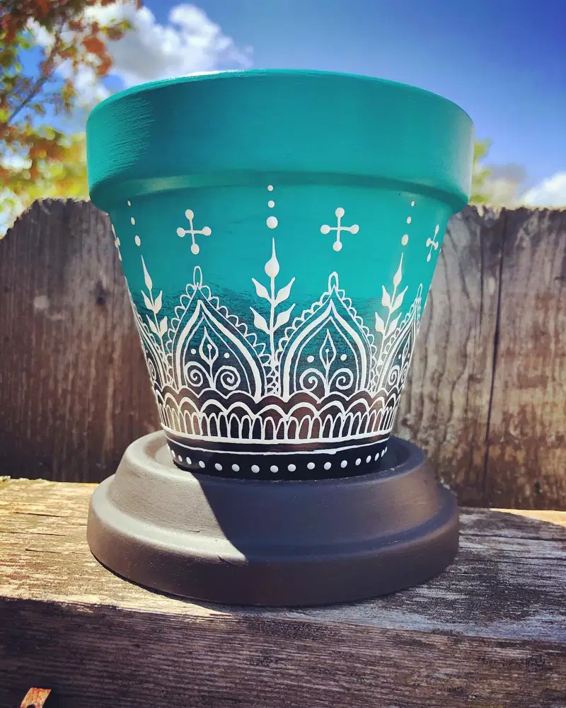
I used to think a detailed pot needed lots of different colors. This one makes a good case for doing the opposite. A turquoise base and crisp white linework are enough to create an intricate folk-style pattern.
The arches, leaves, curls, and little dots repeat in a loose rhythm around the pot, while the dark band at the bottom grounds everything. Start with the largest shapes first. Once those feel balanced, the tiny dots and flourishes become much easier to place without making the design feel cluttered.
11. Green Mandala Moment
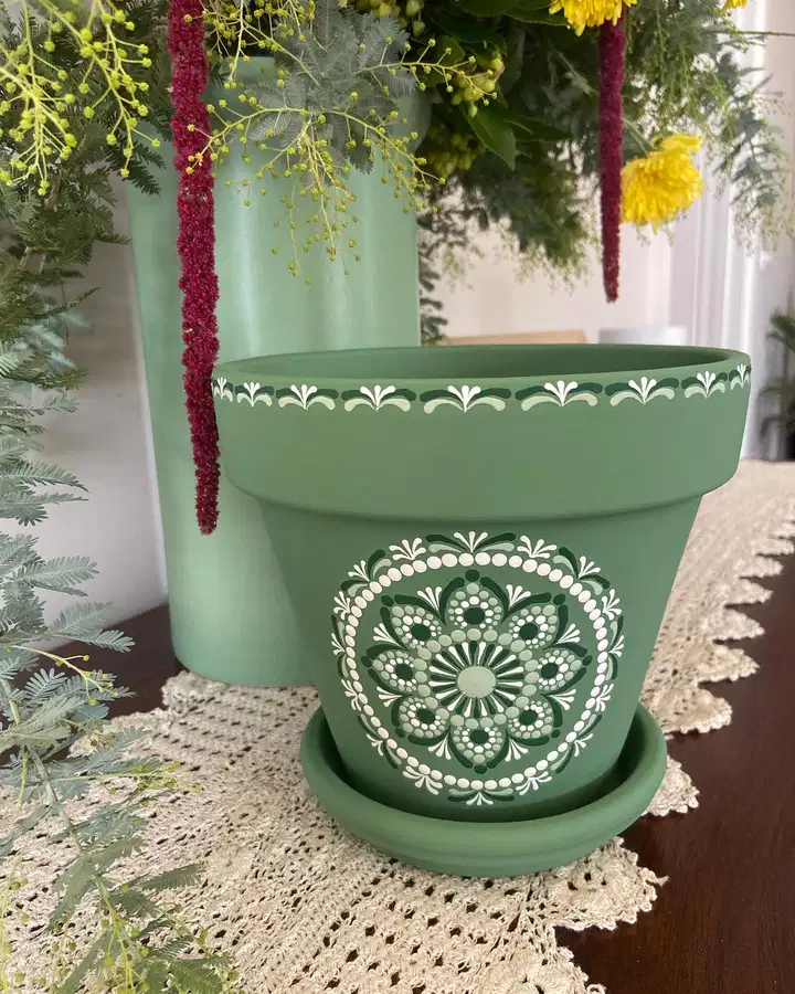
All the attention goes to one spot here, and I think that is what makes the pot feel so polished. A large white-and-dark-green mandala sits in the center while a simpler little border circles the rim.
I’d mark the middle point before painting anything else, then build the design outward one ring at a time. Repeating petals, dots, and curved marks creates plenty of detail without needing dozens of different shapes. The muted green background also keeps the white pattern feeling soft rather than stark.
12. Creamy Florals on Terracotta
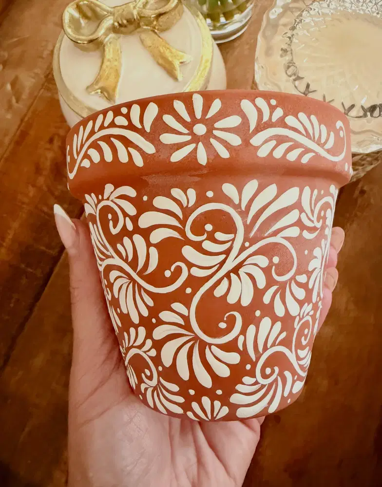
I would leave that warm terracotta showing. It already has so much character that covering it with another base color would almost be a shame.
The creamy white vines curl freely across the pot, mixing teardrop leaves, little flowers, dots, and swirling stems. What keeps all that detail manageable is the two-color palette. Repeat a small handful of shapes rather than inventing a new motif every few inches. The result feels rich and handmade without becoming visually heavy.
13. Dots Meet Oversized Blooms
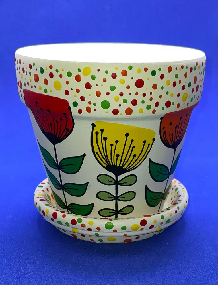
Bright little dots around the rim and saucer give this pot an almost party-like border, while the large flowers in the middle keep the design from turning into one giant polka-dot pattern.
The white background is doing me a favor here because it lets the reds, greens, yellows, and oranges stay vivid without fighting one another. I’d finish the flowers with dark outlines after the color dries. Those simple black details make the petals, stems, and centers much easier to read from a distance.
14. A Detailed Dot Mandala
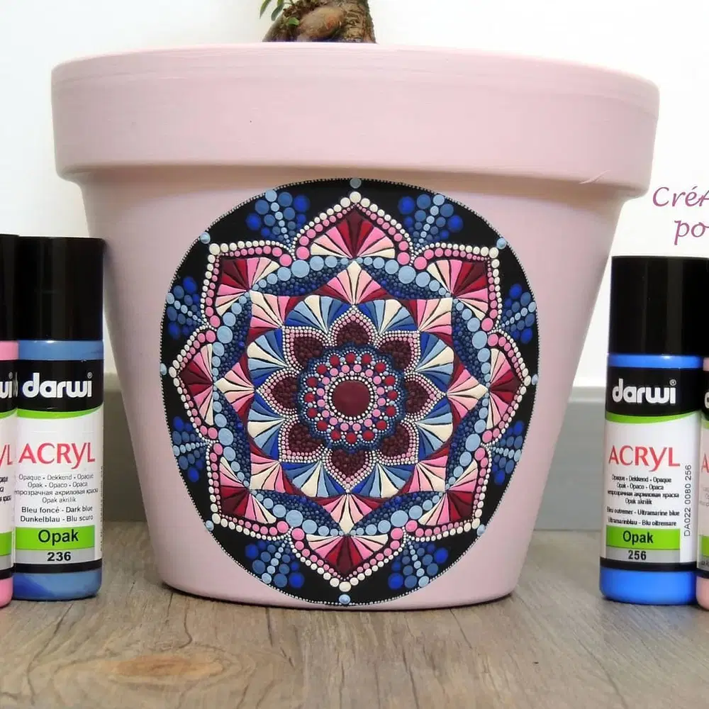
This is one I would save for a slow afternoon. The pale pink pot is wonderfully quiet, while the black circular center holds rings of blue, burgundy, cream, and pink dots.
Rather than trying to paint the whole mandala at once, build one complete ring before starting the next. That little habit makes symmetry much easier to manage. The larger petal shapes create the structure, and the tiny dots do the finishing work. There is already plenty happening here, so I would resist adding another color.
15. Palette-Knife Petals
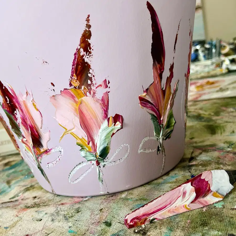
No neat little petals here. Thick swipes of blush, burgundy, cream, yellow, and green create flowers that almost look sculpted onto the pale pink pot.
The raised texture is the part I would protect. Smoothing every edge would take away the energy that makes this design interesting. Let colors overlap, allow a few rough edges, and use thin looping lines underneath as a quiet finishing detail. It feels painterly and expressive without needing a perfectly drawn flower.
16. Vintage Florals on Dusty Blue
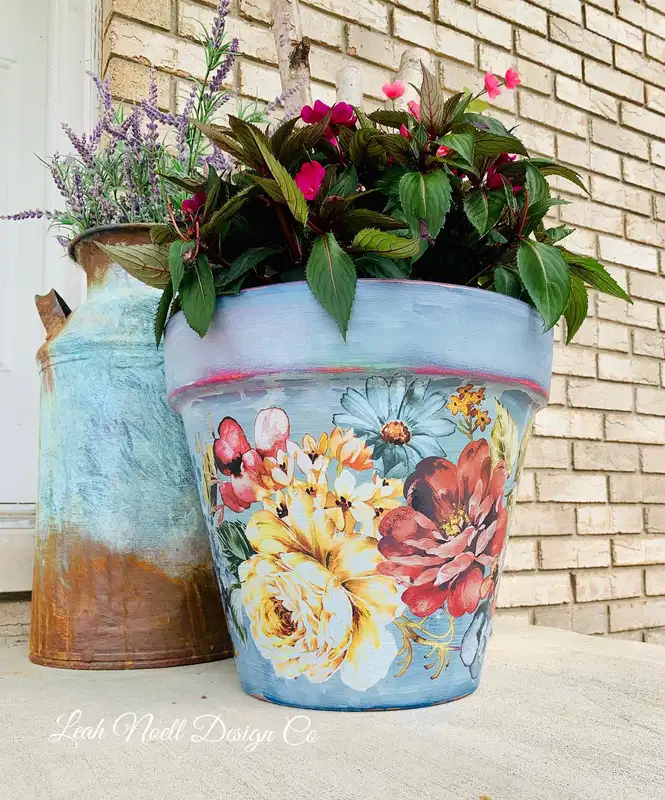
These flowers overlap like they belong on an old painted canvas. Cream, coral, faded red, yellow, and pale blue blooms sit against a dusty blue background, with some flowers partly disappearing behind others.
I’ve found that overlapping flowers usually look more natural than lining them up neatly across a surface. Here, it also creates a sense of depth. The thin coral detail near the rim quietly connects back to the warmer flowers below, while the slightly worn brushwork stops the whole thing from feeling too polished.
17. Wildflower Confetti Everywhere
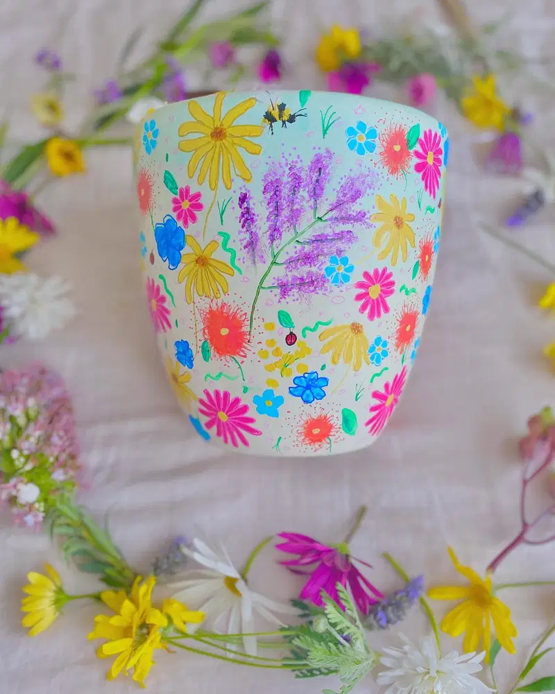
This pot feels like somebody gathered a whole summer garden and decided not to edit anything out. Bright yellow daisies, pink flowers, blue blooms, lavender-like stems, little green marks, and tiny painted creatures all share the pale background.
My approach would be to start with the biggest flowers and forget about the small gaps at first. Once those anchors are in place, tiny blossoms and playful details can fill the awkward spaces. A few imperfect marks only make this kind of loose wildflower design more convincing.
18. Dotted Lace Along the Base
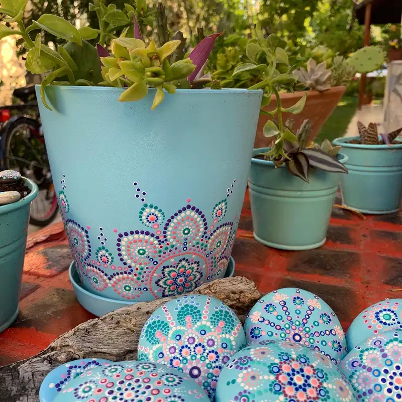
Keeping the decoration near the bottom was such a smart choice. Coral, purple, teal, cream, and white dots build scalloped, almost lace-like patterns around the base, while most of the aqua pot stays wonderfully plain.
That empty upper section gives trailing greenery room to become part of the display instead of competing with it. I’d begin with a few larger circular motifs, then connect them with smaller dot trails. Trying to cover the entire pot would lose the lightness that makes this one work.
19. Playful Symbols on Pink
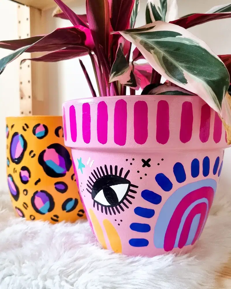
I know myself well enough to know that once I started painting this pot, I would have trouble stopping. There is an eye, rainbow-like arches, dots, stars, little crosses, chunky brush marks, and blocks of vivid blue, pink, yellow, and black.
The secret is not making everything the same size. One oversized symbol can lead the design, then smaller marks can fill the awkward spaces around it. Repeating a few colors keeps all the random shapes connected even though nothing really matches.
20. Botanicals Meet Bold Polka Dots
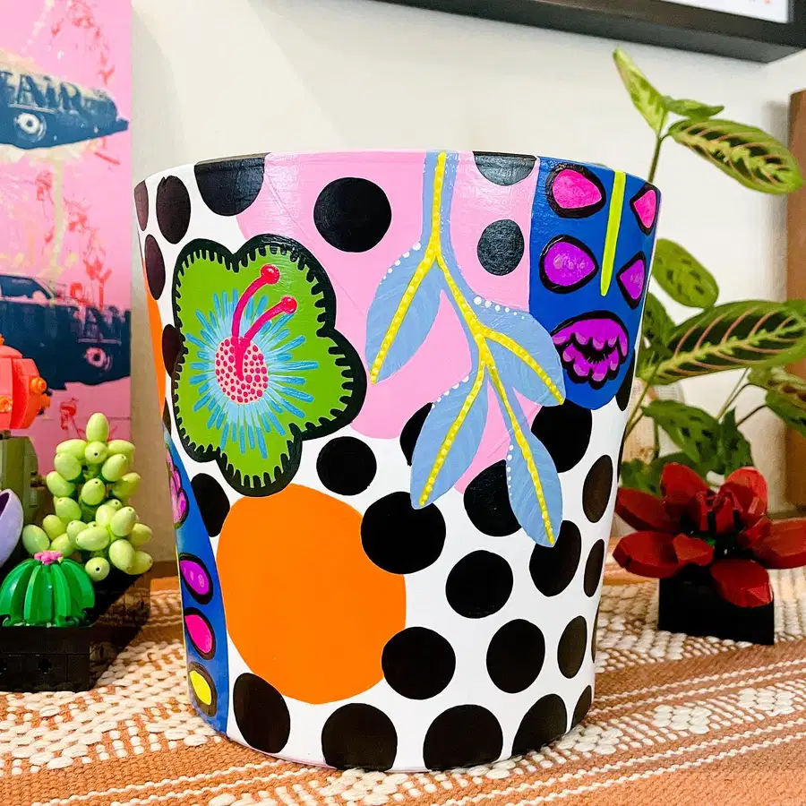
Black polka dots, an oversized orange shape, pink blocks, leafy branches, and quirky floral motifs should probably clash, yet they somehow work together here.
I’d credit the changing scale. Huge circles sit beside delicate leaves, and solid color fields are broken up by finer painted details. The white areas keep the pattern from getting too heavy. If recreating this, sketch the largest blocks first. Once those feel balanced, the smaller botanical pieces can be layered over and around them.
21. Sunset Scene With a Palm
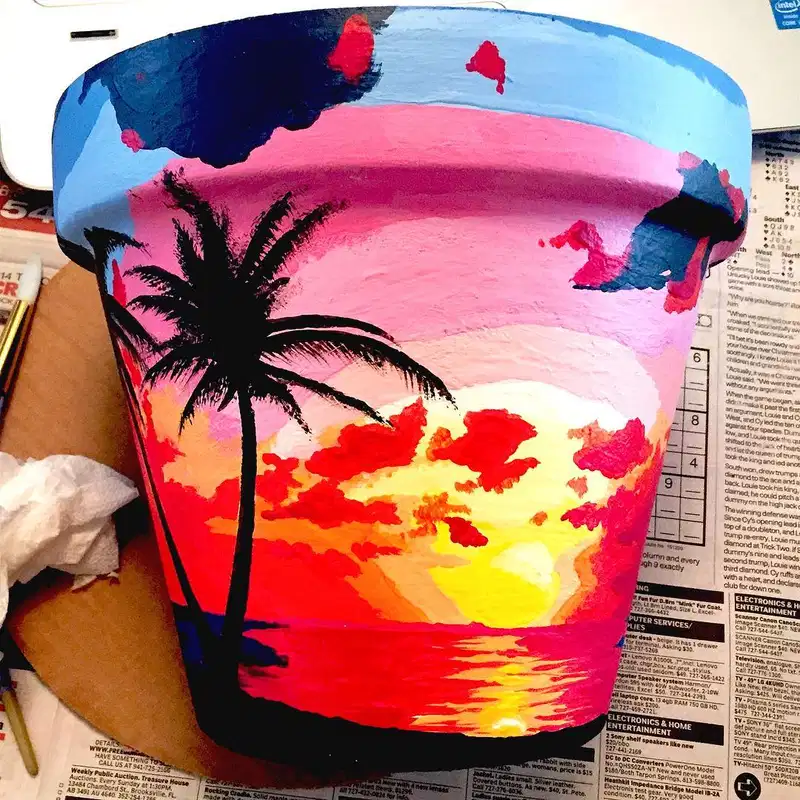
Instead of decorating the pot with a pattern, this idea turns the whole surface into a tiny landscape. Pink sky, glowing yellow and orange light, deep blue areas, and fiery reflections create the sunset before the dark palm even enters the picture.
I’d paint those color layers quite freely. They do not need seamless blending to read as sky and water. The palm silhouette should come last, once everything underneath is dry. That one strong dark shape is what pulls the whole colorful scene together.
22. Floral Rims, Sleepy Faces
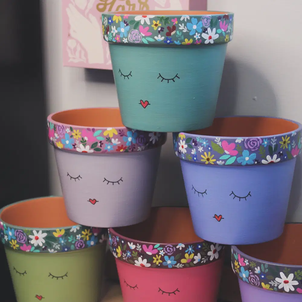
For me, the best detail here is where the flowers are placed. Instead of covering the entire pot, tiny roses, daisies, leaves, and colorful blossoms wrap only around the rim.
Below that, the pastel bodies stay almost bare except for sleepy eyes and a tiny heart-shaped mouth. That contrast gives the flowers much more impact. I would keep the faces just as simple. Once the rim has this much detail, adding extra decoration underneath would only compete with it.
23. Layered Mountain Horizons
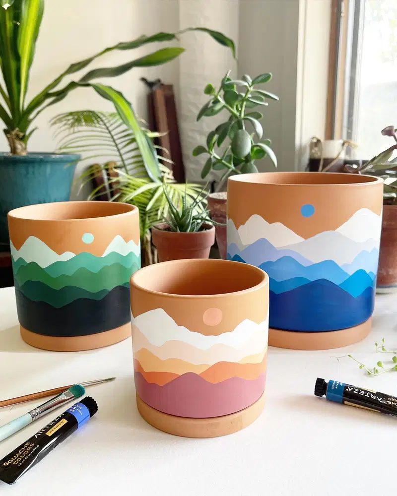
These are such forgiving designs because the mountain edges do not need to be exact. Green, blue, or warm sunset-colored ridges overlap across the lower half of each terracotta pot, while a tiny sun hangs above them.
The little imperfections are what I’d keep. Slightly uneven peaks make the landscape feel more natural anyway. Work from the palest distant ridge toward the darker foreground, and leave some raw terracotta showing around the top. It adds warmth and saves you another whole layer of paint.
24. Pots With Personality
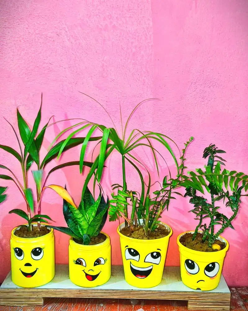
These bright yellow planters make me smile before I even notice the plants. Each pot has its own expression, with wide eyes, lashes, little mouths, and tiny white highlights bringing the faces to life.
I would absolutely make every face different. One can look cheerful, another surprised, another slightly grumpy. That mismatch is the fun part. Keep the outlines bold enough to read from across the room and let the shared yellow base tie the whole group together.
25. Daisies Meet a Minimal Face
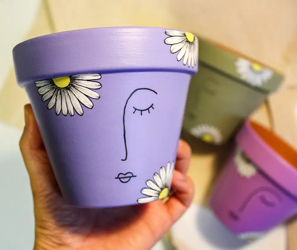
Quiet details win here. A lavender background stays mostly untouched while a delicate line-drawn face sits in the center and a handful of white daisies peek in from the edges.
I’d leave all that empty space alone. Filling it would take away the calm quality that makes the design feel different from the busier pots. Black outlines give the pastel colors enough definition, and those tiny yellow flower centers provide just one bright accent. Even the partly cropped daisies make the arrangement feel less staged.
26. A Tiny Painted Message
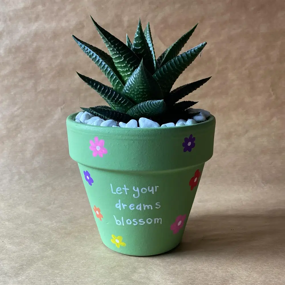
I’ve learned that lettering on a pot works best when the message is short. Here, a simple handwritten phrase sits in the center of a soft green background, surrounded by tiny pink, purple, orange, red, and yellow flowers.
The lettering does not look overly formal, which suits the playful little blooms around it. I’d embrace that handmade quality instead of trying to turn every letter into perfect typography. Keep enough open space around the words so the message remains the first thing you notice.
27. Portrait Wrapped in Vines
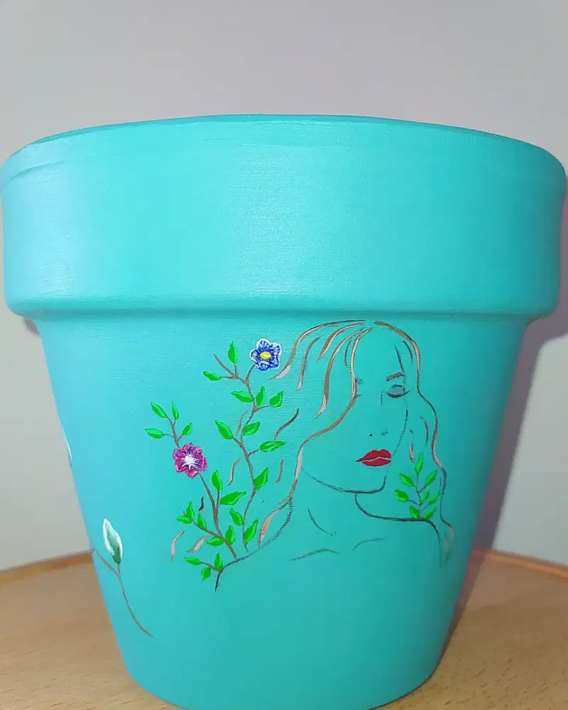
A delicate face sketch gives this aqua pot a softer, more artistic direction. Thin lines create the portrait while small green vines weave around it, carrying just a few tiny pink and blue flowers.
What I would protect most is the open background. There is no need to fill the empty aqua areas because they make the portrait easier to appreciate. The red lips offer one concentrated pop of color, while the greenery softens the face without covering it. It feels graceful because nothing is fighting for attention.
28. Abstract Color Meets Fine Leaves
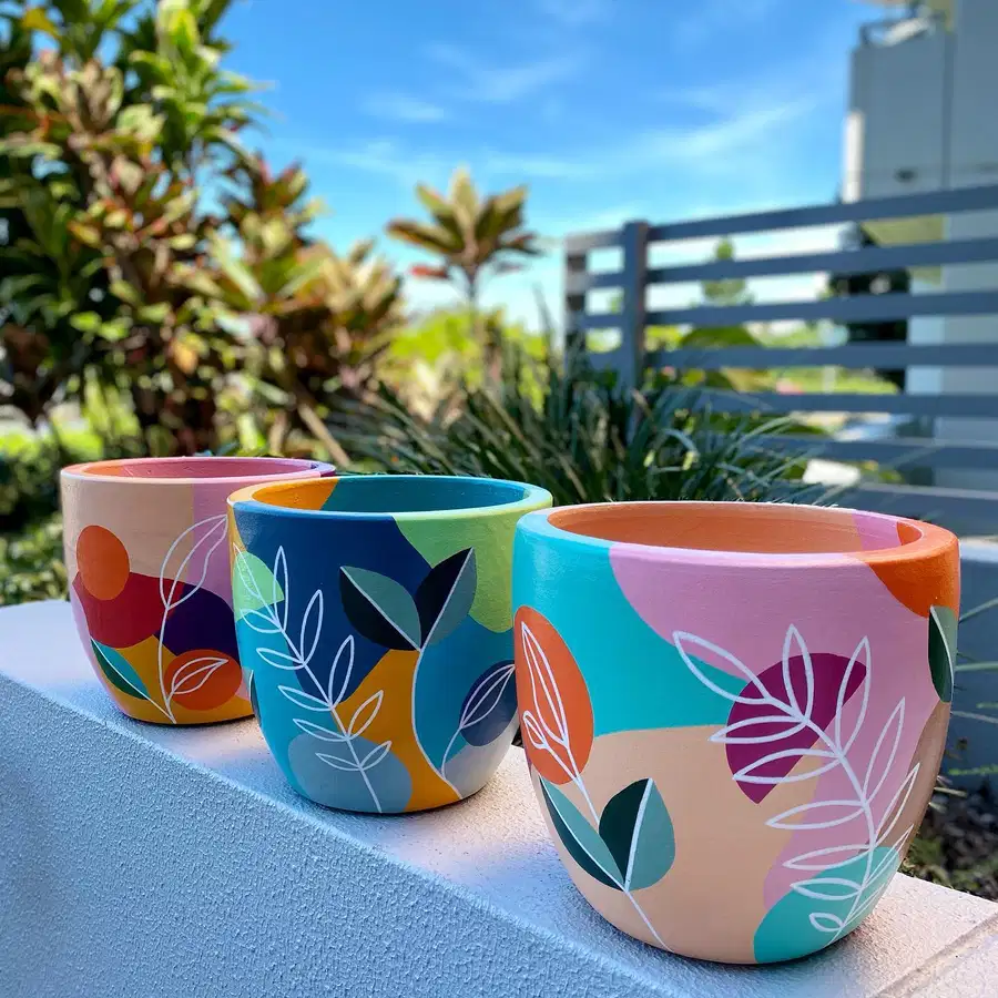
Large blocks of pink, teal, navy, orange, cream, and green build the background on these pots, then delicate white branches sweep across the top like a second layer.
I’d paint the big color shapes quickly and keep their edges a little organic rather than measuring everything. Once those are dry, the thin leaf outlines can go over them. The contrast is what makes the idea interesting, chunky color underneath, airy linework above. It feels modern, but there is still enough hand-painted irregularity to keep it warm.
29. Soft Blooms, Fine Outlines
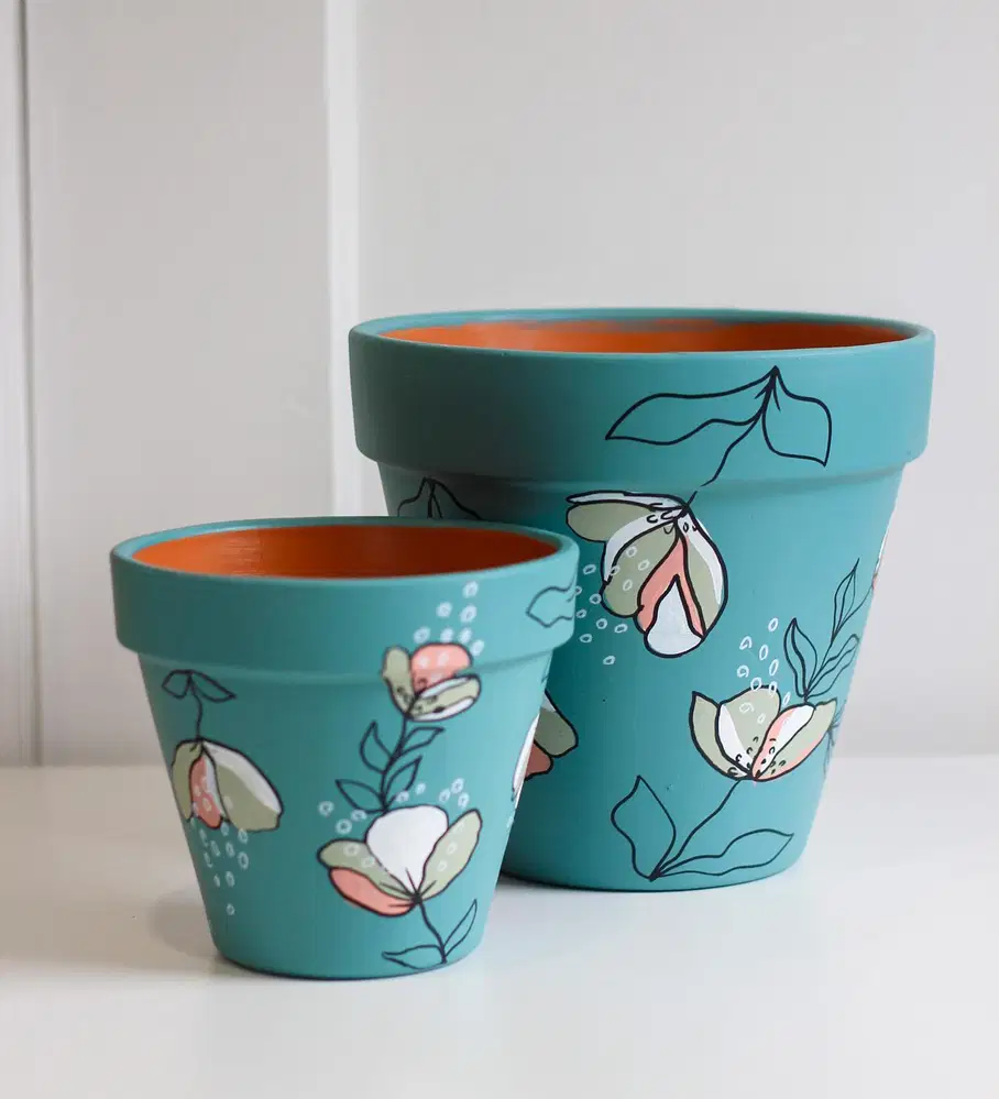
What works for me here is the mix of finished and unfinished detail. Soft peach, sage, and white petals are partly filled in, while other flowers and leaves remain simple black outlines against the muted teal background.
That uneven treatment makes the pots feel lighter than a fully painted floral pattern. Start with the colored petal shapes, then add stems, leaf outlines, and tiny white dots once everything dries. I wouldn’t fill every outlined leaf. Leaving some of them open is exactly what gives the design its airy look.
Final Thoughts
What I keep noticing with painted pots is that the handmade details are usually what make them interesting. A slightly uneven petal or loose brushstroke can give a pot much more character than a perfectly neat finish.
I’d start with one simple design and build from there. It is much easier to add another flower or dot than to rescue a pot that already feels too busy. If you enjoy small handmade projects like this, these DIY mason jar centerpiece ideas are another easy way to add color without buying new decor.
Save your favorite Painted Flower Pot Ideas for the next time a plain planter needs a little more personality.