24 Leopard Print Bedroom Ideas That Actually Feel Stylish
Leopard print can get loud fast, but that isn’t always a bad thing. Some bedrooms look better when the pattern is allowed to take over. Others only need one pillow, one rug, or a small run of spots on the wall.
These leopard print bedroom ideas go in very different directions. There’s burnt orange and deep green, pale pink and gray, moody black, sage, navy, teal, and even a few rooms that mix leopard with another animal print.
You don’t need to treat any of these rooms like a full formula. Sometimes the bedding is the part to notice. Sometimes it’s the wall color beside it. And sometimes one small detail is enough.
1. Let Leopard Lead the Bed
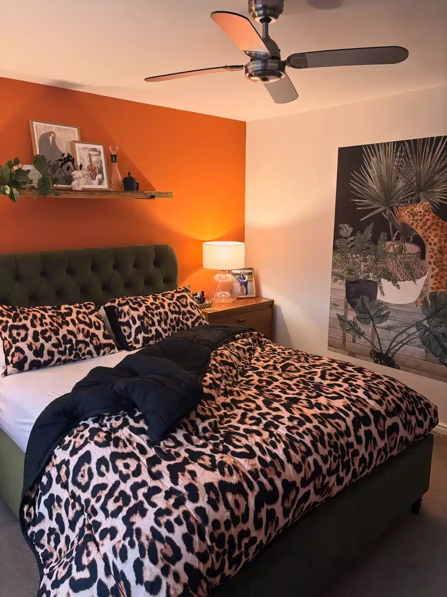
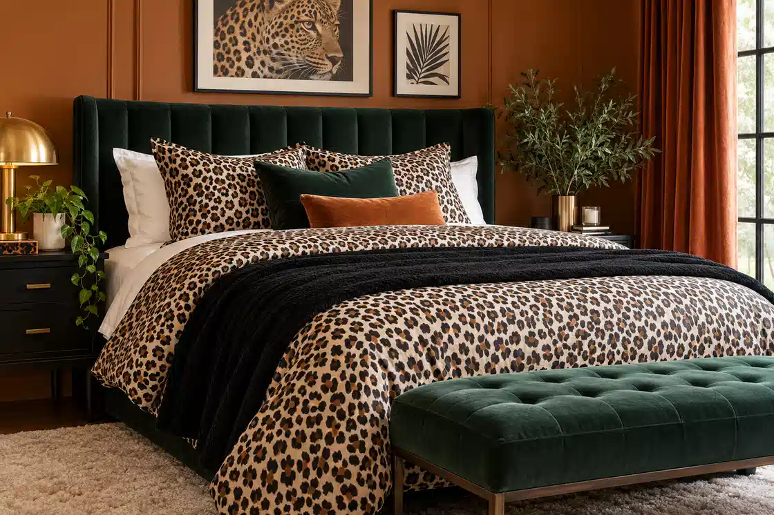
This room commits to the print instead of treating it like a tiny accent. Leopard covers the duvet and pillows, so the dark green upholstered bed has an important job. It gives all those spots a solid place to land.
The burnt orange wall is just as good. It picks up the warm brown in the bedding without matching it exactly.
I’d leave the black throw right where it is too. One dark solid layer across the middle breaks up a lot of pattern with almost no effort.
2. Paint the Spots Instead
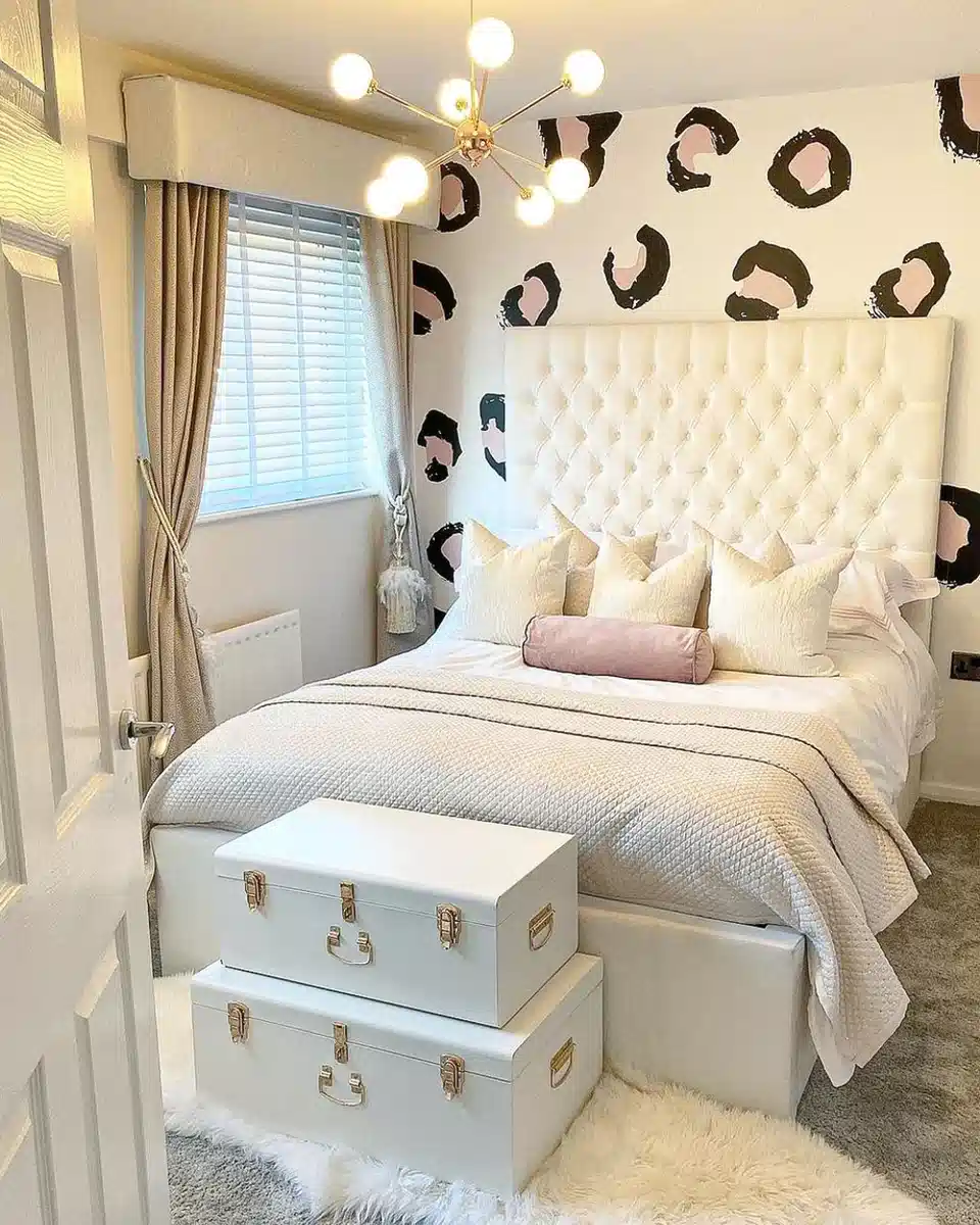
Leopard doesn’t have to come from fabric.
The oversized black spots with blush centers turn the wall behind the bed into the main feature, while the bedding stays almost completely white. That contrast is enough.
The tall tufted headboard also covers part of the pattern, which I actually like. You see the spots around it rather than one giant uninterrupted wall of leopard.
Good option for a bedroom where changing bedding every season matters more than keeping the whole room tied to one print.
3. Deep Green Changes Everything
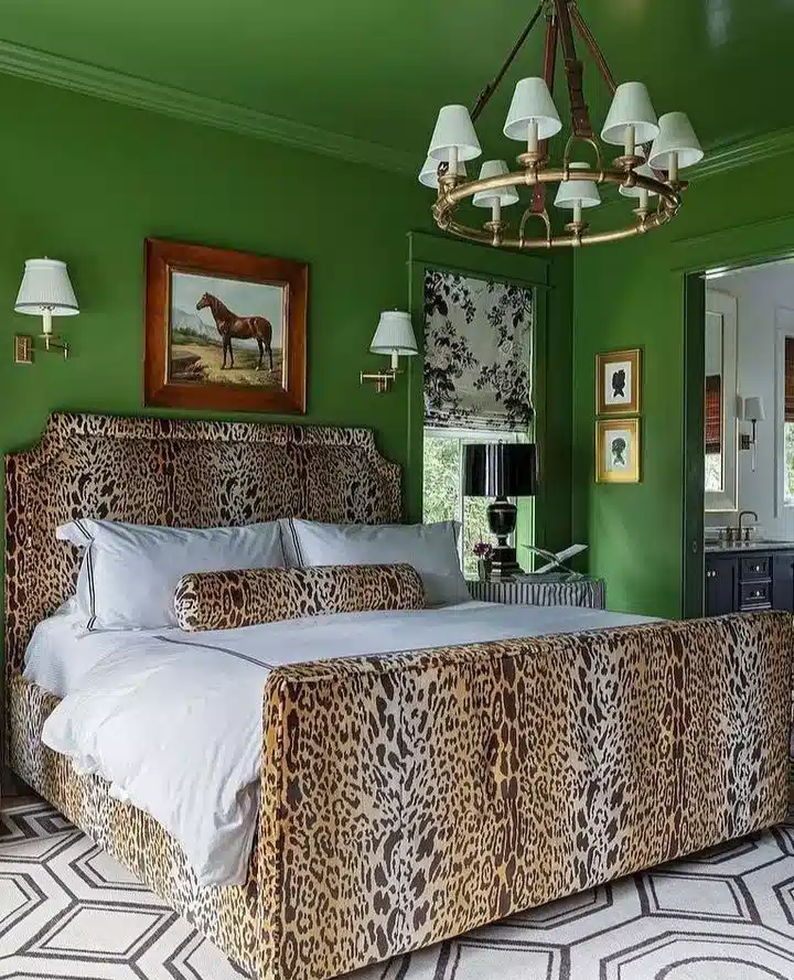
The leopard upholstered bed is already bold, but those deep green walls and ceiling make it feel richer rather than busier.
Crisp white bedding is the smartest part of the room. There’s no need for another pattern across the duvet. A small leopard bolster repeats the bed fabric, then stops.
I wouldn’t add patterned curtains here. Green, leopard, white. Enough.
4. Let Two Animal Prints Meet
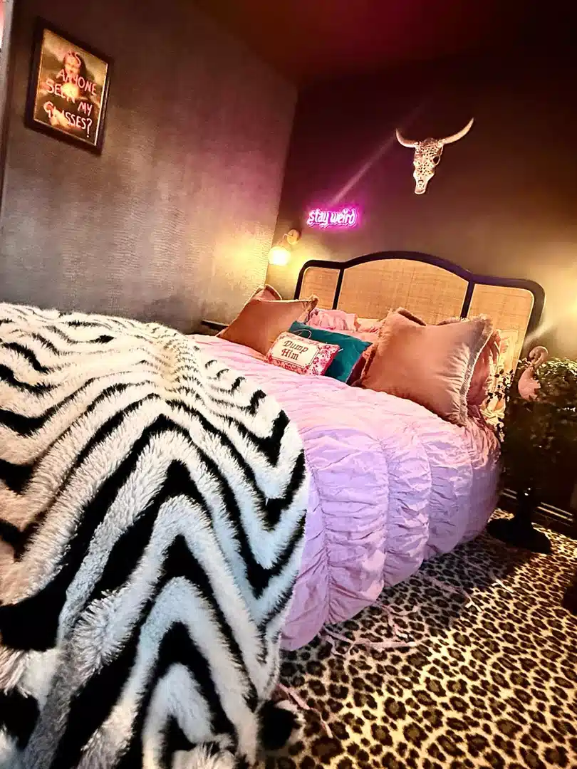
A zebra throw over pink bedding with a leopard rug underneath sounds like too much on paper.
Here, the solid pink layer keeps the two prints apart. That little bit of breathing room matters.
The room is dark and playful already, so matching the zebra and leopard would actually make it less interesting. Keep them different. Just don’t pile both patterns onto the same section of the bed.
5. Rust Makes Leopard Feel Warmer
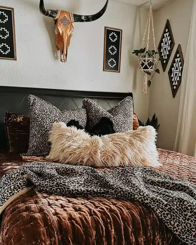
The leopard pillows and throw sit against a rich rust bedspread instead of plain beige or white, and that one change shifts the whole look.
The shaggy cream pillow is what gives your eye a break. It cuts through all those small dark spots and gives the bed one soft, quiet section.
The black headboard and graphic wall pieces keep the room from drifting too far into warm brown tones.
6. Keep It Mostly Black and White
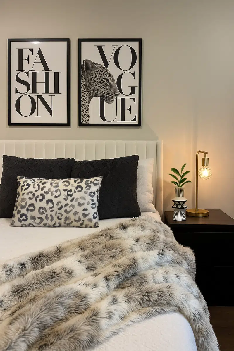
One leopard pillow is enough in this bedroom.
The print is gray rather than golden brown, so it fits naturally between the oversized black pillows and pale bedding. A soft gray faux-fur throw continues the same color story without repeating the spots.
If classic leopard feels too warm for your room, this is the direction I’d look at. Same idea, much cooler palette.
7. Try Olive Leopard Instead
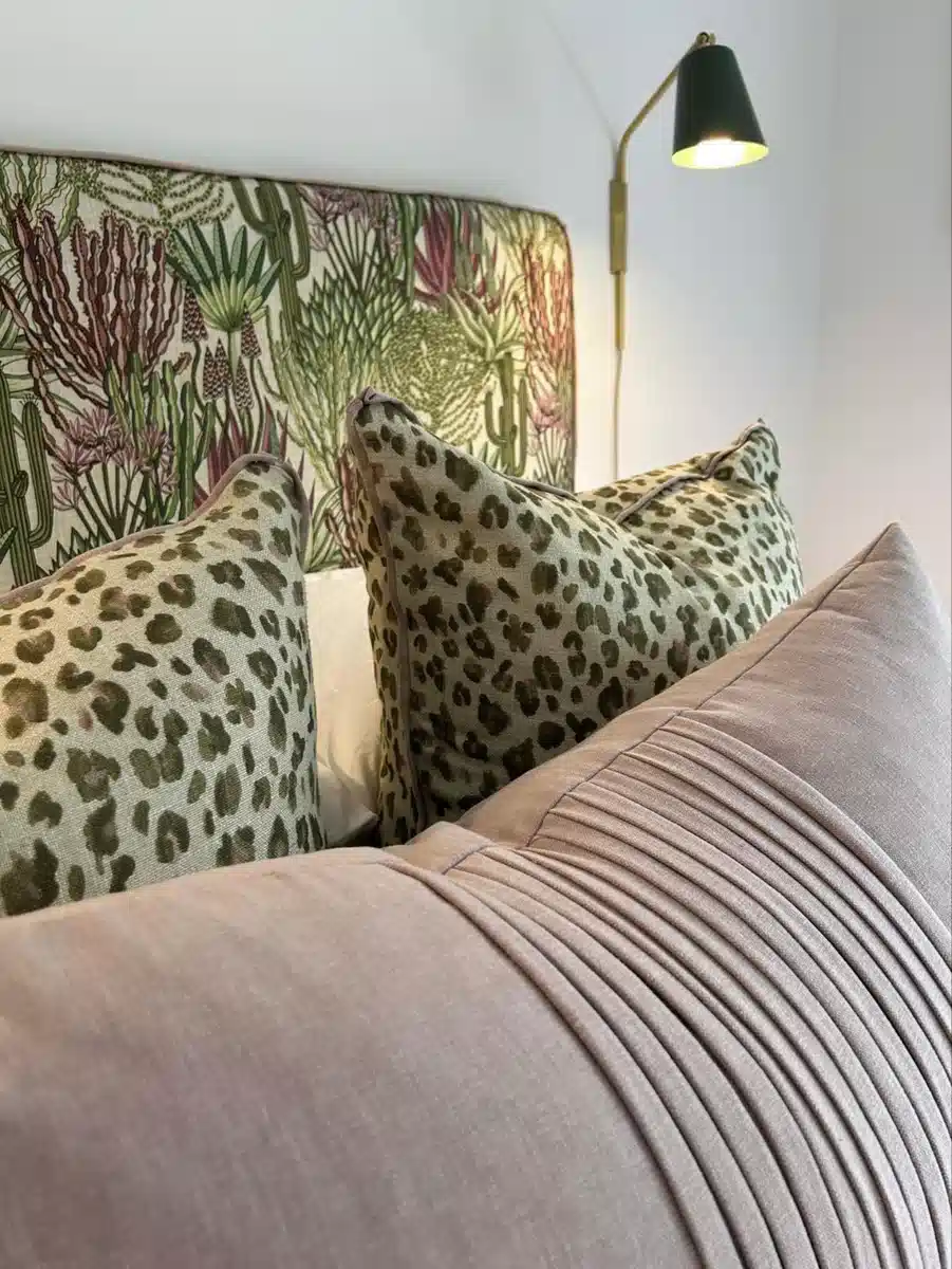
These leopard pillows are muted olive, which makes them sit surprisingly well against the botanical headboard.
The dusty pink cushion in front stops the whole bed from turning green, but it doesn’t shout for attention either.
There are already two patterns here, leopard and botanical. I would keep the duvet plain. A third printed fabric would be where this starts getting messy.
8. Pink Walls, Gray Leopard
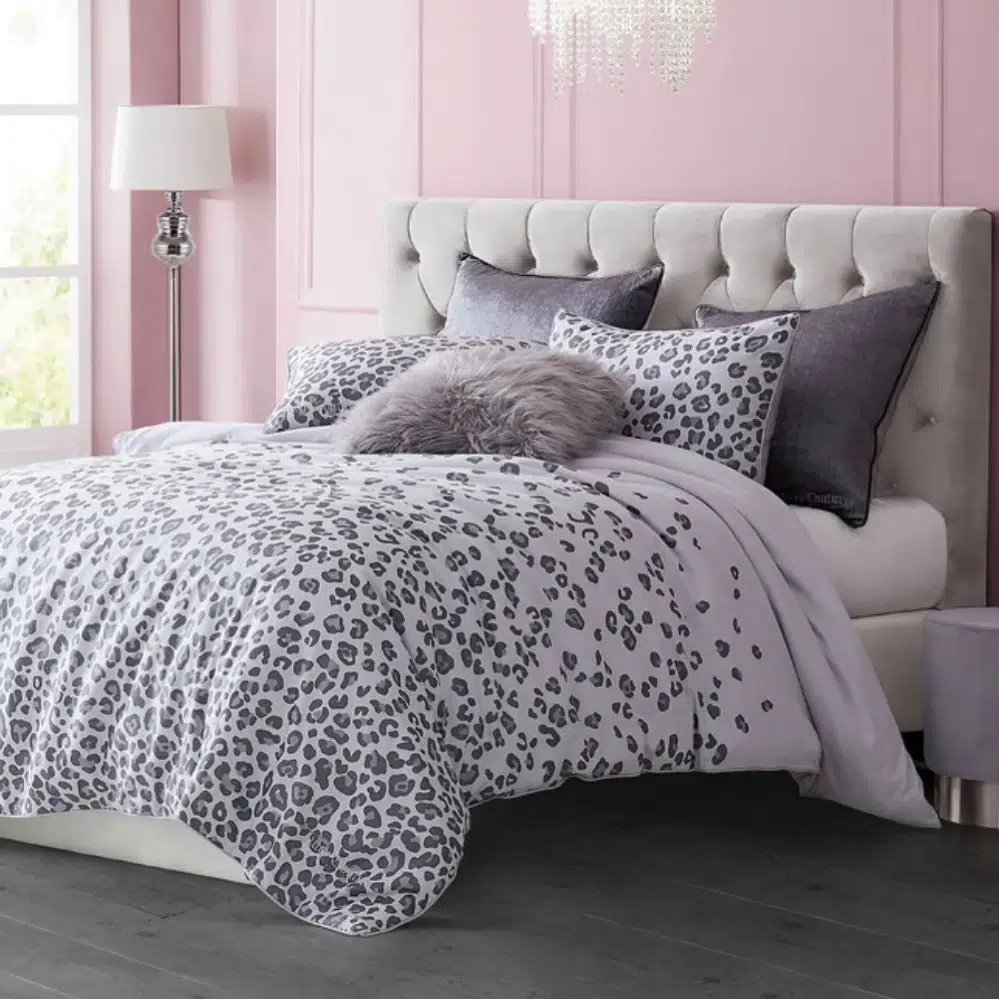
This bedroom is soft without being overly sweet.
The leopard bedding uses gray spots on white, then the pale pink paneled wall adds the color. Nothing complicated.
The gray throw pillow and tufted headboard help because they stay close to the bedding rather than introducing something new. The fluffy texture does more than another print would.
A nice example of leopard working in a light room instead of the usual dark, dramatic setup.
9. Break Leopard With Brown
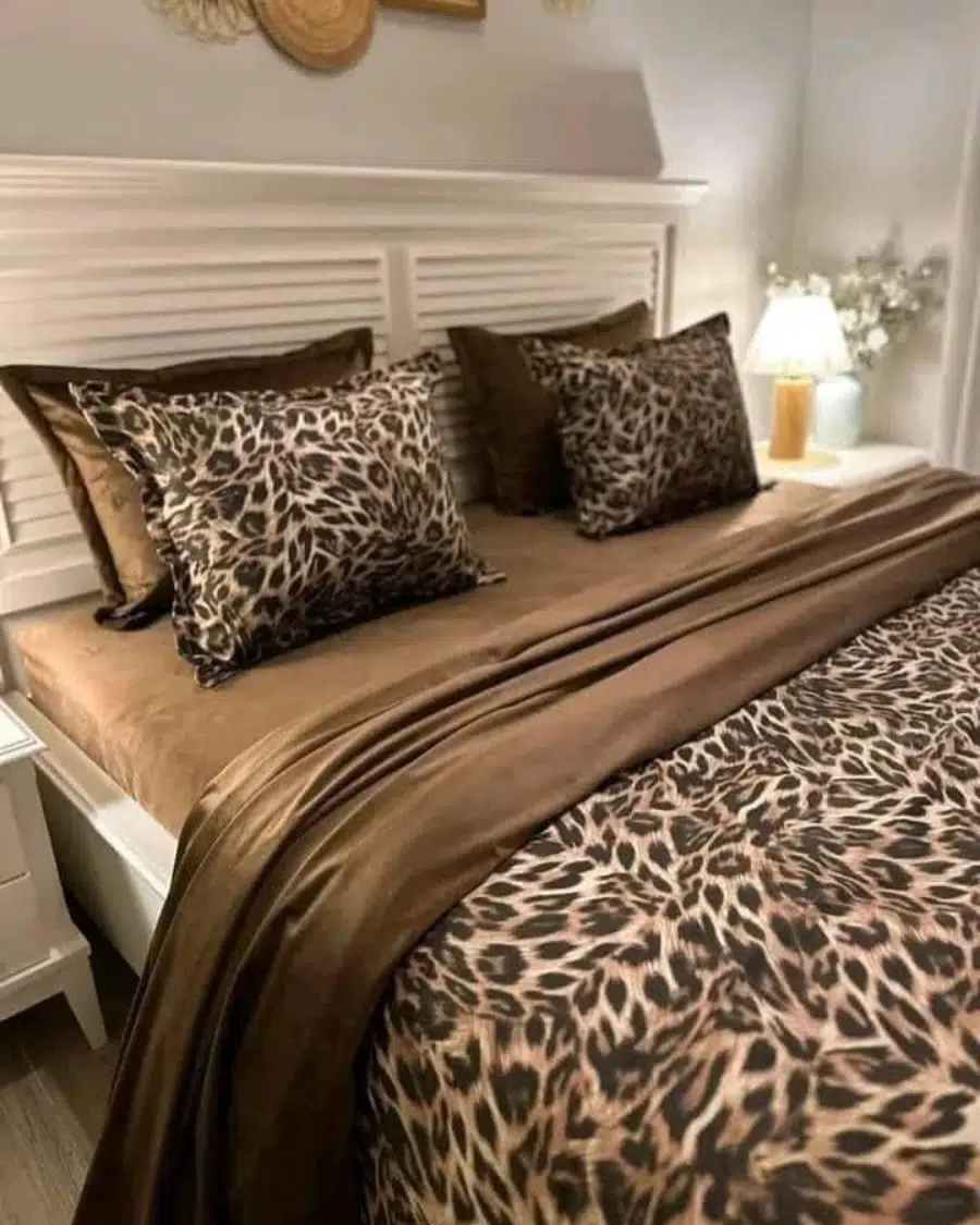
The bed could easily have been leopard from top to bottom, but the wide section of chocolate brown through the middle changes that.
You notice the patterned pillows and lower bedding, then your eye gets a break.
That white headboard matters too. Without it, all the brown and black would feel much heavier.
If you already own leopard bedding, adding a plain brown blanket might be easier than changing anything else in the room.
10. Cover the Awkward Wall
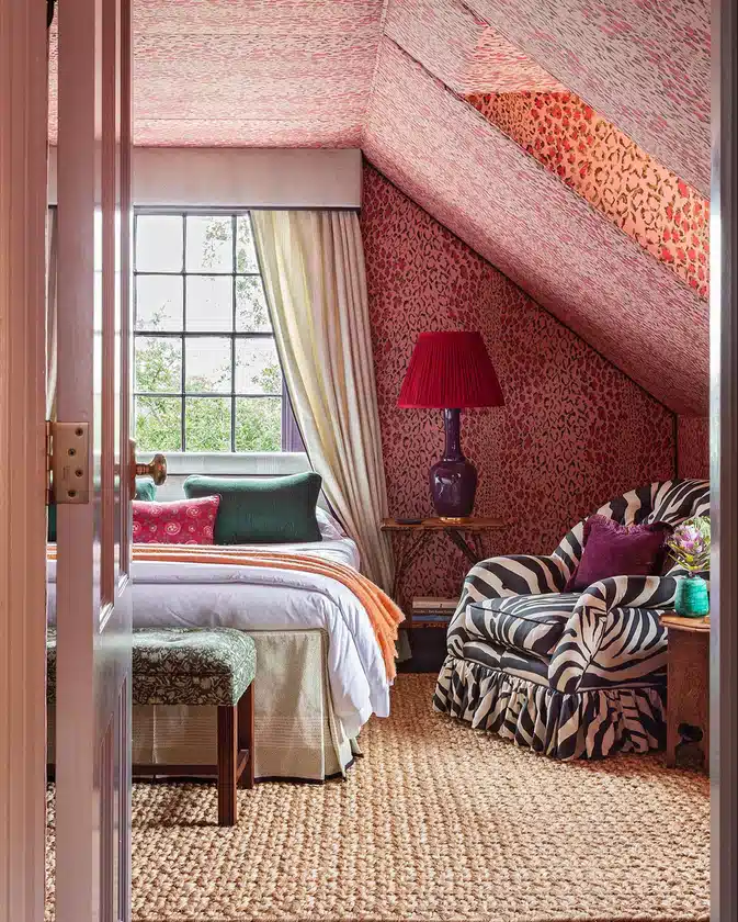
The sloped ceiling could have been treated like a problem. Instead, leopard print runs right across it and down the wall.
Bold choice, but it suits the odd shape.
The rest of the room doesn’t try to calm down completely either. There’s a zebra chair, strong green cushions, orange trim, and a red lamp.
With that much happening around it, the mostly white bed gives the room somewhere to settle.
11. Add a Soft Cream Edge
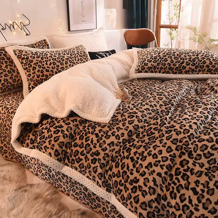
This is full-on leopard bedding, but the cream sherpa trim changes the mood.
The fluffy border cuts through the tan and black spots and makes the whole set feel softer. The pale rug beside the bed repeats that texture without adding another color.
Nothing fancy. Just a good reminder that texture can break up a strong print almost as well as a solid fabric can.
12. Go Small With the Spots
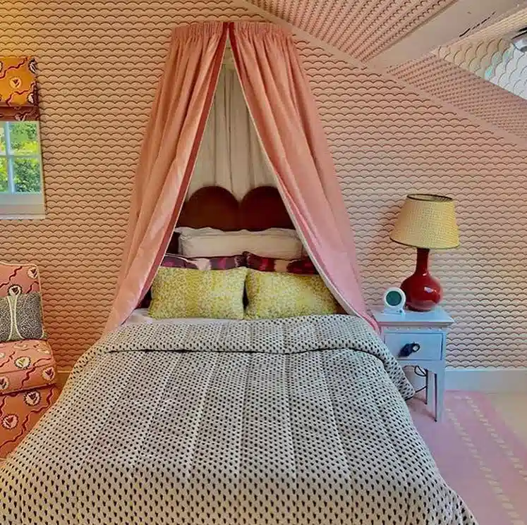
Tiny leopard-style spots are much easier to live with than a huge high-contrast print.
Here, the bedding almost reads like a neutral from a distance. That leaves room for the pink canopy, yellow cushions, patterned wall, and other colorful pieces.
A larger leopard print would compete with all of that.
For a bedroom that already has plenty going on, smaller spots make much more sense.
13. Put Leopard on the Floor
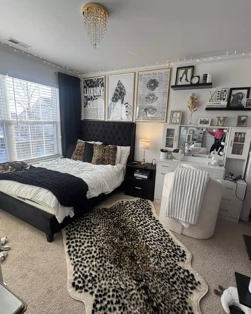
The rug is the main leopard moment here, and I think that’s enough.
A few matching pillows near the headboard connect the floor to the bed, but the duvet stays white and the furniture stays black. No leopard curtains. No leopard wall.
This approach is especially handy when you want the print to feel intentional without committing to patterned bedding every day.
The rug does the job.
14. Teal Gives Leopard More Contrast
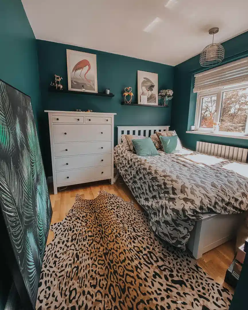
Warm tan leopard against deep teal walls is a strong pairing.
The rug looks brighter because the surrounding color is cool and saturated. White furniture then breaks up the teal before the room starts feeling too dark.
There are other animal and botanical details in the bedroom, but I wouldn’t keep adding more. The leopard rug is already the piece you notice first.
Let it be that.
15. Put the Print on Furniture
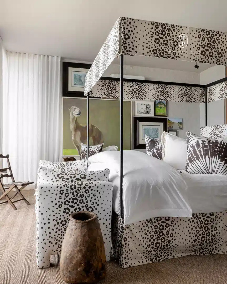
The most interesting thing here is that leopard isn’t sitting on top of the bed. It’s part of the bed itself.
The upholstered base and wide canopy border carry the black-and-white pattern, while the duvet stays clean and white. That gives the whole canopy shape more attention.
Dark bed posts sharpen the edges. Botanical pillows add a different graphic pattern without looking like more animal print.
If you ever use leopard on a large furniture piece, plain bedding is probably the safest next move.
16. One Black Bow Is Enough
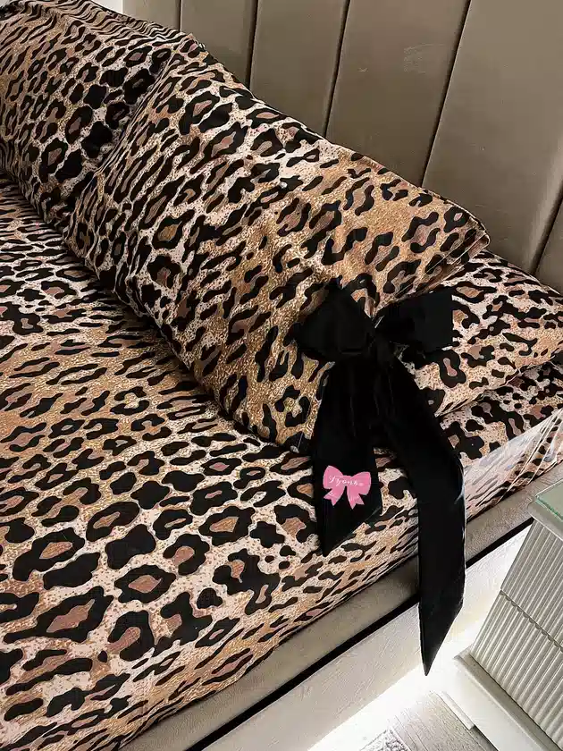
There’s leopard everywhere on this bed, so another patterned pillow would do nothing.
The oversized black bow is much better.
It interrupts the print, picks up the darkest spots, and adds one playful detail without introducing another color. The taupe headboard quietly sits behind all of it.
I’d stop there. This bed already knows what it wants to be.
17. Make Leopard Sage Green
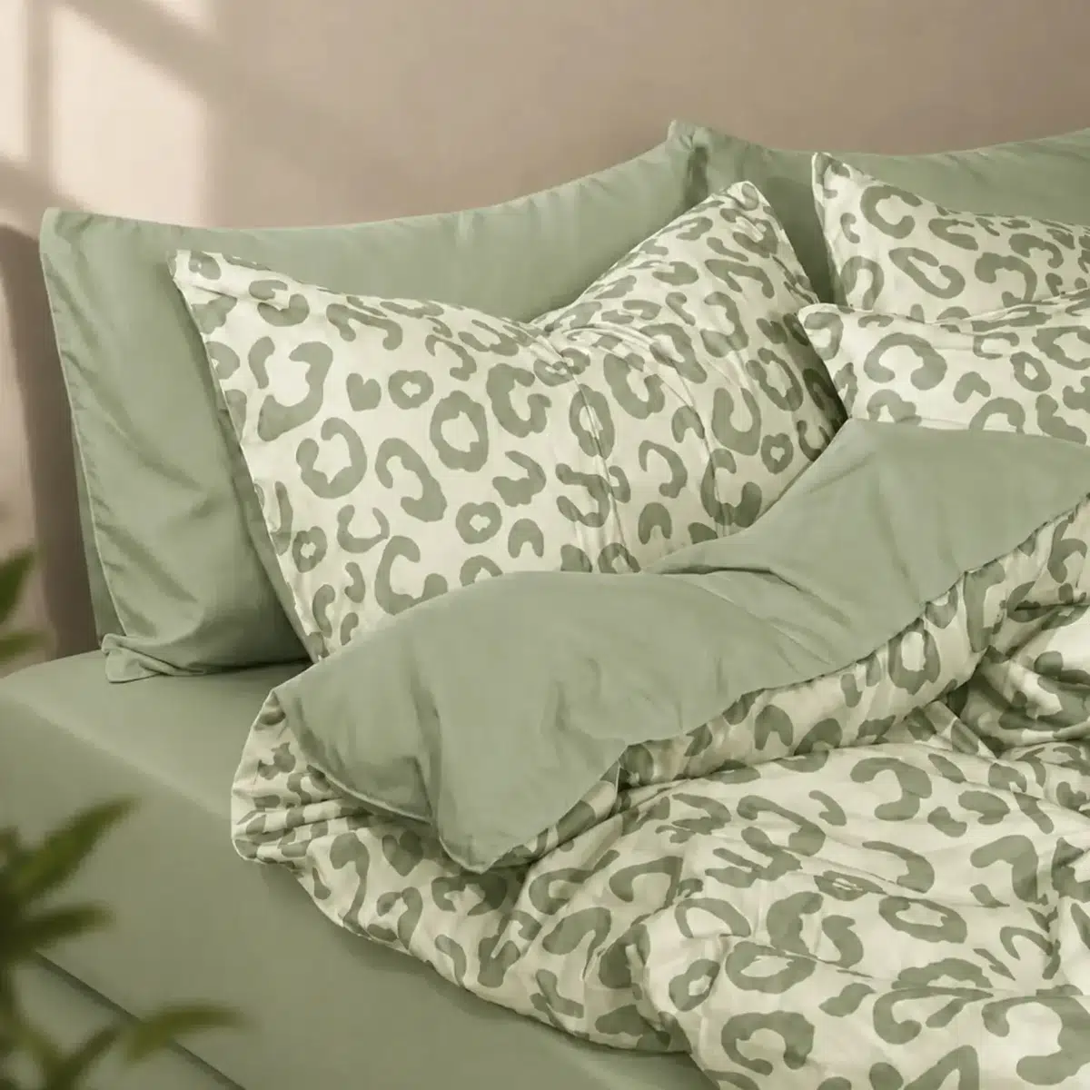
This might be the calmest leopard bedding in the group.
The spots are a muted sage and the solid pillowcases use nearly the same color, so the print doesn’t jump out from across the room. Even the cream background is soft rather than bright white.
No black outline. No warm brown. No gold.
If you want animal print but your bedroom is mostly quiet greens and neutrals, this is a much easier fit than classic leopard.
18. Emerald Velvet Loves Leopard
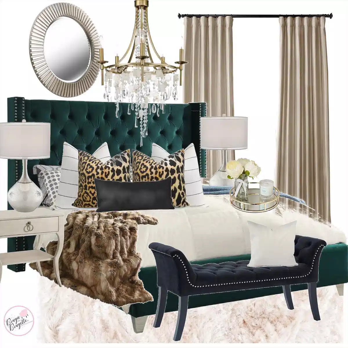
The emerald velvet headboard is doing most of the heavy lifting here.
Classic leopard pillows sit right against that deep green, then white bedding fills the rest of the bed. A plain black lumbar cushion between the patterned pillows is a small but smart pause.
Gold lighting and a brown faux-fur throw pick up the warmer side of the leopard.
I wouldn’t add leopard curtains as well. The pillows already have enough support around them.
19. Take Leopard Into Dark Glam

Leopard walls, black bedding, deep blue velvet, a dark rug, black curtains. This room isn’t trying to be subtle.
The crystal chandelier is what keeps all that darkness from becoming flat. One bright reflective piece overhead is enough.
Smaller leopard sections on the bedding repeat the walls, but most of the bed remains black and blue.
If you like this look, take the contrast more than the quantity. Dark surfaces, one strong leopard area, then a little sparkle.
20. Polka Dots Can Work Too
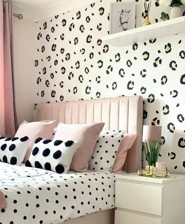
Leopard spots on the wall and polka dots on the bed could have turned into pattern overload.
The scale difference saves it.
The wall spots are larger and irregular. The bedding dots are small and neat. Blush pillows and a pale upholstered headboard sit between the two.
I wouldn’t add stripes, florals, or another print here. Two is plenty.
21. Add Blue Inside the Spots
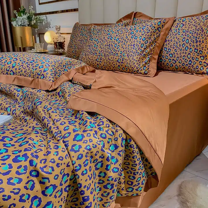
This leopard print has turquoise and deep blue worked into the pattern, which makes it feel much brighter than the classic version.
The caramel sheets are what keep the bed grounded. They match the warm base of the print without repeating all those blue spots.
The quieter caramel background is the color I’d pull into the sheets. It lets the blue stay the fun part instead of spreading across the whole bed.
22. Blush Softens Classic Leopard
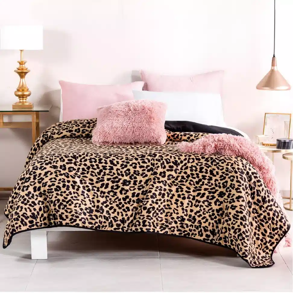
Tan-and-black leopard covers most of the bed, but fluffy blush pillows and a pink throw take some of the edge off.
The texture is important. Smooth leopard beside shaggy pink feels more layered than using another plain cushion would.
Gold lamps work naturally with the tan in the comforter, so there’s no need for another accent color.
Pink, leopard, gold. I’d leave it there.
23. Mustard Walls Do the Warming
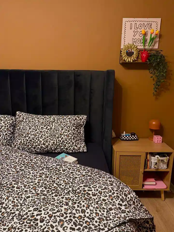
The leopard bedding has a pale background, and that keeps it from disappearing against the mustard wall.
A tall black headboard gives the bed a hard dark edge, while the wood nightstand sits closer to the wall color. Nice balance without looking overly matched.
The little orange lamp is almost unnecessary, but because it stays within the same warm family, it doesn’t hurt.
The combination is simple: warm wall, light leopard, dark headboard.
24. Navy Makes It Look Sharper
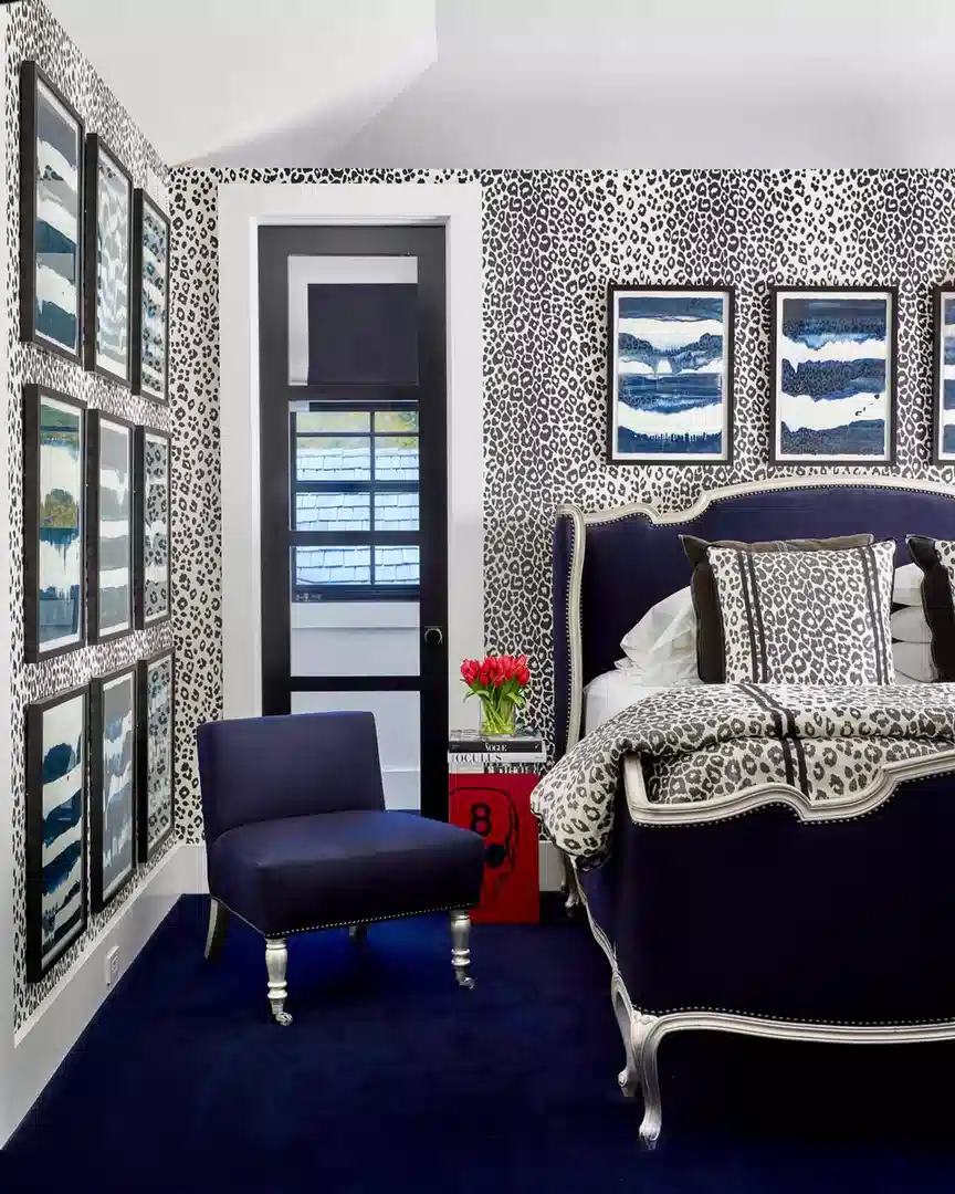
Black-and-white leopard covers a lot of this bedroom, including the walls and bedding, so the navy furniture becomes the real relief.
That dark blue bed frame and matching chair give the eye two big solid areas to rest on. The framed blue artwork repeats the navy without copying the leopard again.
I also like the thin strips of white around the pillows and bedding. Small detail, but necessary.
With this much print, I wouldn’t add one more pattern anywhere.
Final Thoughts
Leopard print doesn’t have one fixed look. It can be tan and dramatic, gray and quiet, sage green, bright blue, or almost black and white.
The easiest way to use these leopard print bedroom ideas is to decide where you want the pattern first. Bed, wall, rug, pillows, or furniture. Pick one main place, then see if the room actually needs another.
And you definitely don’t need to recreate an entire bedroom. Sometimes the best idea in the photo is just the green wall behind the leopard pillow, the plain blanket through the middle of the bed, or that one black bow. If the softer pink-and-leopard rooms were the ones you liked most, these pink bedroom ideas have more color combinations to work from.