32 Colorful Living Room Ideas That Feel Joyful, Not Chaotic
Some living rooms play it safe. These don’t.
A pink ceiling, a lime green sofa, burnt orange beside blush, deep teal walls with hot pink flowers. There are rooms here that go all in, and others that use just one strange little lamp, one patterned rug, or one painted shelf to wake everything up.
That’s what I like about these colorful living room ideas. You don’t need to copy a whole room or suddenly become brave enough for five bright walls. Start with the detail that makes you stop scrolling. A bold chair. A weirdly good color clash. A rug that makes three other shades suddenly make sense.
Take one idea. Leave the rest. That’s usually where the good stuff starts.
1. Let Deep Teal Ground Color
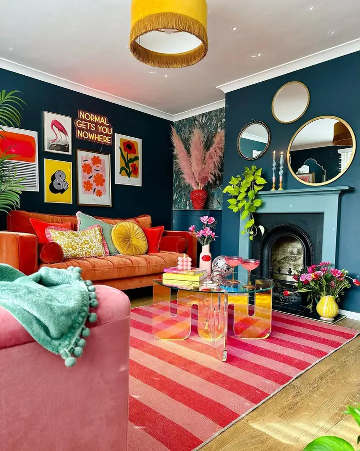
The dark teal walls are doing more work than any accessory here. Orange velvet, a pink striped rug, yellow lighting, bright prints, green plants. There’s a lot going on.
Because the walls are so deep, the brighter colors don’t float around looking random. They sit against something solid. I wouldn’t tone down the sofa or rug. The dark paint is already balancing them.
2. Let The Rug Mix Colors
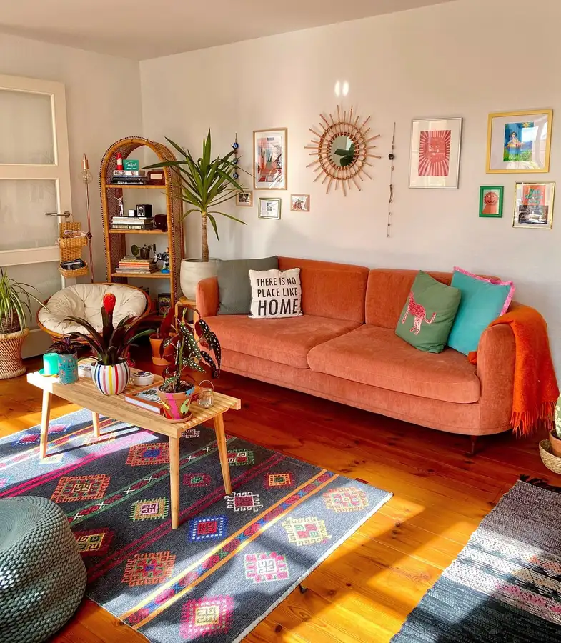
That patterned rug gives this room its color map. Orange, pink, blue, green, and red already live together on the floor, so the cushions and accessories don’t need to match perfectly.
The burnt orange sofa is the biggest block of color, but the rug is what lets everything else loosen up.
A useful idea if you’re nervous about mixing shades: start with one textile that already does it for you.
3. Color The Built-Ins Too
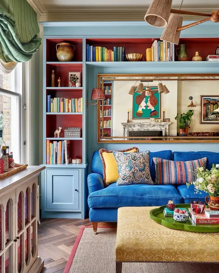
The red backs inside these pale blue shelves are such a good detail. Much more interesting than painting the whole built-in one color.
They also stop the blue sofa from carrying the entire room. Mustard on the ottoman, green at the window, patterned cushions, colorful books. The color is spread across the architecture and furniture instead of being piled onto throw pillows.
I’d copy the contrasting shelf backs first.
4. Carry Color Into Nearby Rooms
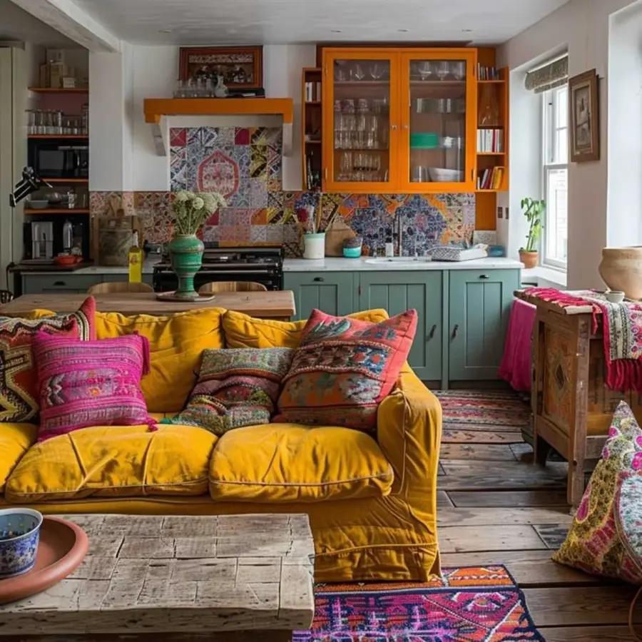
This open-plan setup feels richer because the living room and kitchen share the same color story.
Mustard on the sofa talks to the orange cabinets. The cooler teal cabinetry in the back keeps all that warmth from becoming too much. Then the cushions pull bits of those colors forward.
You don’t need both spaces to match. Just give them a few shades in common.
5. Keep The Sofa Quiet
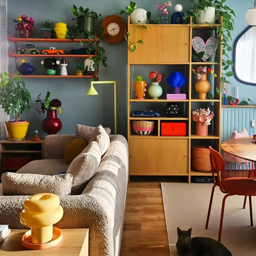
The beige sofa is almost background furniture here, and that’s useful.
Color shows up on the shelves instead. Yellow ceramics, orange objects, blue pieces, flowers, plants, a red chair. Even the lighting joins in.
If you already own a neutral sofa, I wouldn’t rush to replace it. Let the smaller things be louder. It’s cheaper, easier to change later, and this room proves it can still look very colorful.
6. Layer Pastels Over Cream
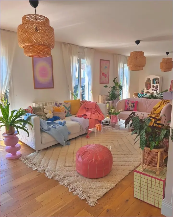
This is colorful without being loud.
Cream walls, a pale rug, and a white sofa give the pinks, blues, yellows, and lavender plenty of room. The coral pouf is probably the strongest piece, but even that still feels soft beside the rest.
Nothing complicated. A few pastel throws, cushions, art, and one brighter piece can completely change a pale room.
7. Repeat Colors Through The Artwork
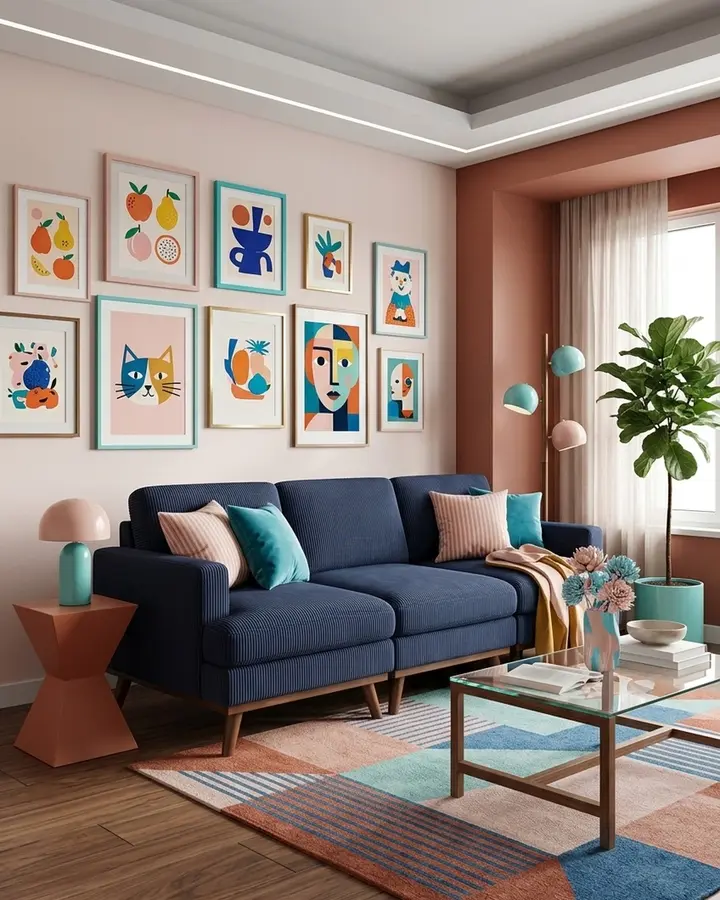
The gallery wall isn’t just filling blank space. It carries nearly every color used below it.
Teal shows up again near the cushions and lamps. Peach and pink echo the wall and rug. Deep blue connects back to the sofa.
I’d pay attention to that before buying more decor. Sometimes the easiest way to make several colors feel related is to hang art that already contains all of them.
8. Split The Wall With Color
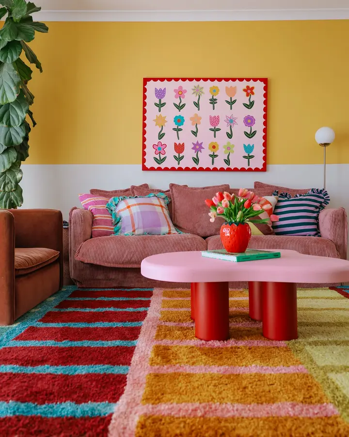
Painting only the upper half mustard was enough.
The pale section underneath stops the yellow from swallowing the room, while the pink table, red legs, striped rug, and flower artwork get to stay playful.
This would be especially handy if a full yellow room feels like too much. Paint one section strongly and leave the rest alone.
9. Pair Pink With Burnt Orange
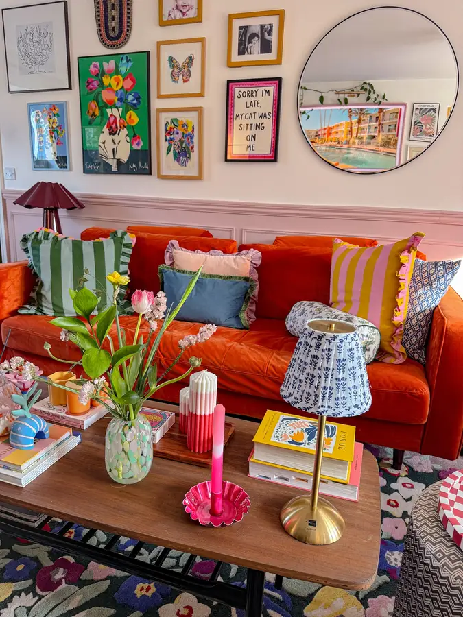
Pink paneling behind a burnt orange sofa sounds like a lot, but it works because the shades are warm neighbors.
The cushions are where things get looser. Green stripes, blue pattern, yellow and pink. None of them are trying to match the sofa exactly.
I wouldn’t buy a coordinated cushion set for this kind of room. The mixed prints are much better.
10. Hang Color Above Eye Level
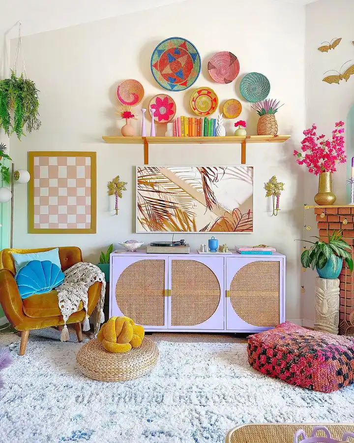
Most colorful rooms concentrate everything around the sofa and rug. This one sends color upward.
Those woven wall baskets add red, pink, turquoise, orange, and yellow above the shelf, so the top half of the room doesn’t feel empty.
Useful in a small room too. Walls can carry a lot of color without taking up another inch of floor space.
11. Mix Florals With Olive
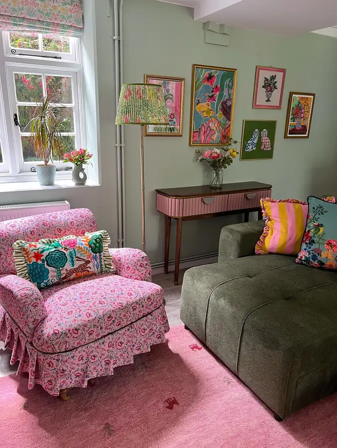
That pink floral chair could easily dominate the room. The olive sofa stops it.
One piece is busy, the other is plain. That’s enough.
The sage wall and pink rug quietly repeat both sides, while the striped cushion sneaks in some yellow. I wouldn’t add another floral chair. One is doing the job.
12. Repeat Mustard In Two Places
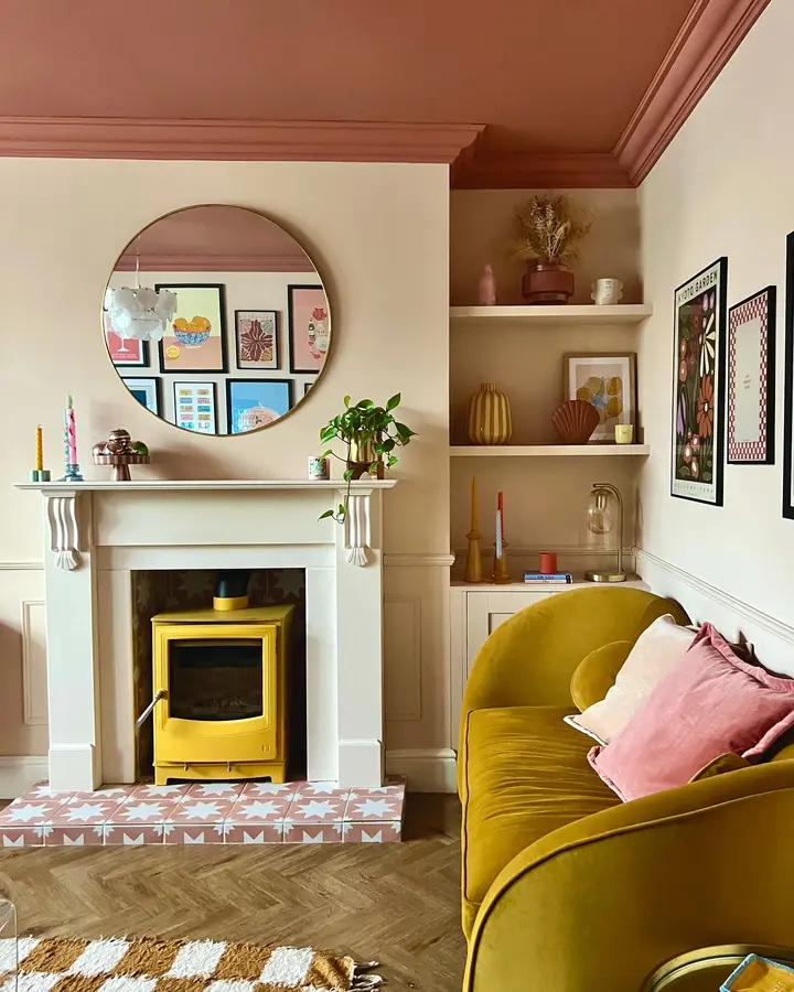
The mustard sofa and yellow stove are far apart, which is exactly why the repetition catches your eye.
You notice one, then the other.
Everything between them stays softer with cream, muted pink, wood, and terracotta. This is a nice reminder that a bold color doesn’t need to appear five or six times. Two strong repeats can be plenty.
13. Let Art Bring Color
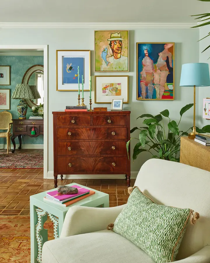
This room is a good option for someone who wants color without committing to a bright sofa.
The chair is cream. The walls are pale green. The wooden chest is dark and traditional. Then the artwork brings in blue, coral, green, pink, and yellow.
A mint side table and pale blue lampshade are enough to pull a little of that color into the room itself.
14. Use Shelves As Color
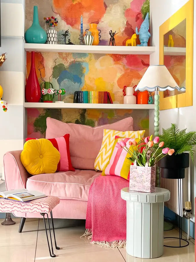
The shelf backing almost looks like a giant abstract painting.
Orange, pink, teal, yellow, and green sit behind the books and objects, so even the white shelving feels colorful. I like that the chair underneath stays a softer pink. It doesn’t compete.
This is the part worth copying: make the back of the shelves interesting, then keep the styling a bit looser.
15. Layer Pink With Greenery
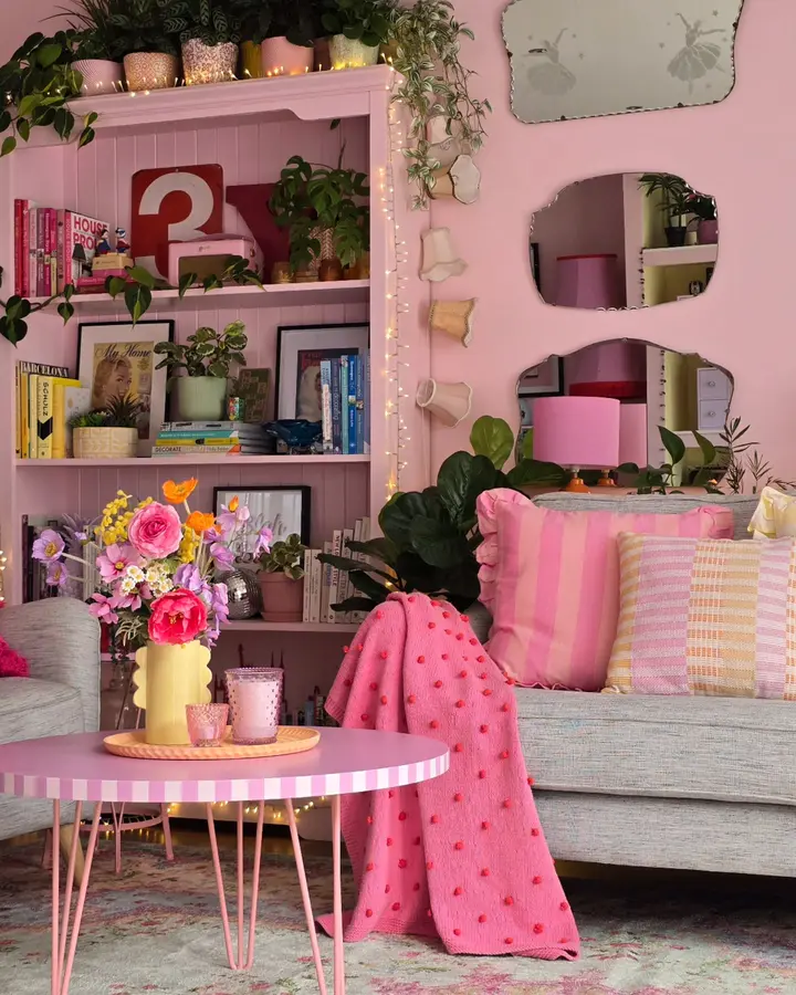
Pink is everywhere here. Walls, shelving, table, lamp, blanket, cushions.
But it doesn’t become one big pink blob because the plants cut through it with deep green leaves. The gray sofa helps even more.
If a room starts feeling too sweet, I’d add plants before adding another accent color. Green already looks at home with pink.
16. Let Orange Lead The Room
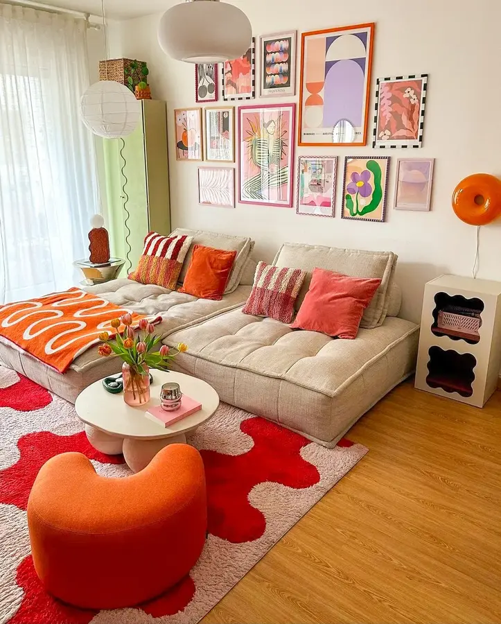
Orange is clearly in charge, but it isn’t on the biggest piece of furniture.
The sectional stays beige. Orange comes through the blanket, cushions, wall lamp, and rounded chair, with pink and lilac sitting around it.
That’s an easy setup to copy if you want one color to lead without buying a bright sofa.
17. Try Tonal Pink Walls
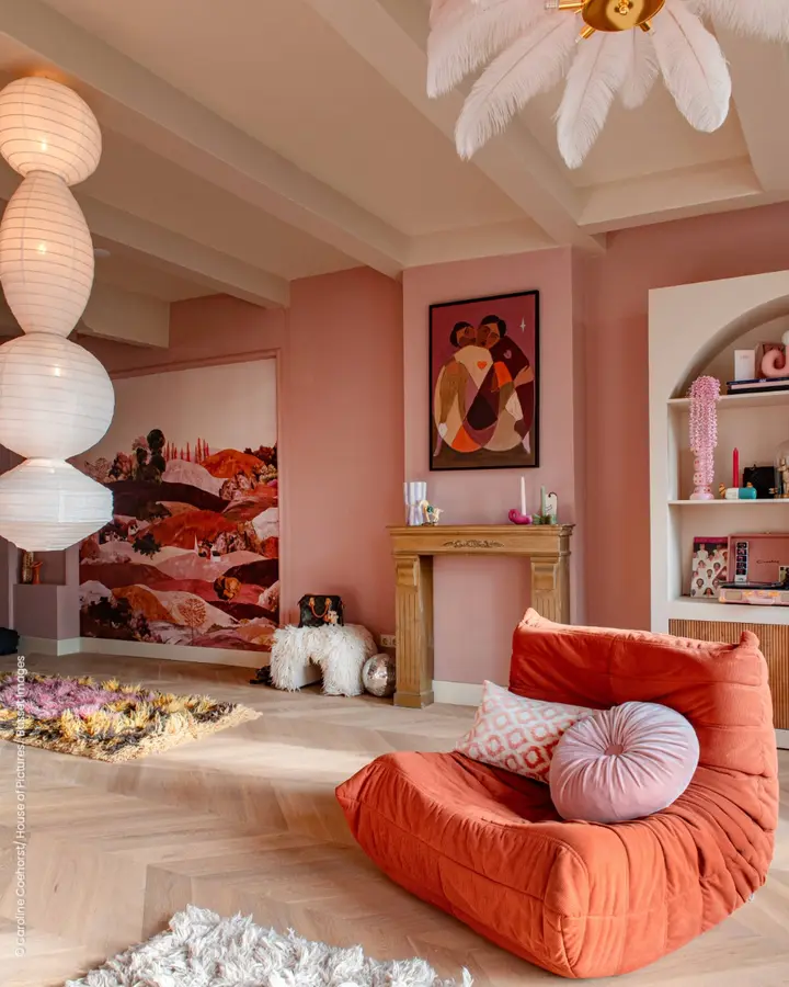
Dusty rose, coral, blush, rust. They’re all close, but not identical.
That’s why this room feels layered instead of flat. The deeper coral chair looks strong against the softer pink walls, while the pale cushions give your eye a break.
I’d keep the floor and ceiling light just like this. More pink there would probably be too much.
18. Brighten Gray With Orange
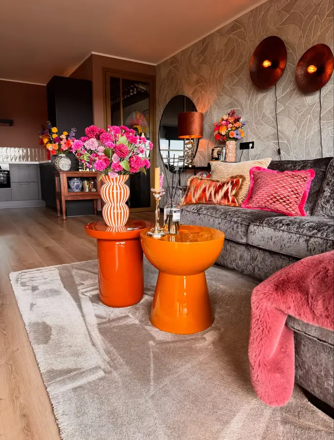
Those orange tables are the whole move.
The gray sofa and neutral rug could have made this room feel very safe, but the glossy orange pieces immediately wake it up. Hot pink flowers and cushions push it a little further.
If you already have a gray living room, start small. One bold table may do more than six new cushions.
19. Frame The Mirror In Pink
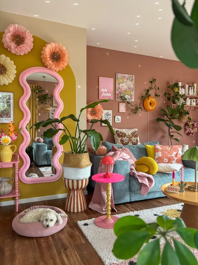
A mirror usually disappears into the room. This one absolutely does not.
That thick wavy pink frame turns it into wall decor, then the pink side table and small lamp repeat the color in quieter doses. Mustard behind the mirror makes the shape stand out even more.
Probably my favorite detail is how simple the actual furniture stays around it.
20. Outline Pink With Red
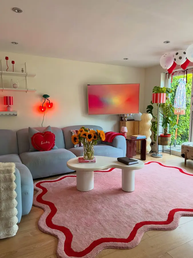
The rug could have been plain pink. The red wavy border makes it.
That stronger edge gives the floor definition and connects nicely with the red heart cushion and glowing wall light. The pale blue sofa keeps both colors from becoming too sugary.
Sometimes the border is enough. You don’t need a complicated pattern.
21. Mix Soft And Sharp Patterns
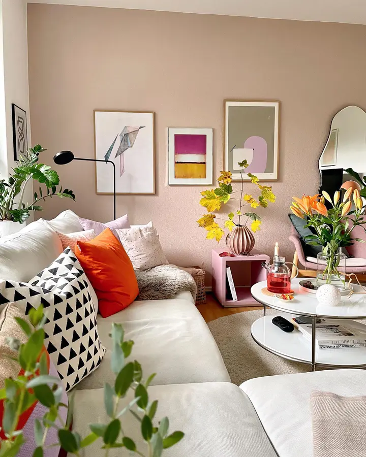
Pastel rooms can start feeling a little sleepy. The black-and-white cushion prevents that here.
Its hard geometric pattern sits against a soft orange cushion, pale pink walls, flowers, and rounded furniture. That contrast gives the softer pieces some bite.
I’d copy the cushion mix, not every color in the room.
22. Let Green Be The Anchor
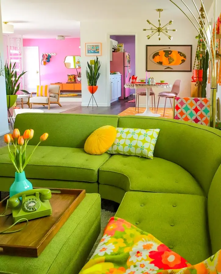
That curved green sectional is huge, bright, and impossible to ignore. Good.
Instead of fighting it, the rest of the room treats green as the starting point. Yellow, orange, pink, and turquoise appear in smaller amounts across the cushions, flowers, art, and nearby spaces.
The white walls are doing important work too. I wouldn’t paint them another strong color.
23. Ground Brights With Olive
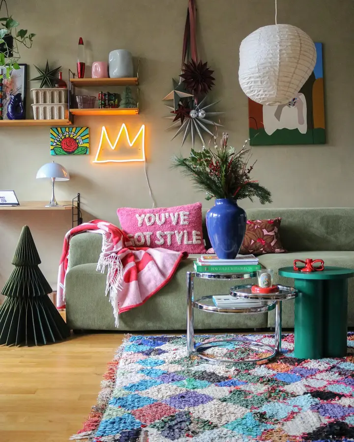
Olive is a useful color when you like bright accessories but don’t want the whole room to feel sugary.
Here it sits under pink, blue, red, green, and a very busy rug without looking dull. The sofa almost acts like a pause between all the smaller colorful things.
A good compromise room. Plenty of color, but not everything is shouting.
24. Repeat Rust And Blue
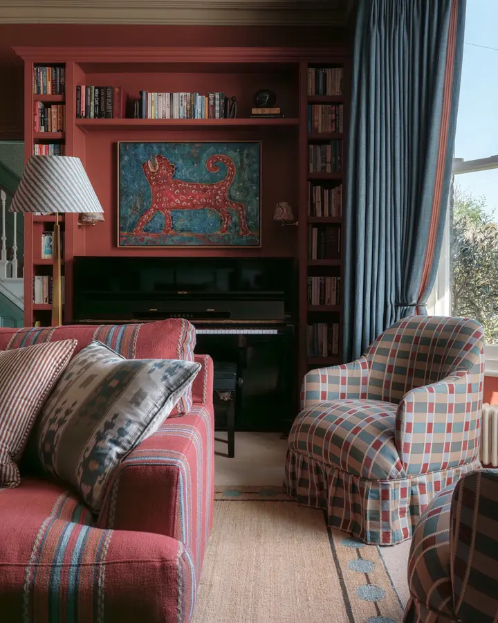
This room uses color in bigger blocks instead of tiny accents.
Rust covers the built-ins and appears again on the striped sofa. Blue moves through the curtains, plaid chair, cushions, and artwork.
The result feels richer than a room built around one accent color. Two strong families are enough. You don’t always need a rainbow.
25. Let Mustard Fill The Room
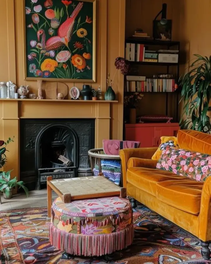
Mustard covers the walls and shows up again on the velvet sofa, so the room already feels saturated before you even reach the rug.
Then the patterns get much looser. Pink fringe, floral cushions, dark blue, green, rust, red.
I wouldn’t try to simplify those textiles. The steady mustard background is already doing that job.
26. Mix Jewel Tones Freely
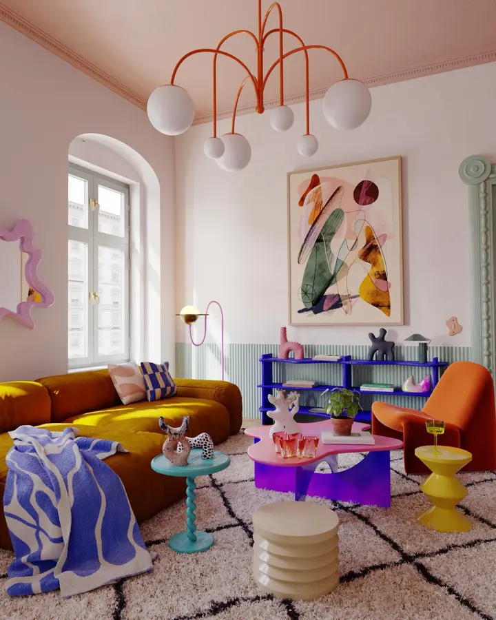
Mustard sofa. Orange chair. Violet shelving. Pink table. Turquoise side table.
None of those pieces seem interested in matching.
And that’s the point. The walls stay pale, the rug is mostly neutral, and the furniture gets to be the fun part. If you want this look, I’d spend money on two or three strong furniture colors before collecting dozens of tiny bright accessories.
27. Use Primary Colors Sparingly
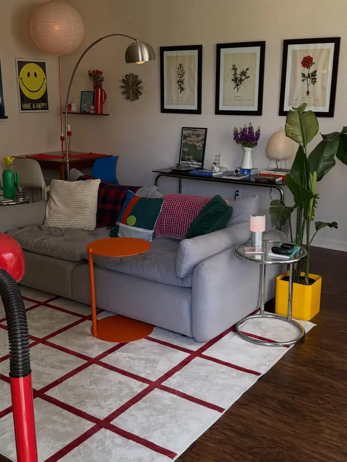
The orange side table and yellow planter are tiny compared with the gray sectional, but they completely change the room.
There’s also red in the rug, green in the cushions and plant, and blue around the dining area.
Small hits. Strong colors.
This would be easy to copy in a rental because none of the big fixed surfaces need changing.
28. Add One Unexpected Color
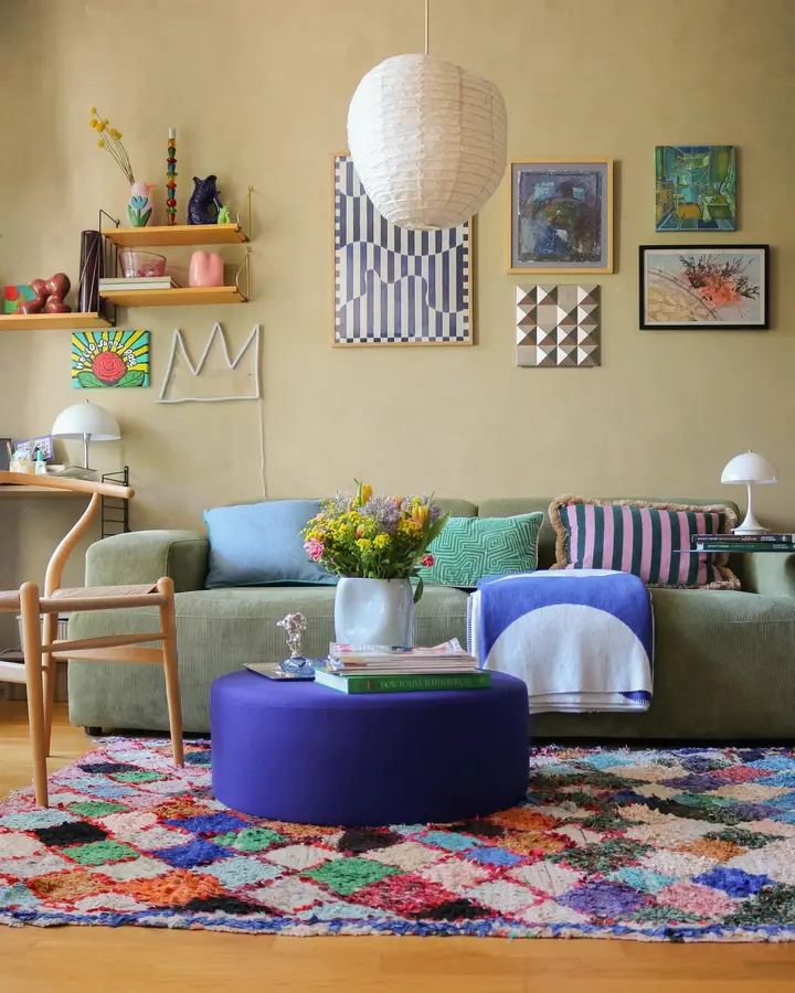
Olive, pale blue, and soft neutrals would have made sense here.
Then comes that deep violet ottoman.
I like it because it doesn’t politely blend in. The rug already contains enough blue, green, pink, orange, and red that one more strong shade feels believable. A room can survive one color that seems slightly wrong on paper.
Sometimes that’s the interesting part.
29. Pair Blue With Purple
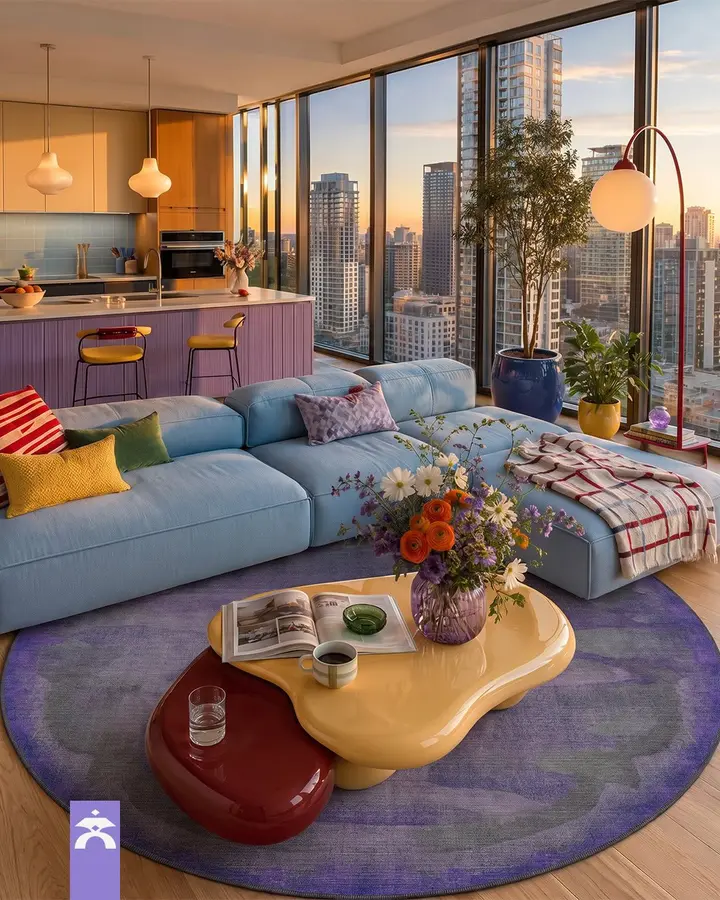
The pale blue sectional is cool and soft. The purple rug underneath is deeper and moodier.
Then the yellow coffee table breaks up both.
That three-color balance is stronger than filling the room with lots of little rainbow accents. Blue gets the sofa, purple gets the floor, yellow gets the table. Clear jobs.
30. Repeat Crochet Colors Around
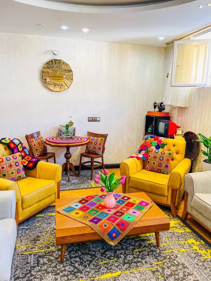
The crochet pieces make this room feel personal.
Tiny blocks of red, blue, green, orange, and pink repeat on the cushions, throws, table covering, and the small dining setup behind. Because the pattern keeps returning, the different areas feel related.
The mustard chairs are the solid pause. I’d keep those plain. Another multicolor chair would be too much.
31. Go Bold With Neon Color
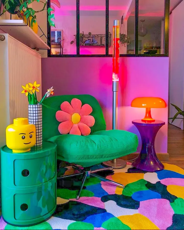
This corner is basically permission to stop being careful.
Bright green chair. Purple table. Orange lamp. Yellow decor. Hot pink light. A rug with nearly everything.
The saving grace is the furniture itself. Simple shapes, not fussy ones. The color is already enough.
If you copy this, don’t add complicated patterns to every surface too. Pick your chaos.
32. Clash Jewel Tones Confidently
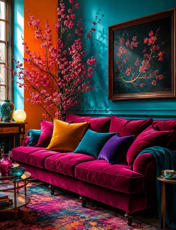
Teal walls with a magenta velvet sofa is not subtle, and it shouldn’t be.
The orange cushion, purple pillow, pink branches, and multicolor rug keep pushing the palette instead of calming it down. Even the artwork repeats the pink flowers against a dark teal background.
This is one of those rooms where timid accents would look stranger than bold ones. I wouldn’t sneak in beige cushions to “balance” it. The drama is the reason it works.
Final Thoughts
Color gets easier once you stop trying to make every shade match.
Pick the part of a room that catches your eye first and start there. Maybe it’s a mustard sofa, a bright rug, a painted ceiling, or just one oddly perfect lamp. Then give that color a little company elsewhere. If you are decorating a first home with a mix of old and new pieces, these first apartment living room ideas show how color can help mismatched furniture feel intentional.
You don’t need all 32 ideas. One good idea, used confidently, can be enough to make a living room feel completely different.