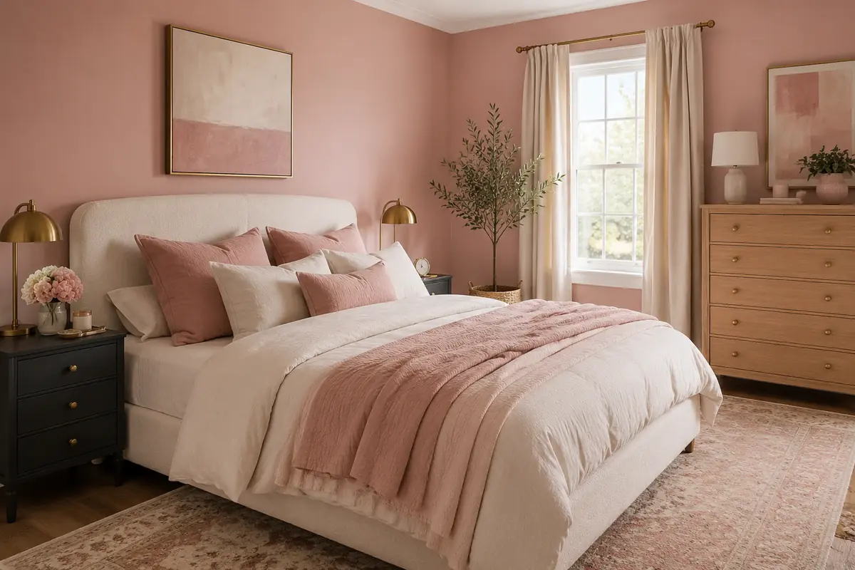
Pink Bedroom Ideas for Adults Who Want a Chic, Sophisticated Space
Pink can look polished in a bedroom, but the wrong shade or too many matching pieces can make the room feel younger than you intended.
The difference usually comes down to contrast. Black furniture gives bright pink walls structure. Crisp white makes dusty pink feel fresh, while oak warms salmon and coral shades. Even a small detail, such as a navy cushion or brass lamp, can change how the whole color scheme reads.
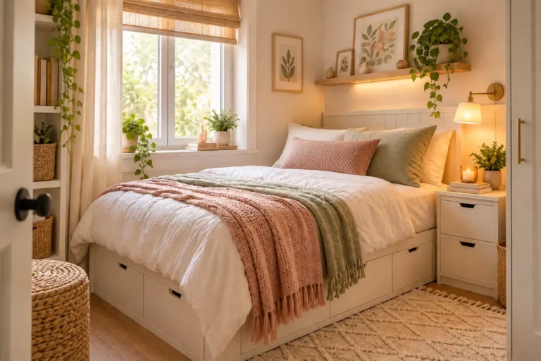
These pink bedroom ideas for adults include bold rooms, quiet blush spaces, practical home office layouts, and renter friendly updates. Some call for paint, but many rely on bedding, furniture, artwork, or fabric instead. You can use one idea as the starting point or combine details that suit the furniture you already own.
The goal is not to fill every corner with pink. It is to choose a clear focal point, add enough contrast, and leave some visual breathing room. That is what makes pink feel intentional rather than overly sweet.
1. Paint the Walls Hot Pink and Ground Them With Black Furniture
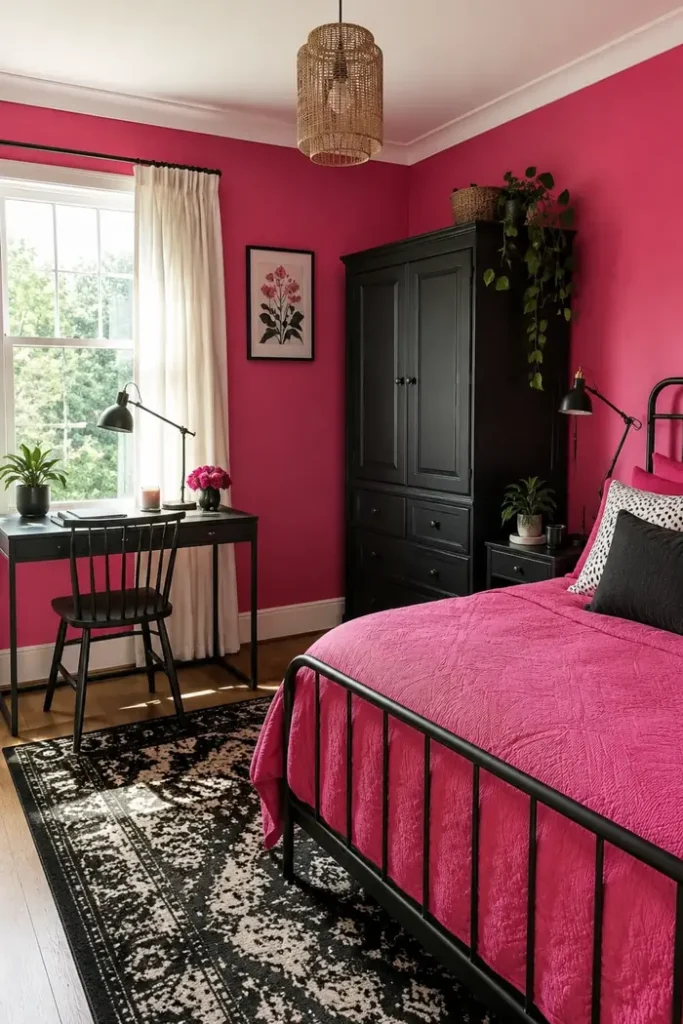
Hot pink feels far more confident when it sits beside something dark and solid.
Use matte black on the largest furniture pieces, such as a wardrobe, bed frame, desk, or chest of drawers. These strong shapes break up the pink and give your eye somewhere to rest. A black and cream rug can connect both colors without introducing another bright shade.
Keep the ceiling, trim, and window area light. This stops the saturated walls from closing in, especially in a small bedroom.
The finishing move: repeat black in two or three smaller places, such as a lamp, chair, and picture frame.
Use black on one or two substantial furniture pieces.
Keep the ceiling, trim, and curtains pale.
Do not add several other bright colors to compete with the walls.
Avoid glossy black on every surface, which can feel heavy.
2. Soften Dusty Pink Walls With Crisp White Furniture
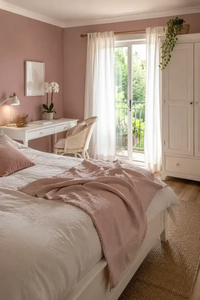
Dusty pink walls create a calmer room than bubblegum or candy pink, especially when paired with simple white furniture.
Choose white for pieces that take up plenty of visual space, such as the bed, wardrobe, desk, and curtains. The pink can then become a soft background instead of the main attraction. A rose throw or velvet cushion will connect the bed to the walls without making everything match.
Warm white usually works better than a sharp blue white. It keeps the room comfortable in evening light and sits more naturally beside muted pink.
A little greenery stops the pale scheme from looking washed out.
| Warm White | Stark White |
|---|---|
| Feels soft beside dusty and muted pink | Creates a sharper, cooler contrast |
| Works well with cream, beige, and oak | Works well with gray, black, and chrome |
| Best for a relaxed and comfortable room | Best for a clean modern room |
3. Pair Blush Built Ins With Navy Details and Brass Hardware
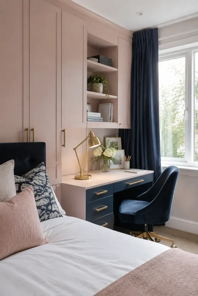
A bedroom office can feel disconnected when the desk looks like it was squeezed into the last open corner. Matching blush built ins solve that problem by making the work area part of the room.
Use blush on the cabinets and desk surround, then introduce navy through the drawers, chair, curtains, or pillows. Navy brings enough depth to keep the pink mature, while brass handles and a warm metal lamp lift both colors.
Keep the bed quiet: plain white bedding with one blush cushion and one patterned navy pillow is enough.
This idea works especially well when storage needs to fit around a window or beside the bed.
4. Warm Salmon Pink With Natural Oak and Vintage Florals
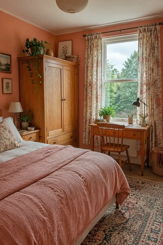
Salmon pink has a warm, earthy quality that suits older furniture beautifully.
Instead of replacing an oak wardrobe or wooden chair, let its grain become part of the scheme. Add a faded floral curtain, an aged rug, and simple white trim. These softer patterns keep the room collected without turning it into a themed vintage bedroom.
Avoid matching every wood finish. A slightly darker chair beside a lighter wardrobe often looks more natural than a full furniture set.
One useful limit: keep the bedding mostly plain. A washed pink quilt gives the eye a quiet area between the patterned rug and curtains.
Pieces that build this look
5. Use a Muted Rose Wall Behind a Neutral Upholstered Bed
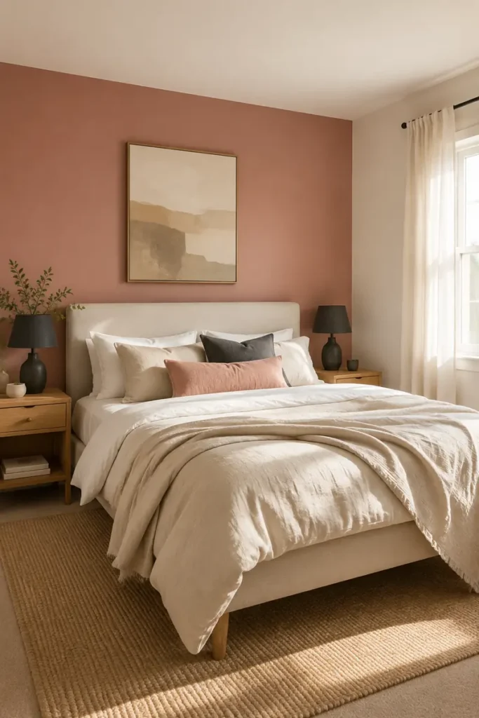
One rose wall can give the bed a clear focal point without surrounding you in pink.
Paint only the wall behind the headboard, then keep the other walls warm cream. An oatmeal, beige, or soft gray upholstered bed will stand out gently against the rose without creating a hard contrast. Repeat the wall color through one lumbar cushion or a throw folded near the foot of the bed.
Choose artwork that is narrower than the bed so the arrangement feels contained.
This approach is useful when you want color but still own neutral furniture, curtains, and rugs. Most of the room can stay exactly as it is.
The neutral bed blends into the wall, and small artwork appears to float above it.
The rose wall frames the bed, while neutral upholstery and bedding keep the focal point calm.
6. Color Drench the Room in Clay Pink From Walls to Trim
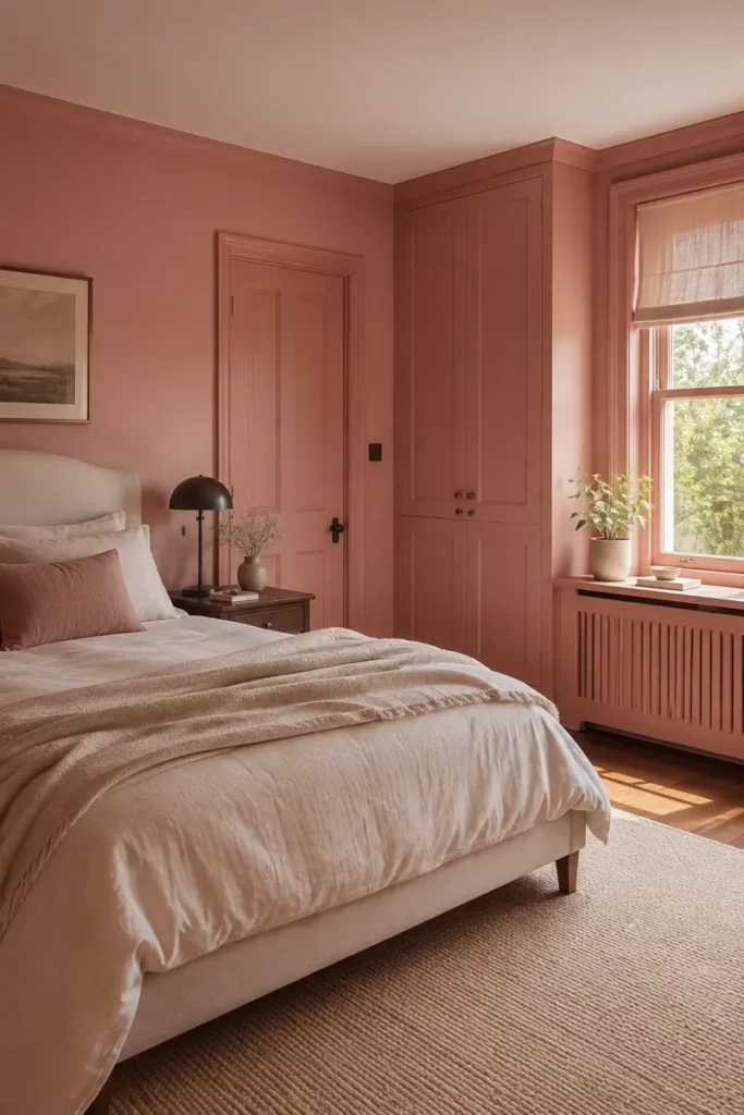
Color drenching does not mean choosing the loudest pink in the shop. Clay pink works because its brown undertone feels warm and settled.
What should match? Cover the walls, skirting boards, doors, and fitted cupboards in the same color. Removing bright white outlines gives the room a more connected appearance.
What should change? Use a tougher eggshell finish on doors and trim while keeping the walls matte. The small change in sheen prevents the room from looking flat.
Break up the pink with oatmeal bedding, dark wood, and one cream rug. The color remains bold, but the room still has places for the eye to rest.
Test a clay pink. View the sample beside your flooring and bedding during the day and at night.
Choose two finishes. Use matte on the walls and eggshell on woodwork.
Paint in sections. Complete the ceiling line, walls, trim, and doors in a sensible order.
7. Paint the Ceiling Pink and Leave the Walls Warm Cream
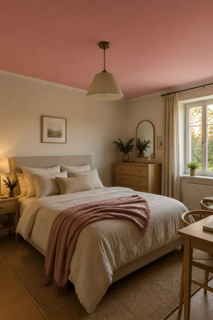
At bedtime, a pink ceiling is visible without surrounding the whole room in color. It creates a softer focal point than a bright feature wall and leaves plenty of freedom for neutral furniture.
Choose a dusty or muted pink rather than a very pale blush. A shade with enough depth will look intentional beside cream walls and white trim.
Works best with: simple bedding, low furniture, and a ceiling light that casts a warm glow.
Use caution in: rooms with very low ceilings or little daylight. Test a large sample overhead first because paint often appears different on a horizontal surface.
Keep the walls quiet and let the color above do the work.
Repeat the ceiling color only once below eye level, perhaps in a throw or cushion. That single link makes the ceiling feel connected to the room.
8. Create a Raspberry Half Wall With a Slim Picture Ledge
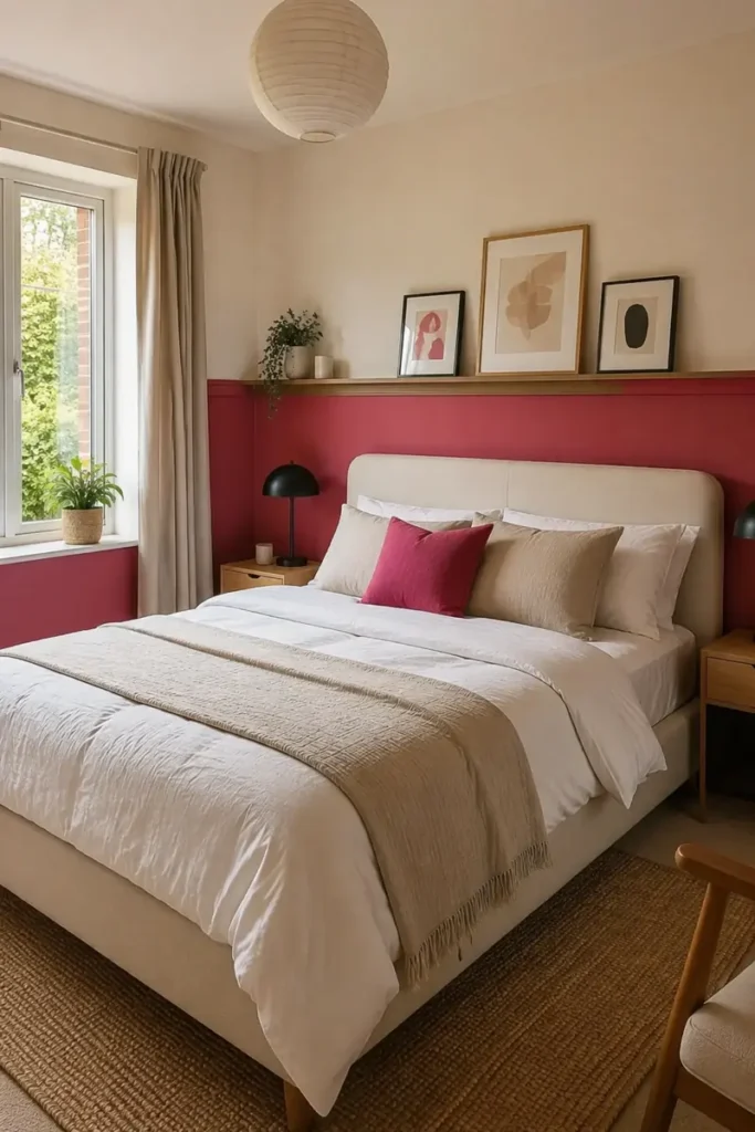
A two color wall looks deliberate only when the dividing line relates to something else in the room.
Use a simple sight line test:
- Check the height of the headboard.
- Notice where the window sill sits.
- Mark the position of nearby switches and sockets.
- View the proposed line while standing at the doorway.
Paint raspberry below the line and warm cream above it. A narrow picture ledge placed directly over the divide hides minor paint imperfections and gives you space for small framed art.
Keep the frames similar in color but vary their heights. The room gains movement without asking the wall color to carry every detail.
📏 Measuring Tip
Mark the proposed line with low tack tape across the full wall. Live with it for a day before painting, then check how it meets the bed, door, and window.
9. Add Cloudy Depth With a Soft Pink Limewash Finish
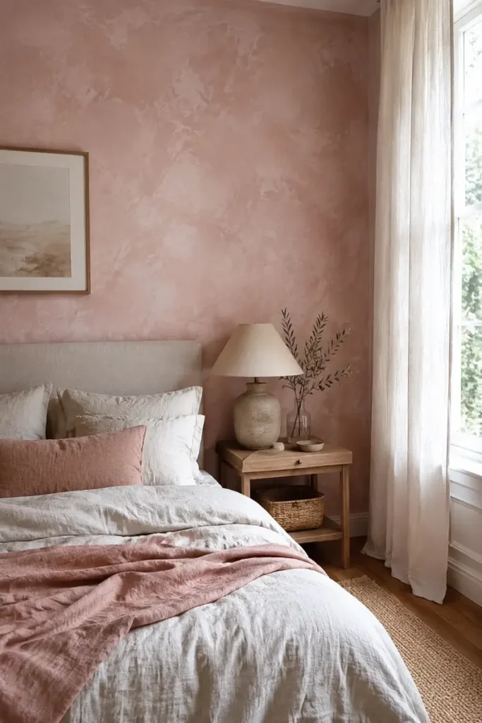
Soft streaks, lighter patches, and visible brush movement give a pink wall more depth than one flat coat of paint.
Limewash suits bedrooms that already contain natural materials. Linen bedding, pale wood, woven baskets, and handmade pottery sit comfortably beside its uneven surface. Keep the artwork sparse so some of the cloudy finish remains visible.
Best setting: a wall that receives gentle side light during part of the day.
Small warning: limewash behaves differently on different surfaces and may need a suitable primer. Test the full system on a sample board before covering the wall.
The slight variation is the point, so do not chase a completely uniform result.
10. Choose a Small Scale Botanical Wallpaper for One Wall
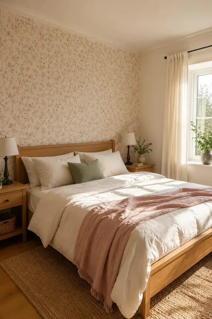
Pink floral wallpaper does not have to look busy or old fashioned. The scale and contrast matter more than the flowers themselves.
Start with the pattern, then pull the rest of the room from it. Use the background color for the plain walls, the leaf color for one cushion, and the deepest flower color for a lamp or artwork.
A small bedroom usually handles a low contrast pattern more easily than large flowers with sharp outlines. Place it behind the bed so furniture covers less of the design.
Let the wallpaper be the room’s main pattern. Plain curtains and bedding will keep the wall readable instead of burying it under more prints.
- ▸Pattern scale: small enough to read as texture across the room
- ▸Background: cream, faded blush, or warm beige
- ▸Leaf color: muted green, gray, or soft brown
- ▸Supporting fabrics: mostly plain with visible texture
11. Bring Pink In Through a Channel Tufted Headboard
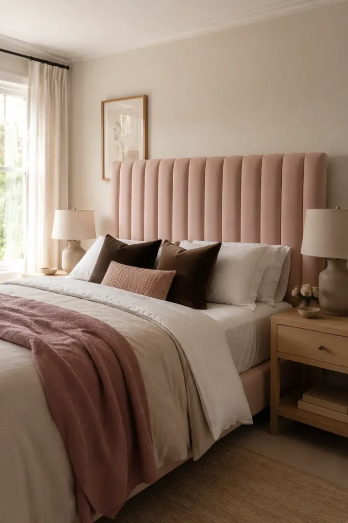
A blush headboard brings pink close to the bed without asking you to repaint the room.
Choose vertical channels if the ceiling feels low. The upward lines draw attention above the pillows, while a wide headboard makes the bed feel properly anchored. Velvet gives richer color, while woven fabric creates a quieter finish.
Keep the wall behind it cream, beige, or soft gray. Then repeat the blush once through a throw placed near the foot of the bed.
Best placement: allow the headboard to extend slightly beyond the mattress, but not so far that it crowds the bedside tables.
The headboard should be the pink focal point, not the start of a matching furniture set.
A plain bed blends into the neutral wall, while the pillows carry all the visual weight.
A tall blush headboard frames the bed, introduces pink, and makes simple neutral bedding feel intentional.
12. Layer White Sheets With Dusty Rose Linen and One Dark Cushion
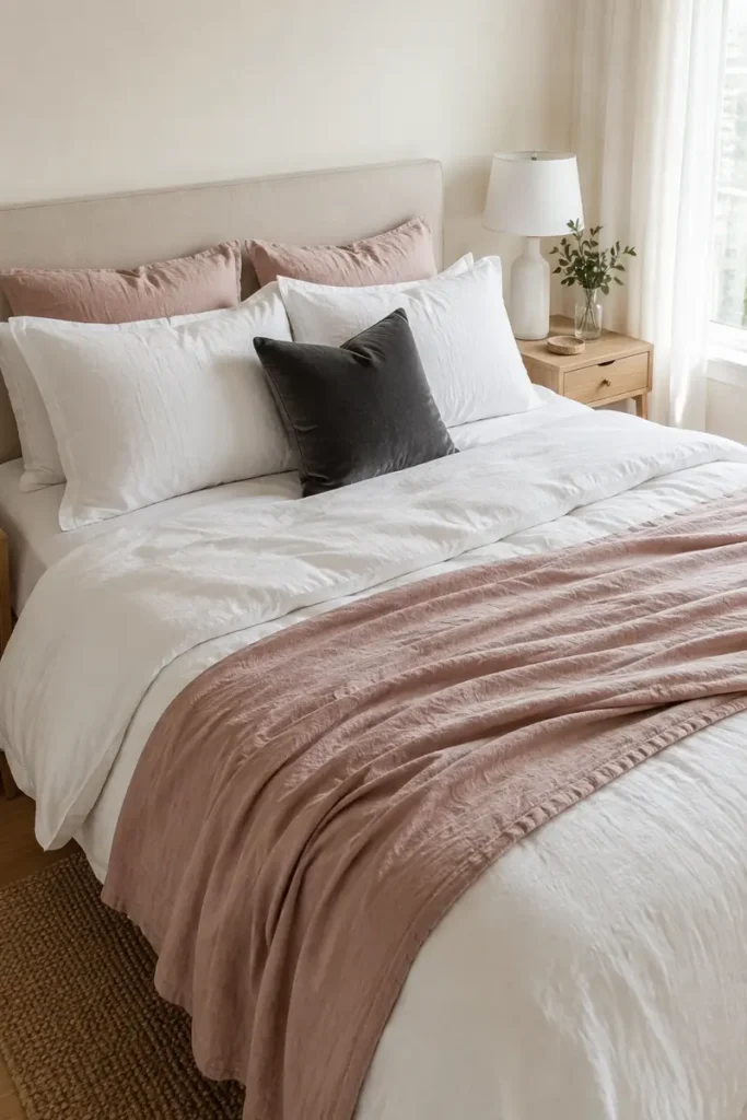
Build the bed in a clear order instead of adding pink pillows until it feels finished.
- Begin with clean white sheets and pillowcases.
- Add a cream or oatmeal duvet for warmth.
- Fold a dusty rose linen throw across the lower third.
- Finish with one charcoal, burgundy, or deep brown cushion.
The dark cushion may be small, but it gives the pale layers an ending point. Place it in front rather than hiding it behind several blush pillows.
Let some of the white bedding remain visible. That breathing room is what makes the rose layer noticeable instead of allowing it to disappear into a fully pink bed.
Bedding materials to combine
13. Build a Tonal Pink Bed With Velvet, Linen, and Bouclé
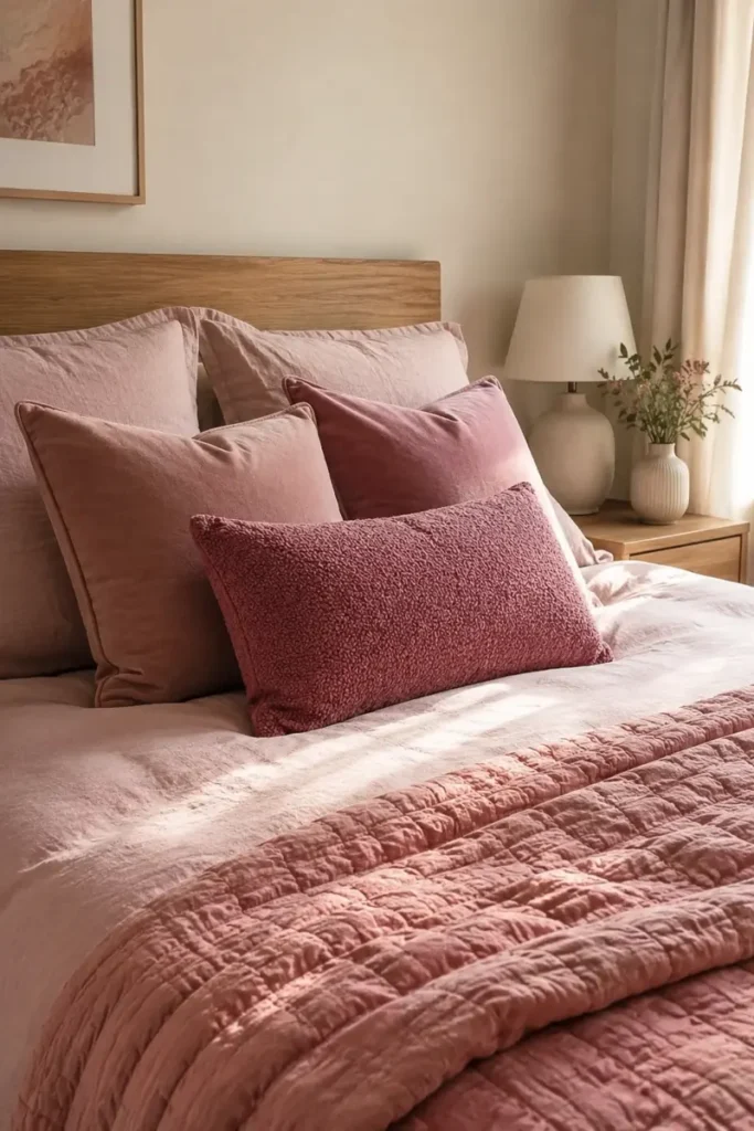
Three pink fabrics can look more interesting than three noticeably different pink colors.
Stay within a close family of dusty rose, muted blush, and faded raspberry. Then let texture create the separation. Linen appears relaxed and slightly uneven. Velvet catches the light, while bouclé brings a soft, nubby surface.
Place the smoothest fabric at the back and the strongest texture near the front. This keeps every layer visible when you look at the bed from the doorway.
A quick test helps: take a phone photo in black and white. If the layers still look different, you have enough contrast in texture and depth.
14. Balance Pink Florals With Tailored Stripes and Checks
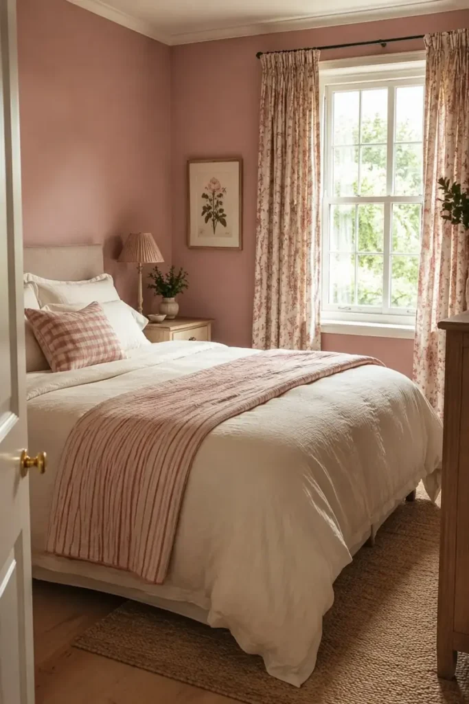
Florals begin to feel overly sweet when every patterned surface curves, trails, and repeats the same type of flower.
Choose one floral as the lead pattern. It might appear on the curtains, a quilt, or the wallpaper, but it does not need to cover all three. Then bring in a narrow stripe or small check to give the scheme a straighter edge.
Keep both patterns connected through one shared color, such as dusty pink, cream, or muted green.
The final layer should be plain. Solid sheets, a simple rug, or unpatterned walls leave enough quiet space for the floral and tailored pattern to remain easy to read.
| Pattern | Give It This Job |
|---|---|
| Floral | Use as the main pattern on one large surface |
| Stripe | Add structure through one pillow or folded blanket |
| Small Check | Use as a quiet supporting pattern on a cushion or chair |
15. Sharpen a Pink Room With Matte Black Frames and Lighting
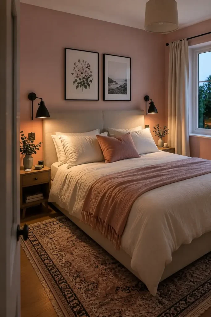
The common mistake is adding black everywhere once a pink room starts to feel too sweet.
Black works better as a thin outline than as another large color block. Use it around artwork, on a bedside lamp, and perhaps on a curtain pole. These repeated lines give the room definition without competing with the bed or walls.
Look at the room from the doorway. If one side holds every dark detail, move a frame or lamp across the room to restore balance.
Avoid mixing several black finishes. Matte black is quieter than glossy black and sits comfortably beside linen, wool, light wood, and muted pink paint.
Three well placed accents are usually enough.
Repeat matte black at low, middle, and upper eye levels.
Choose slim frames and lamps with simple shapes.
Do not cluster every dark object on one side of the bed.
Avoid adding black furniture only because the room needs contrast.
16. Use Charcoal Gray to Cool Down Sweet Blush Tones
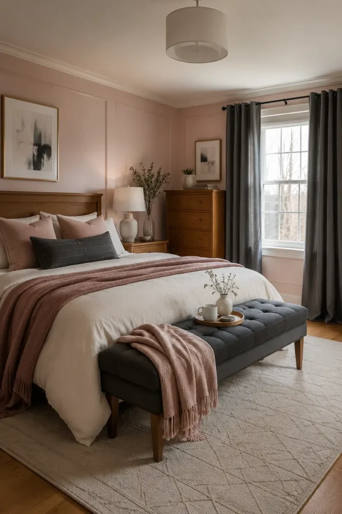
Blush can start looking sugary when it sits beside bright white, pale pink, and other delicate colors. Charcoal gives it a firmer edge.
Use gray on soft pieces rather than covering another wall. A charcoal quilt, upholstered bench, or pair of curtains creates depth while keeping the pink paint visible.
For a smaller adjustment, choose:
- One dark lumbar cushion
- A gray bedside lamp
- Artwork with charcoal lines
- A rug with a faded gray border
Avoid blue gray if the blush has a warm peach undertone. A warmer charcoal usually connects more naturally with cream bedding, beige carpet, and wooden furniture.
The room should feel grounded, not divided into separate pink and gray halves.
🎨 Undertone Check
Place the charcoal sample beside the pink wall. If the gray suddenly appears blue or purple, try a warmer charcoal with a slight brown undertone.
17. Pair Powder Pink With Sage Green and Warm Wood
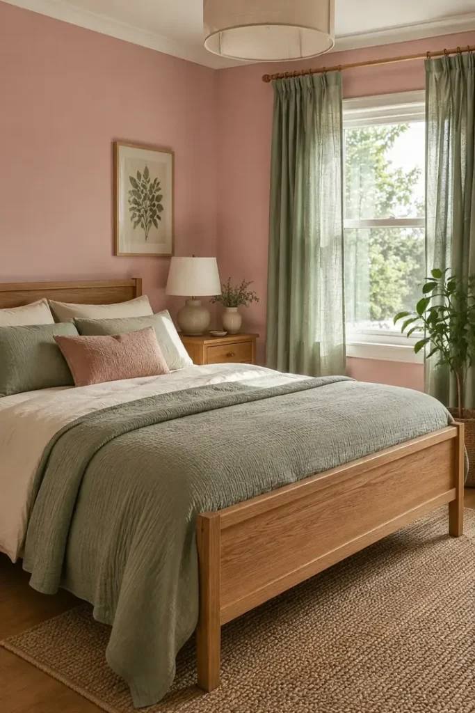
Powder pink becomes quieter beside sage green. Add warm wood, and the room begins to feel connected to nature rather than built around a single pastel.
Give each color a different surface. Pink can cover the walls, sage can appear in curtains or bedding, and oak can handle the furniture. Keeping those roles clear prevents the palette from becoming spotty.
A little variation in the green is useful. Combine one solid sage fabric with a leafy plant rather than trying to match them exactly.
Finish with cream sheets and a simple woven rug. They provide a neutral bridge between the painted walls, green textiles, and natural wood grain.
18. Mix Rose Pink With Deep Burgundy for a Cocooning Bedroom
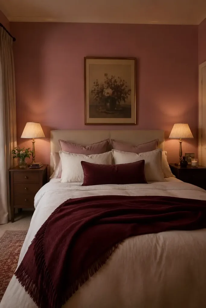
Use burgundy like punctuation. A little gives the room definition, while too much can hide the softness of rose pink.
Bring it into three contained areas:
- A velvet cushion near the center of the bed
- A narrow border inside the rug
- One lampshade or small upholstered stool
Keep the largest fabric surfaces rose, cream, or oatmeal. This allows burgundy to create depth without making the bedroom feel dark.
Warm lighting matters here. A shaded bedside lamp is kinder to these red based colors than a very cool bulb.
If the room already has dark flooring or a heavy wooden wardrobe, use only one or two burgundy details rather than all three.
- ▸Best fabric: velvet, wool, or heavy woven cotton
- ▸Best placement: below eye level and close to the bed
- ▸Best neutral: warm cream rather than bright white
- ▸Best wood: walnut, medium oak, or another warm finish
19. Combine Blush With Chocolate Brown for a Grown Up Look
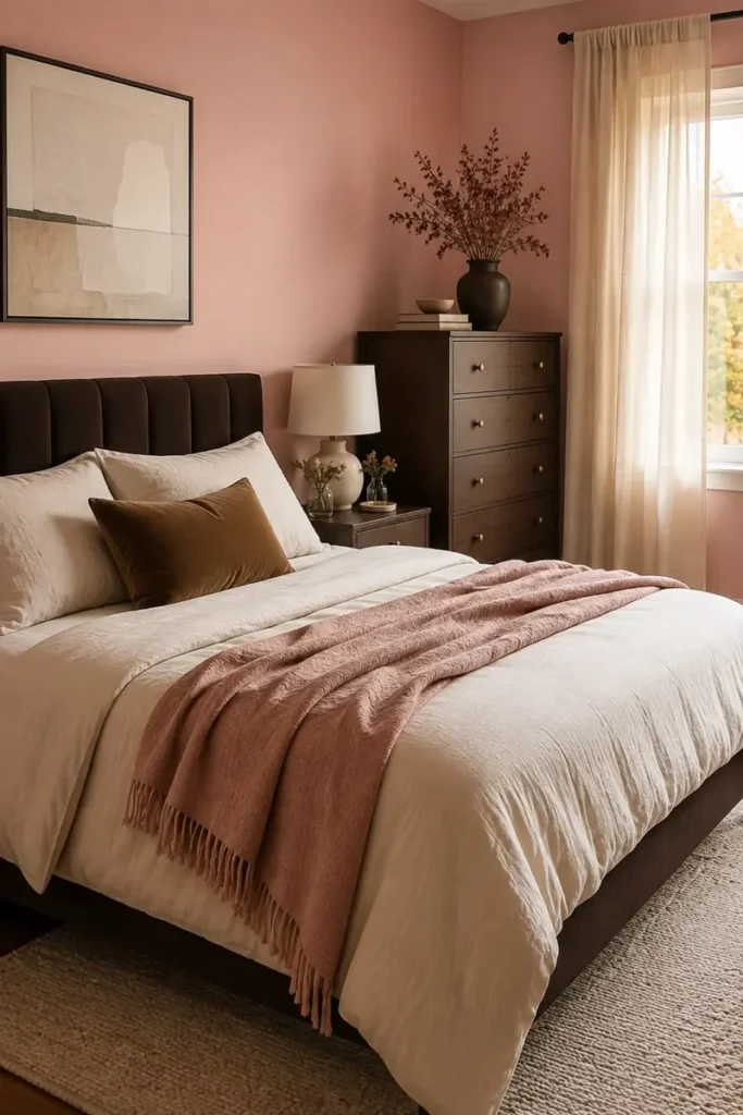
Can chocolate brown work in a pink bedroom? Yes, especially when black feels too sharp and gray feels too cool.
Blush and brown share a warm quality, but they still need a pale buffer. Cream bedding, a light rug, or oatmeal curtains keep the two colors from becoming muddy.
Begin with one brown anchor. A walnut headboard, dark wooden dresser, or chocolate upholstered bench is enough. Then repeat the color through one smaller detail, such as a cushion or picture frame.
Avoid reddish wood beside peachy pink if both colors are highly saturated. Muted blush and deep natural brown create a calmer contrast.
This pairing looks strongest when the materials have visible texture and grain.
Use chocolate brown as the anchor, blush as the softer color, and cream as the space that lets them breathe.
20. Blend Coral Pink With Terracotta and Rusty Red
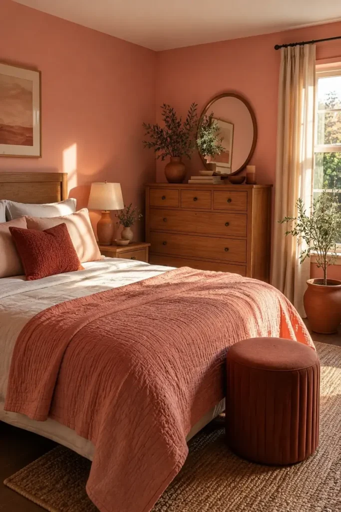
Coral, terracotta, and rust sit close together, but they should not all compete for the same job.
Let coral provide the brighter lift through paint or bedding. Terracotta works well on matte pottery, a small rug, or an upholstered stool. Save rusty red for the smallest details because it carries the most visual weight.
Natural linen and warm white keep the scheme from becoming too orange. Medium oak, walnut, and woven fibers also suit these earthy pinks.
Check the colors in evening light before buying several pieces. Warm bulbs can deepen all three shades.
The room should show a clear change from light coral to deep rust, not three nearly identical reddish pinks.
| Color | Best Role in the Room |
|---|---|
| Coral Pink | The lighter lead color for walls, a quilt, or curtains |
| Terracotta | The earthy middle tone for pottery, a rug, or a stool |
| Rusty Red | The deepest accent for one cushion, artwork, or lamp |
21. Keep the Room Minimal With Shell Pink, Cream, and Pale Oak
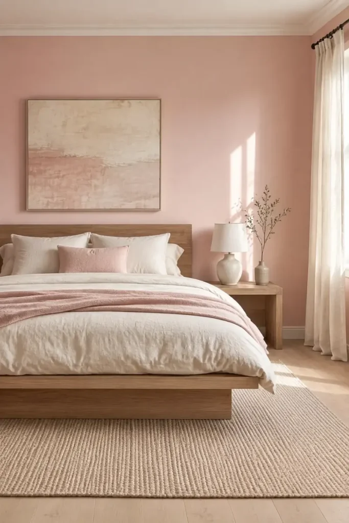
A minimal pink bedroom needs fewer objects, but the remaining pieces must have enough texture to keep the room comfortable.
Use shell pink on the walls, cream on the bed, and pale oak for the main furniture. Stop introducing new colors once those three are working together.
Instead, create interest through small material changes:
- Smooth painted walls
- Rumpled linen bedding
- Visible oak grain
- One tightly woven rug
Leave the bedside tables partly empty and choose one larger artwork instead of several small frames. A lamp, book, and simple branch in a ceramic vase are plenty.
The calm feeling comes from open space, not from filling the room with pale decorations.
22. Fit a Window Desk Into a Small Pink Bedroom
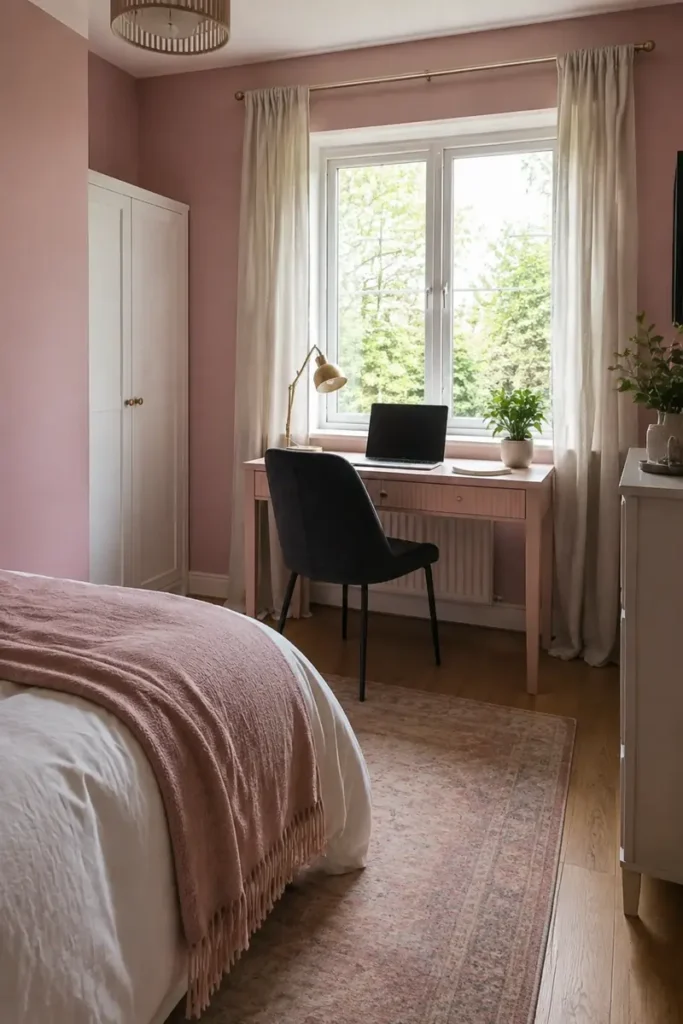
The strip beneath a bedroom window often sits unused while a bulky desk crowds another wall.
A shallow desk can turn that awkward space into a bright work area. Choose a top that fits between the curtains rather than stretching across the whole wall. This leaves room for fabric to hang freely and prevents the desk from blocking radiator controls.
Sit at the proposed position before buying anything. Check the window handle, curtain movement, plug sockets, and the space needed to pull out the chair.
Keep the desktop close to the wall color. A dusty pink or warm white desk visually recedes, while a dark chair provides enough contrast to define the work zone.
Mark the width. Leave clear space for curtains, radiator valves, and nearby drawers.
Test the depth. Use tape on the floor to check that the chair will not block the walkway.
Plan the cables. Keep chargers tidy and away from curtains or heat sources.
23. Frame the Bed With Pink Built Ins for Hidden Storage
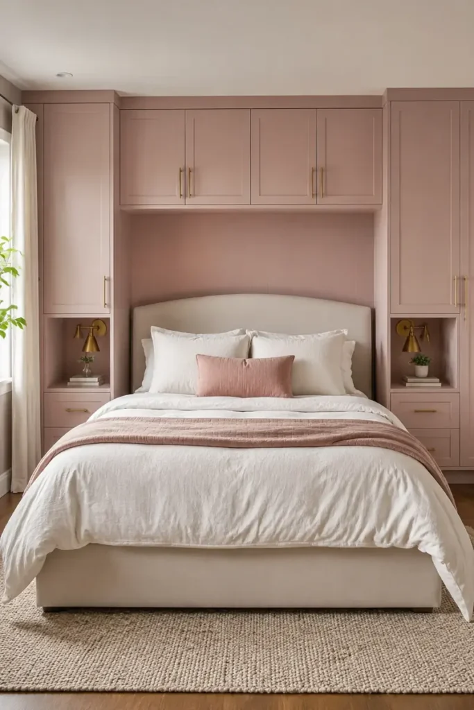
Built ins earn their space when they solve storage problems without making the bed feel trapped.
Place full height cupboards on both sides, then connect them with shallow cabinets or open shelving above the headboard. Painting the entire structure muted pink helps it read as one architectural feature instead of several heavy boxes.
What should stay open? Leave a small niche beside each side of the bed for a lamp, book, and glass of water. The niche can replace separate bedside tables in a narrow room.
Keep cabinet handles slim and quiet. Brass suits warm pink, while matte black creates a stronger outline.
Measure carefully so doors can open without hitting the bed or light fittings.
Separate wardrobes and bedside tables use several areas while the wall above the bed remains empty.
Pink built ins frame the bed, provide closed storage, and create useful bedside niches within one structure.
24. Hang Soft Pink Bed Curtains for an Adult Canopy Look
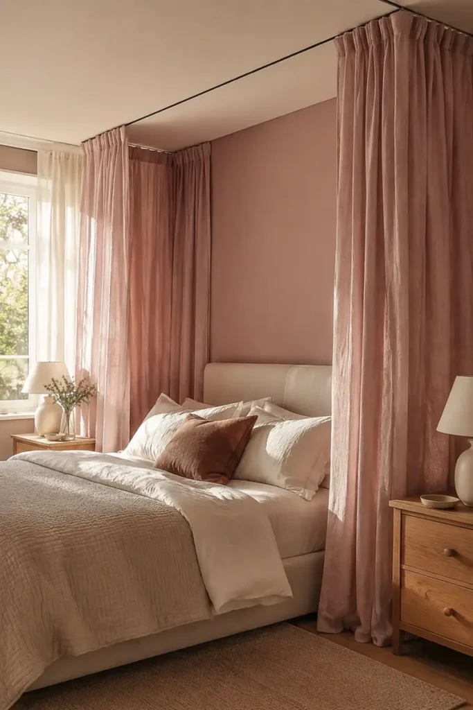
A canopy does not require a decorative four poster bed. Ceiling mounted tracks or slim rods can create the same softness with a cleaner shape.
Use dusty rose linen, cotton voile, or another fabric with a matte finish. Hang it high and let it fall close to the floor. The extra length makes the arrangement feel deliberate rather than like short curtains placed around a bed.
Keep the fabric panels open during the day. They should frame the headboard, not hide the bedding or block natural light.
For an adult look, avoid frills, shiny fabric, and several layers of pink. Simple folds and concealed hardware allow the shape of the canopy to carry the idea.
Canopy planning checklist
25. Give Blush Pink an Art Deco Twist With Curves and Brass
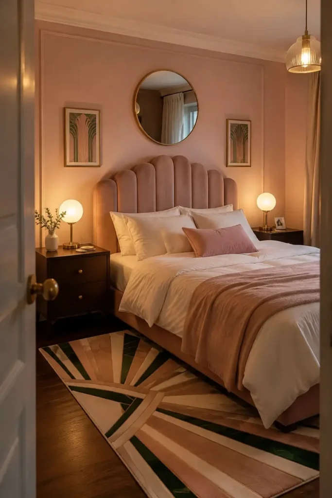
Art Deco style in a pink bedroom does not mean covering every surface with gold.
Begin with one strong curved shape. An arched headboard, rounded mirror, or pair of globe lamps gives the room its direction. Add brushed brass through small details such as handles, lamp stems, or a narrow mirror frame.
Blush works well as the softer background. Deep green, navy, burgundy, or black can provide the darker contrast associated with the style.
Choose one geometric pattern for a cushion or rug, then stop. Too many fan shapes and metallic surfaces can make the room feel like a themed set.
A restrained mix of curves, dark color, and warm metal feels far more convincing.
Choose one large curve and repeat it once in a smaller object.
Use brushed brass on handles, lighting, or a slim frame.
Do not mix several shiny gold finishes in one small bedroom.
Avoid repeating geometric motifs on the wall, rug, curtains, and bedding.
26. Create a Relaxed Boho Bedroom With Rattan and Faded Pink
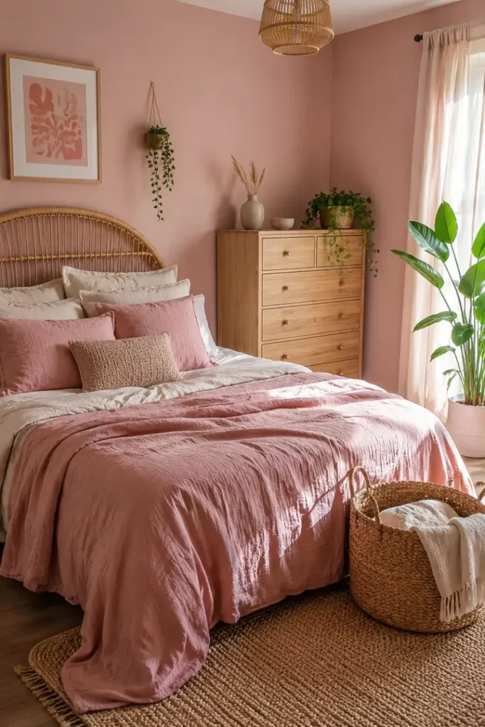
Boho bedrooms can become cluttered when every natural texture, plant, and handmade object is used at once.
Choose two main materials and repeat them. Rattan might appear in the headboard and one basket, while washed linen covers the bed and curtains. Faded pink can then soften the scheme through a quilt, cushion, or painted wall.
Keep the largest furniture simple. A plain wooden dresser gives woven pieces and plants enough room to stand out.
Skip bright white if the room already contains warm cane and timber. Cream, oatmeal, and sandy beige will connect more naturally.
A slightly rumpled bed suits this look. Piles of decorative cushions and crowded shelves do not.
- ▸Woven piece: rattan headboard, chair, or one large basket
- ▸Pink layer: faded quilt, linen curtains, or a muted wall
- ▸Natural base: cream bedding, pale wood, and a jute rug
- ▸Living detail: one healthy floor plant or trailing vine
27. Style a Vintage Pink Bedroom With Dark Wood and Collected Art
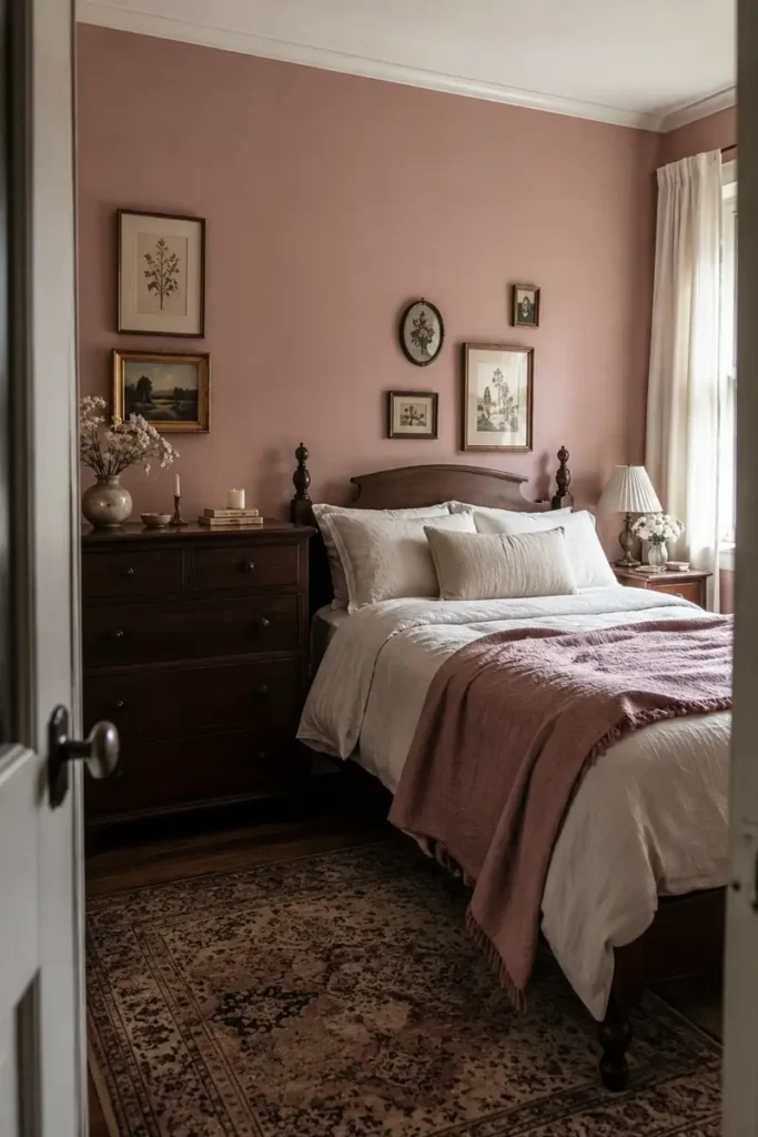
A vintage bedroom should look gathered over time, not purchased as a matching set.
Let one dark wooden piece lead the room. A mahogany dresser, walnut wardrobe, or carved bed creates a strong outline against faded pink walls. Smaller furniture can be lighter as long as the shapes and finishes do not fight for attention.
Artwork does not need identical frames. Mix two or three frame styles, but connect them through subject matter or color. Botanical prints, small landscapes, and simple portraits sit comfortably in this setting.
What keeps the room from feeling heavy? Pale bedding and open wall space.
Leave gaps between the pictures, and keep at least one large surface plain.
28. Make Pink Renter Friendly With Fabric Panels and Removable Accents
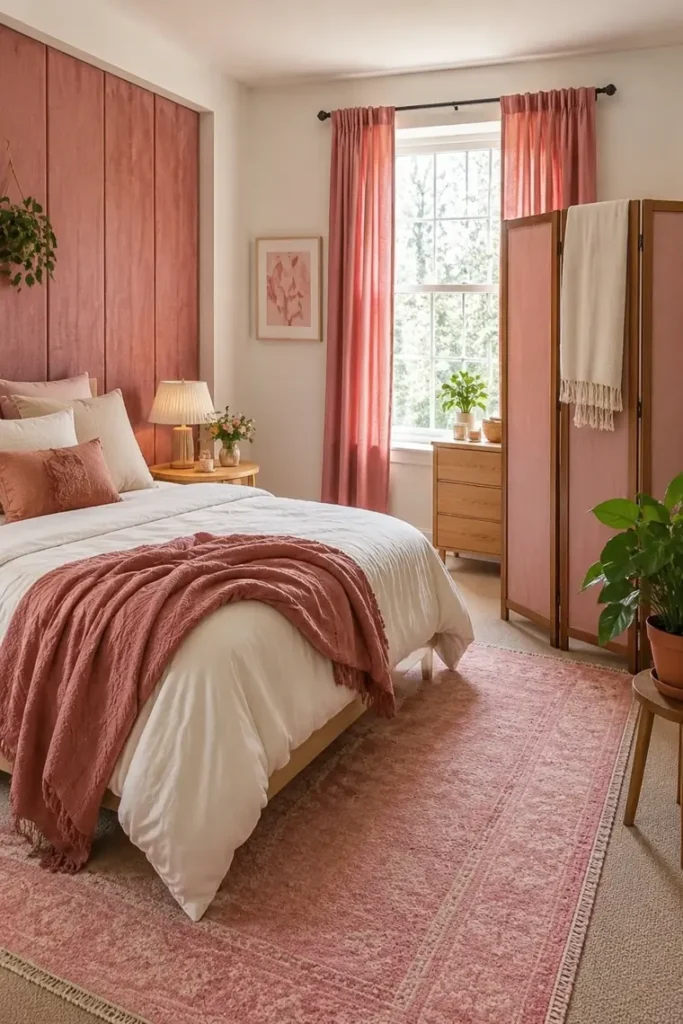
A rental bedroom can carry plenty of pink without changing the permanent surfaces.
Hang a wide fabric panel behind the bed using an approved removable method, or drape dusty rose fabric over a freestanding screen. A large panel gives the visual effect of an accent wall and can move with you later.
Pink curtains, a washable rug, and a quilt can spread the color across the room without making holes or repainting. Keep the furniture neutral so those pieces remain useful in another home.
Before applying hooks, strips, or removable wallpaper, check the product guidance and your rental agreement. Test a hidden spot first because even removable products may affect weak paint or delicate finishes.
📌 Renter Note
Do not assume a product marked removable is safe for every wall. Follow its surface requirements, test it out of sight, and remove it according to the manufacturer’s directions.
29. Use Oversized Abstract Art to Set the Room’s Pink Palette
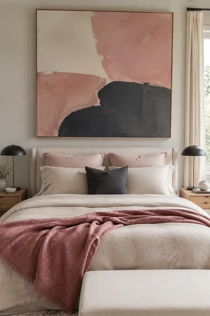
Start with the artwork, not a collection of unrelated paint and fabric samples.
Choose one oversized abstract piece that contains pink plus two supporting colors. Then assign those colors clear jobs:
- Pull the palest shade onto the walls or bedding.
- Use the middle color on a throw, curtain, or chair.
- Reserve the darkest tone for a lamp, cushion, or frame.
The artwork should be wide enough to hold its own above the bed, but it should not extend beyond the outer edges of the bedside furniture.
Repeat each supporting color at least once elsewhere in the room. This makes the painting feel connected instead of looking like a late addition.
Let the artwork supply the palette, then repeat its colors through useful pieces rather than buying decor that serves no other purpose.
30. Repeat Pink in Three Small Places Instead of Decorating the Whole Room
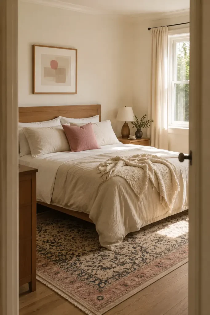
Pink does not need to cover the walls or bed to feel intentional.
Use it once near the floor, once around the middle of the room, and once closer to eye level. A faded pink border in the rug, a rose cushion on the bed, and a small pink section inside the artwork create a clear visual path.
The three pieces should relate without matching exactly. Slight variation looks more natural than buying a coordinated accessory set.
Stand at the doorway and check whether your eye moves through all three areas. If every pink object sits on the bed, shift one to the wall or the opposite side of the room.
Small repetition can carry the entire color story.
The three spot pink check
Final Thoughts
A pink bedroom feels most grown up when every color and object has a job. Start with one idea that suits what you already own, such as a rose wall behind a neutral bed, black accents beside brighter pink, or a dusty throw over white linen. Then step back before adding more.
The strongest pink bedroom ideas for adults leave room for contrast, texture, and a few quiet surfaces. You do not need to repaint the entire room or replace all the furniture. One carefully chosen change can set the direction. If rose is the shade you keep coming back to, these rose pink bedroom color pairings narrow the palette down even further.
Save this list to Pinterest so you can return to the color combinations, layouts, and styling formulas when you are ready to refresh your bedroom.